Motto
Below you’ll find a list of articles broken down by sub topics that cover each and every aspect of your theme. We regularly maintain our documentation in collaboration with our support staff.
General Settings
Section Settings
Settings that are used in almost all sections.
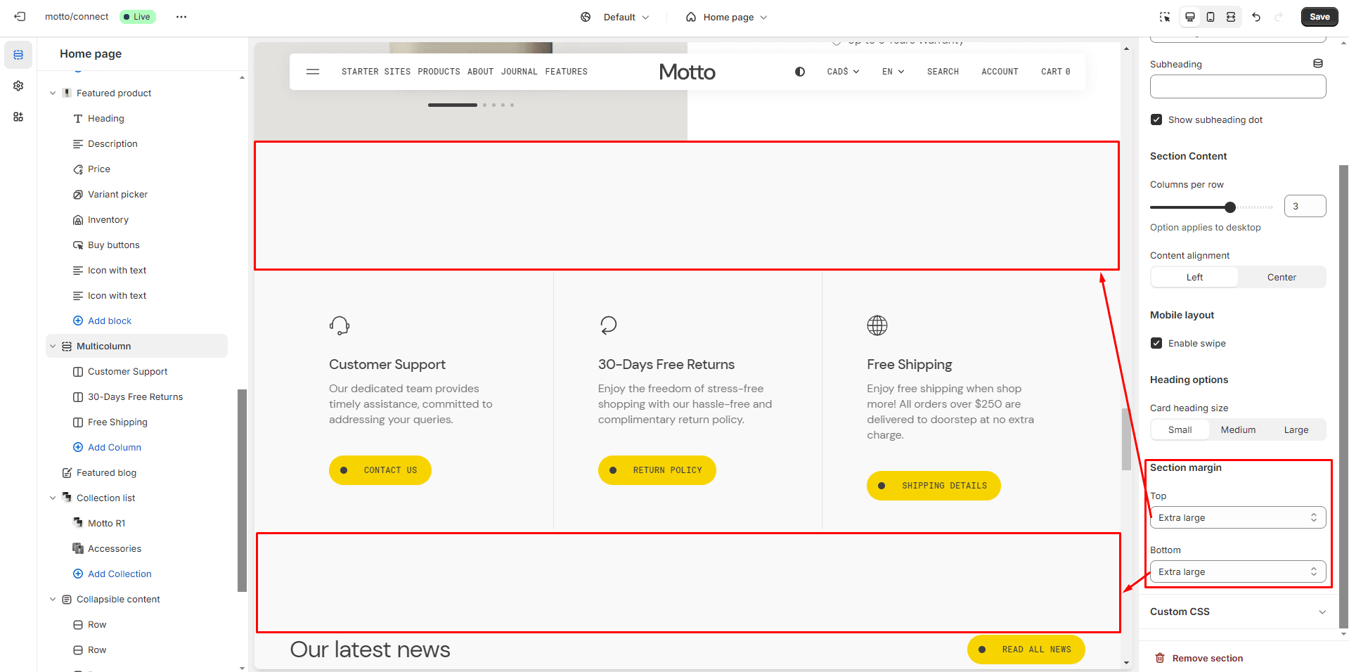
Section margin
Allows you to change the top and bottom margin in the section.
- Top margin selector allows you to change the top margin in the section.
- Bottom margin selector allows you to change the bottom margin in the section.
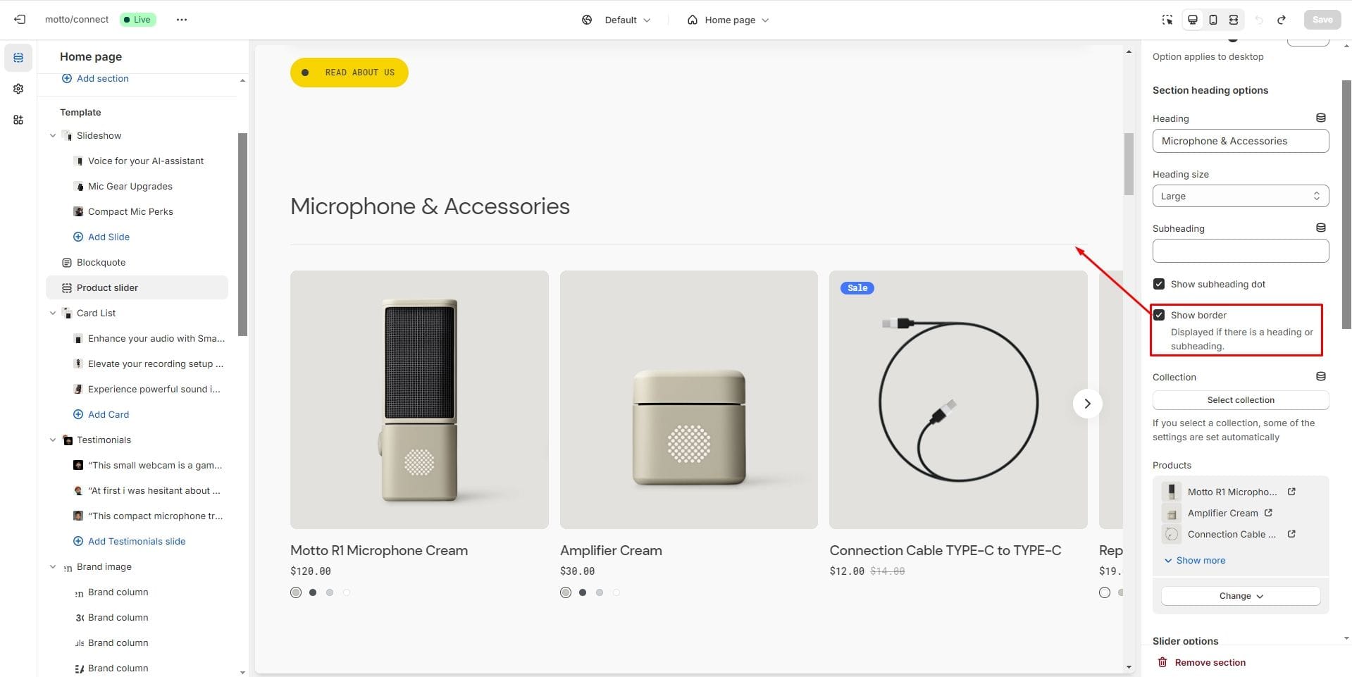
Section border
In some sections you can enable border top using the Show border setting. The border will only be displayed if a section title or subtitle is entered.
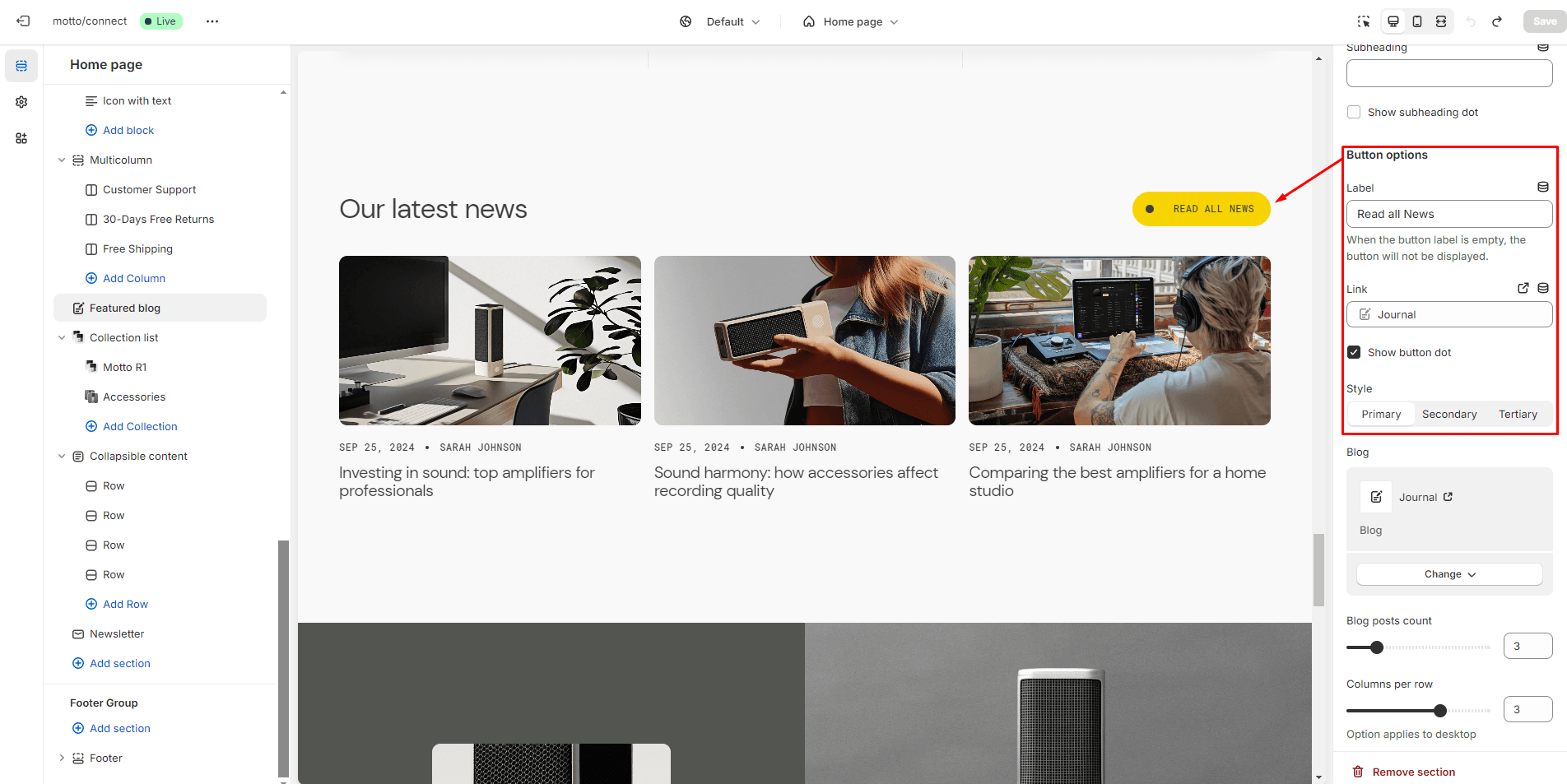
Buttons
Allows you to change button options
- Button label field sets the button's label.
- Button link field allows you to add a link to any source.
- Button style field sets the button's style (Primary, Secondary and Tertiary).
- Show button dot shows/hides the decorative element on the button in the form of a dot
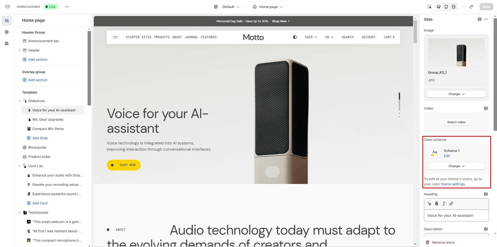
Color scheme
To set color schemes, you can go to Theme Settings → Colors, where three default color schemes are available (Scheme 1 - light colors, Scheme 2 - alternative colors, Scheme 3 - dark colors, Scheme 4 - bright background).
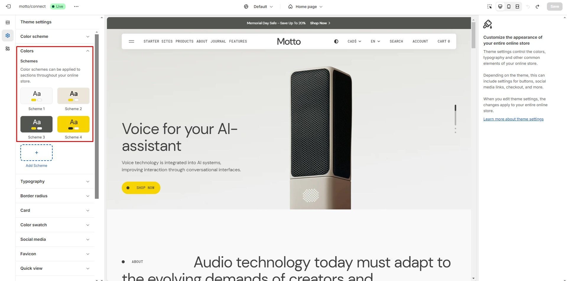
Color scheme selector, located in the section or block settings, allows you to set the color scheme.
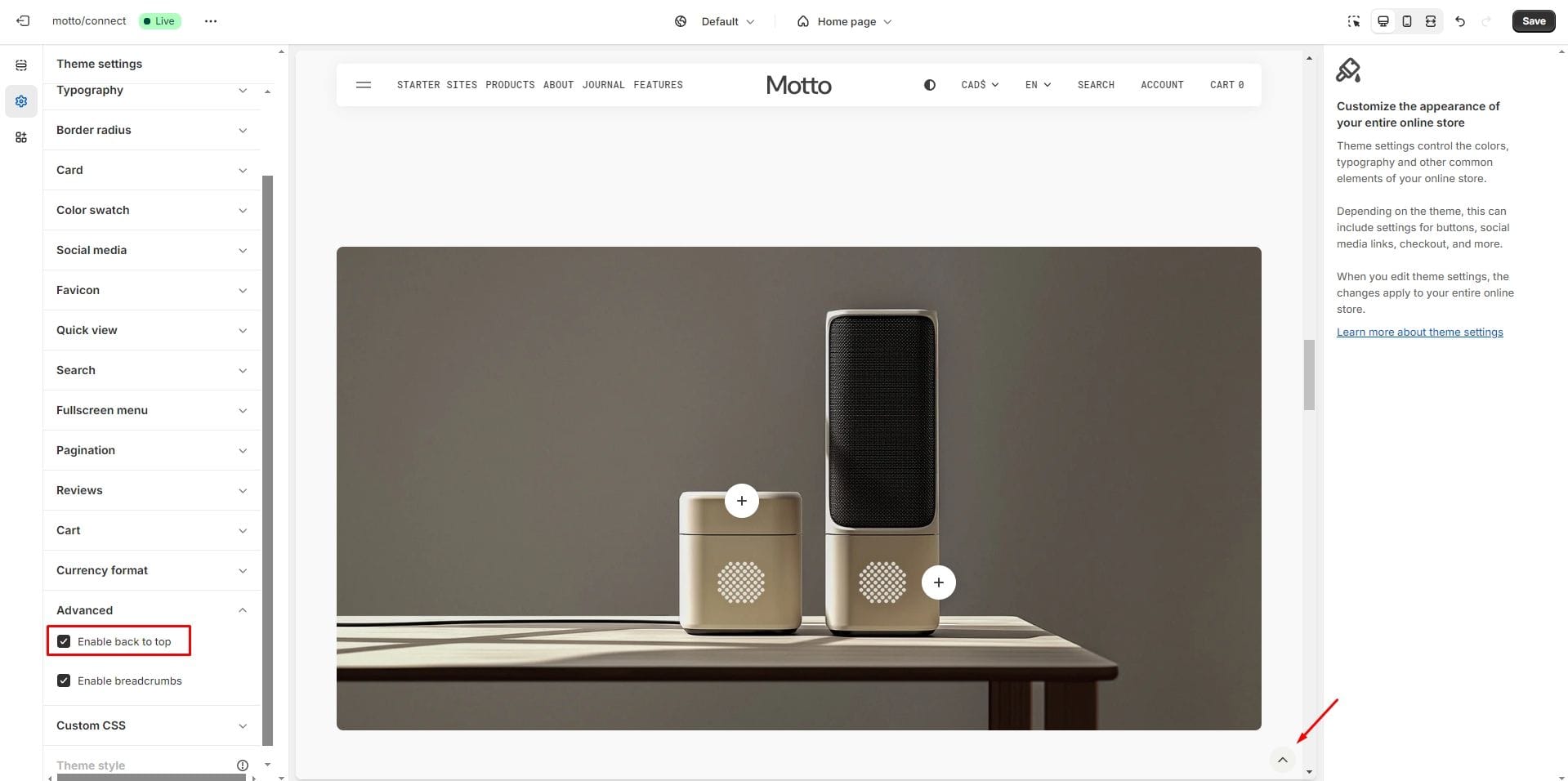
Back to Top
To enable Back to Top button, navigate to Theme settings → Advanced.
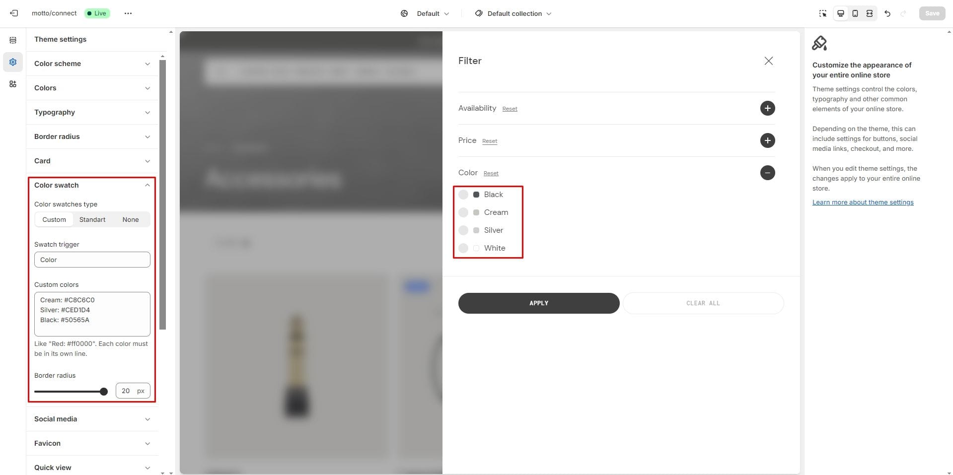
Color swatches
To enable and edit color swatches, go to Theme Settings → Color Swatches. There are two types of swatches available - Custom and Standard.
- Standard: uses basic color swatches for collection filters that depend on Shopify category metafields. Learn More about Shopify category metafields.
- Custom: supports additional color swatches for collection filters, product cards, and product pages.
- None: disable color swatches.
Swatch Trigger and Custom Colors settings are only applicable to the Custom type. The swatch trigger name must match the option name in the product variations. You can also add custom colors by specifying their name and color value in HEX format.
Border radius setting is applied to the product card and the product page.
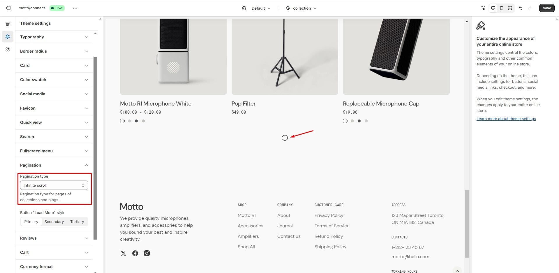
Infinite scroll
To enable and edit Infinite scroll, navigate to Theme settings → Pagination → Pagination type.
Header Group
Sections that are used on all pages by default.
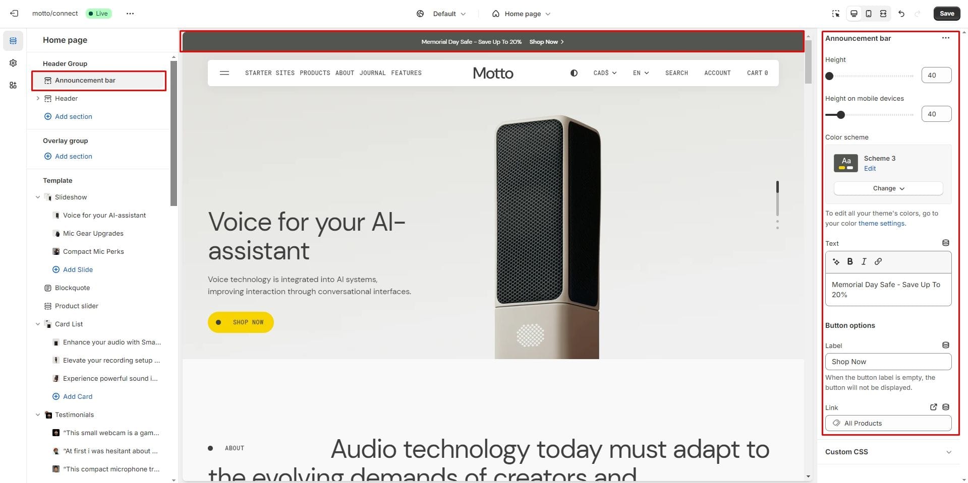
Announcement bar
The Announcement Bar appears at the top of every page and includes custom messages with a button.
Header
There are several types of the header in this theme. You can choose a variant.
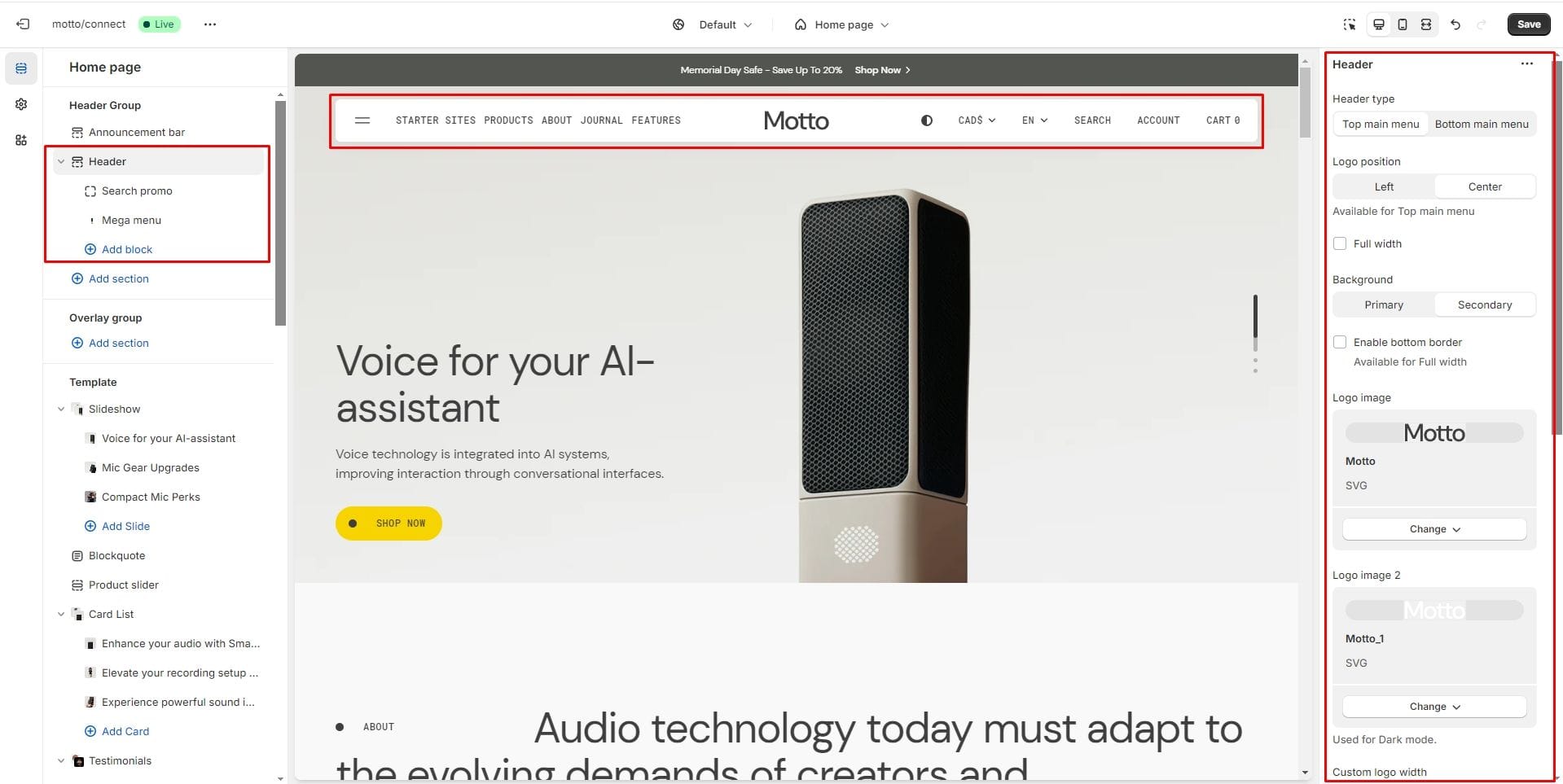
- Select Header type, which changes the appearance of the header
- Enable Full width if you want the header to stretch to the full width of the page.
- You can add a bottom border to the Full width menu by enabling the Enable bottom border setting.
- Select the background color of the header using the Background option. The colors Background 1 and Background 2 of Color Scheme 1 are used.
- Use the Logo image file selector allows you to select or upload your logo file.
- Use the Logo image 2 file selector to select or upload your logo, which can be seen in Dark mode.
- Logo position selector allows you to place the logo either on the left or in the center. Available for Top main menu.
- (Optional) If you add a logo, you can use the Custom logo width slider to change the logo size.
- Choose a Menu to be displayed in the header.
- Sticky header field allows the display of a header on the screen as the user scrolls up.
- Enable country/region selector field enables the display of country/region.
- Enable language selector field enables the display of localization.
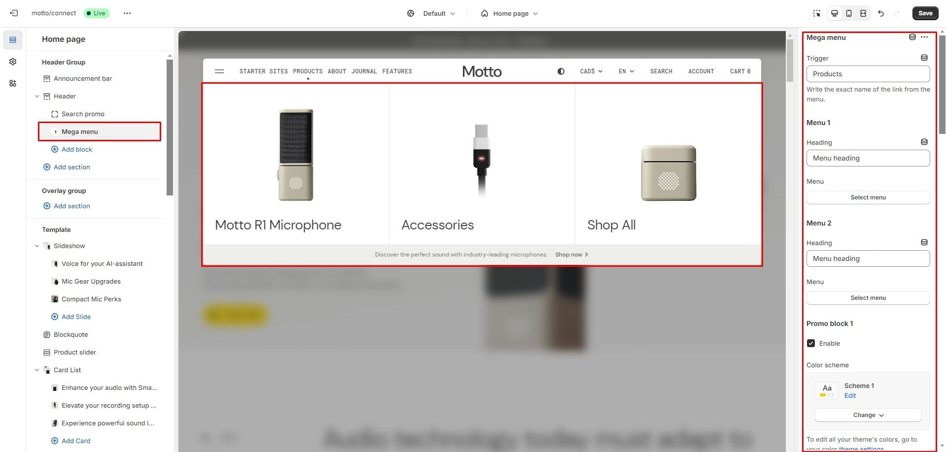
Mega menu
To add a Mega menu then follow these steps:
- Add the Mega menu block to the Header.
- Type the exact name of the link in the Trigger field.
The Mega menu allows you to include two Menus and three Promo blocks within it.
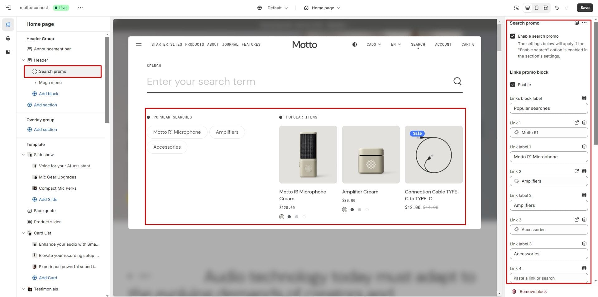
Search
To enable the search, you need to activate the corresponding option in the Header settings (it is enabled by default).
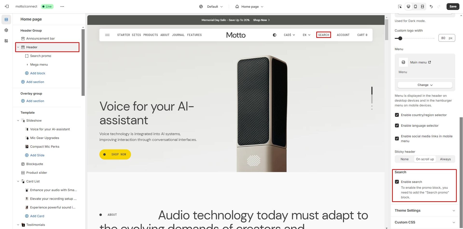
In this theme, you can use a predictive search. It is enabled by default, but you can disable it in the Theme settings → Search.
You can also add a Promo section below the search input field. It allows you to place one menu and one promo block.
Overlay Group
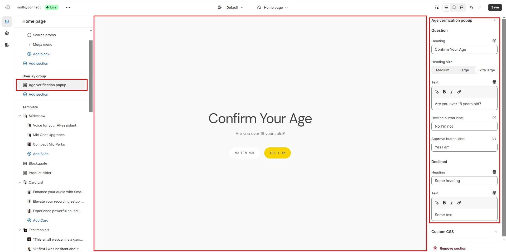
Age verification popup
An Age verification popup is a prompt that appears on a website to confirm the user's age before accessing restricted content. In the Age verification popup settings, you can change customize text and buttons.
Notification Banner
In the Notification Banner settings, you can change layout, add image, texts, edit banner position, change open and exit animations and options.
You can also use this banner as a button-trigger for opening another notification bar or a popup by following these steps:
- Add the id of the popup/notification bar you chose to open to the Id field in the Triggers section (e.g. "popup")
- Navigate to the popup/notification bar settings and add the Id with "#" in the beginning to the "CSS selector for manual trigger" field.

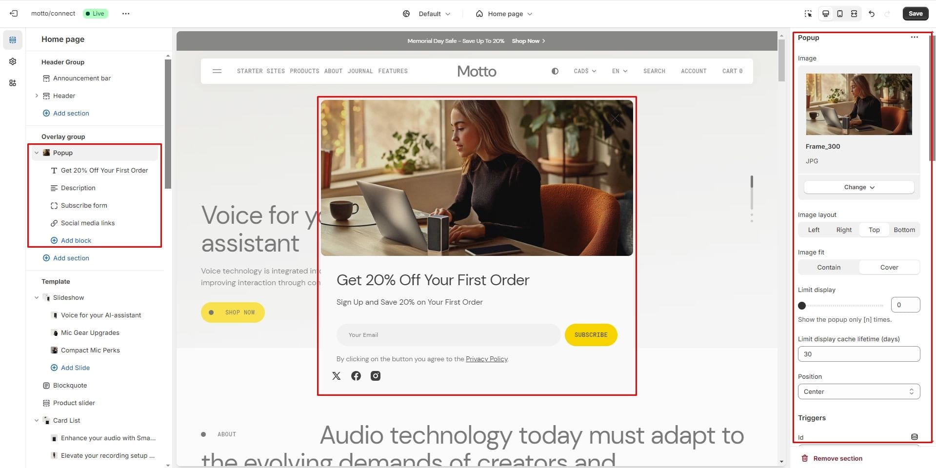
Popup
In the Popup settings, you can change layout, add image, subscribe form, edit position, change open and exit animations and options.
You can also use this popup as a button-trigger for opening another popup or notification bar by following these steps:
- Add the id of the popup/notification bar you chose to open to the Id field in the Triggers section (e.g. "notification-bar").
- Navigate to the popup/notification bar settings and Add the Id with "#" in the beginning to the "CSS selector for manual trigger" field.
Footer Group
Sections is used on all pages by default
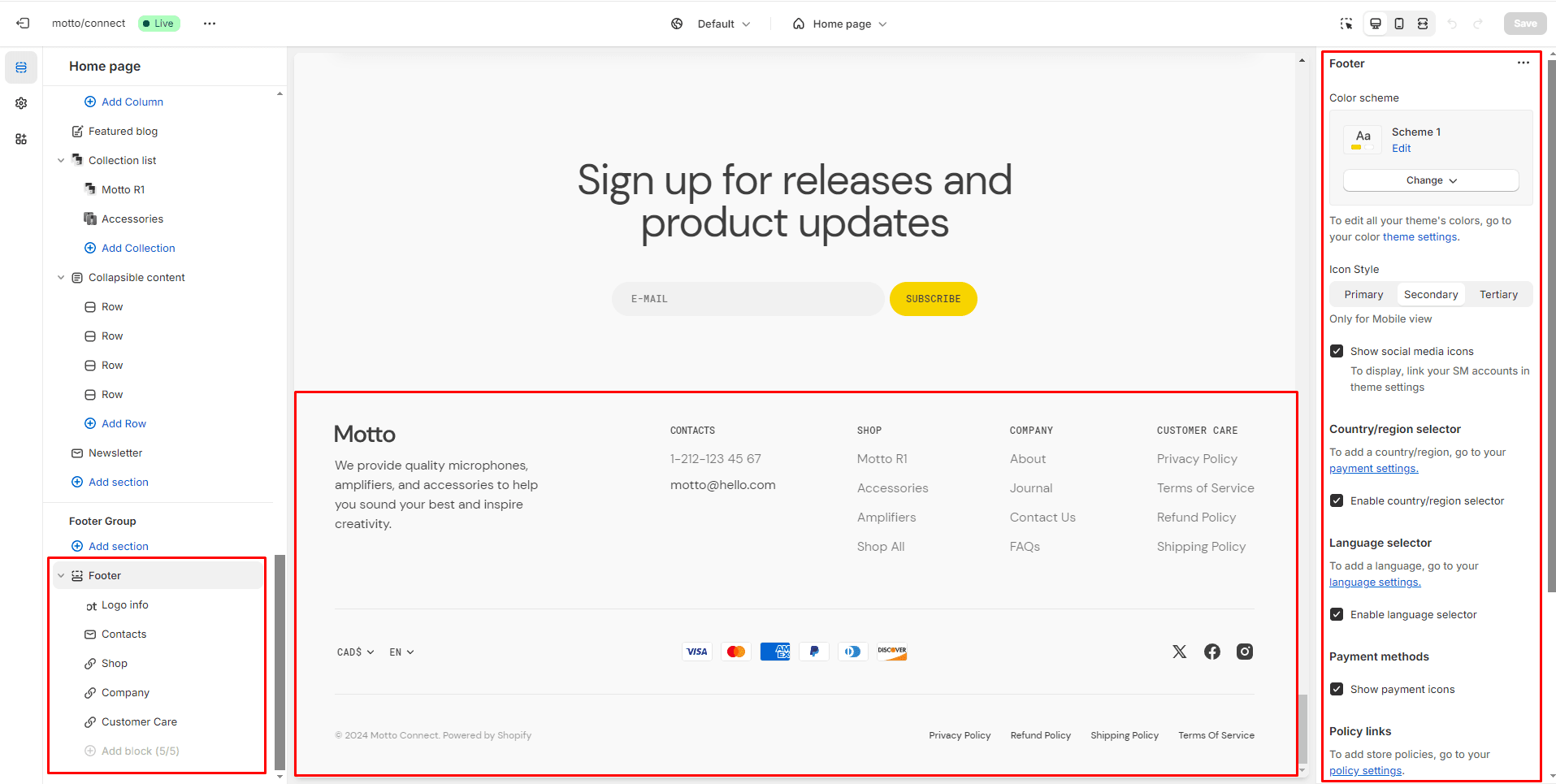
Footer
Footer appears at the bottom of every page. You can customize it to fit your brand and product offerings.
- Use Color scheme selector to change the color scheme.
- Icon Style sets the icon colors for the menu on mobile devices.
- Follow on shop the field allows you to enable the option to subscribe to the store.
- Payment methods field enables the display of payment methods in the bottom line of the footer.
- Country/region selector field enables the display of the region selector in the footer.
- Language selector field enables the display of the language selector in the footer.
- Policy links field enables the display of the policy links in the footer.
- Block Logo info options Image file selector allows you to select or upload your logo file.
- Block Logo info options Image 2 file selector to select or upload your logo, which can be seen in Dark mode.
- (Optional) If you add a logo, you can use the Custom logo width slider to change the logo size.
- Block Menu allows you to select menus, which will be displayed on the top section of the footer.
- Block Contacts allows you to add contact information and social links.
All sections
The theme contains several customizable sections that you can add to your page in any order.
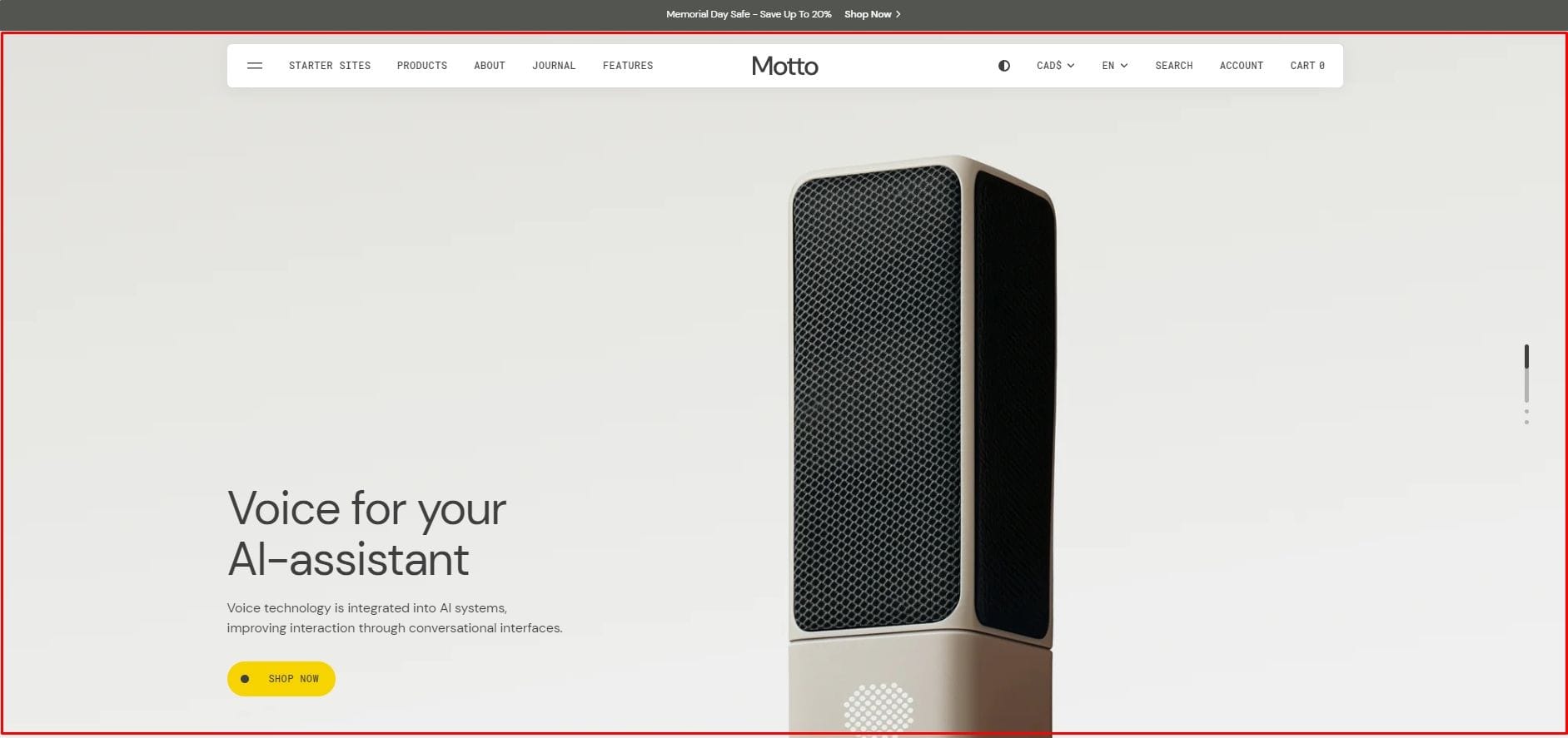
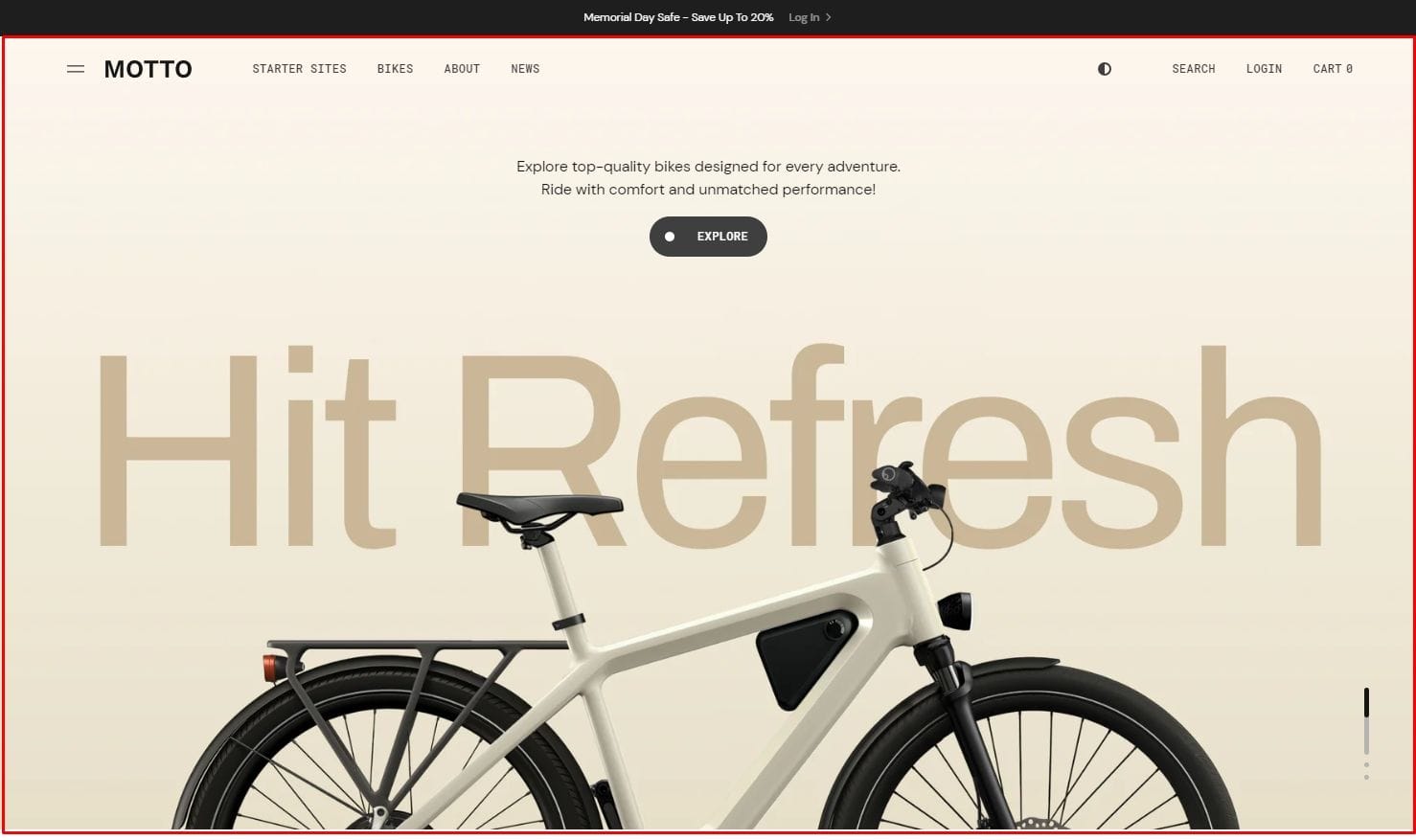
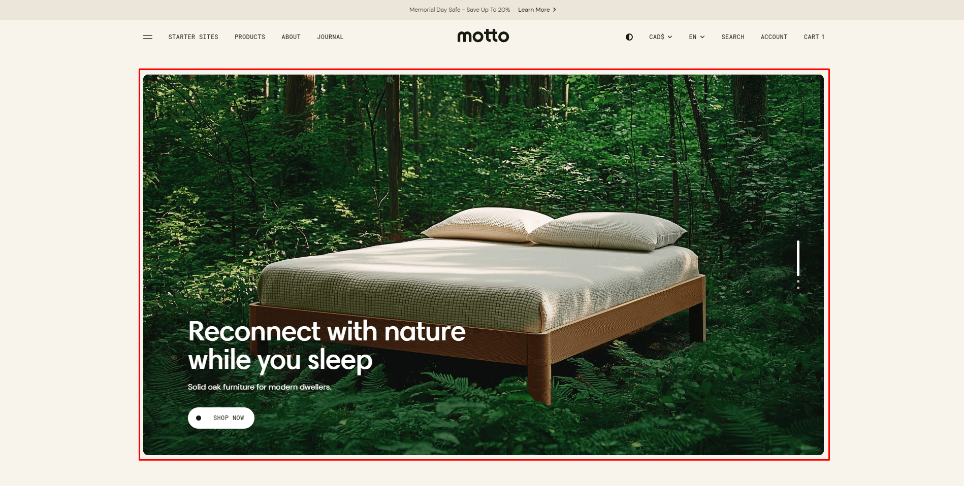
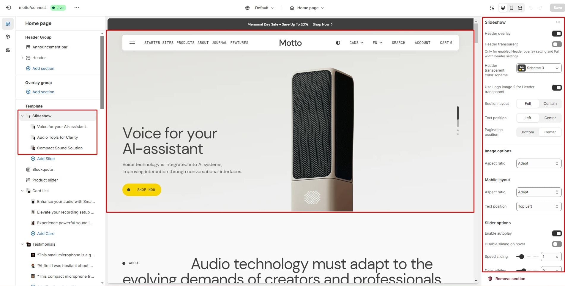
Slideshow
The section allows you to add slides with image, heading, text and button.
- Header overlay checkbox allows you to have a overlay header when the slideshow section is the first.
- Header transparent checkbox allows you to make the overlay header background transparent if it has the Full width setting enabled.
- Using the Header transparent color scheme setting, you can choose the text color for the Header transparent.
- Enable Use Logo image 2 for Header transparent to display Logo image 2 for Header transparent.
- Section Layout selector allows you to change the width of a section to Full or Contain (within a container).
- Text position aligns the content inside the slide to the bottom left - Left or to the center of the top - Center.
- Use Pagination position to align pagination to the bottom or center.
- Image options allow you to set the aspect ratio of this section for desktop devices.
- Mobile layout sets the aspect ratio and content layout for mobile devices.
- Enable autoplay checkbox field allows you to enable autoplay for slider.
- Disable sliding on hover checkbox field allows you to stop slider autoplay while hovering.
- Speed sliding checkbox field allows you to set the duration of the slide flip animation.
- Delay sliding checkbox field allows you to change delay after each slide.
- Sliding effects selector allows you to choose a few sliding effects.
- Block Slide options Image allows you to set an image for the block.
- Block Slide options Video allows you to set an video for the block.
- Block Slide option Heading allows you to set a heading for the block.
- Block Slide option Description allows you to set a text for the block.
- Block Slide option Overlay options slider allows you to change the opacity of the overlay for desktop and mobile devices separately.
Slideshow column
This section allows you to add slides in two columns with an image, title, text and button.
- Section Layout selector allows you to change the width of a section to Full or Contain (within a container).
- Text position aligns the content inside the slide to the bottom left - Left or to the center of the bottom - Center.
- Image options allow you to set the aspect ratio of this section for desktop devices.
- Mobile layout sets the aspect ratio for mobile devices.
- Enable autoplay checkbox field allows you to enable autoplay for slider.
- Disable sliding on hover checkbox field allows you to stop slider autoplay while hovering.
- Speed sliding checkbox field allows you to set the duration of the slide flip animation.
- Delay sliding checkbox field allows you to change delay after each slide.
- Sliding effects selector allows you to choose a few sliding effects.
- Block Slide options Image allows you to set an image for the block.
- Block Slide options Video allows you to set an video for the block.
- Block Slide option Heading allows you to set a heading for the block.
- Block Slide option Description allows you to set a text for the block.
- Block Slide option Overlay options slider allows you to change the opacity of the overlay for desktop and mobile devices separately.
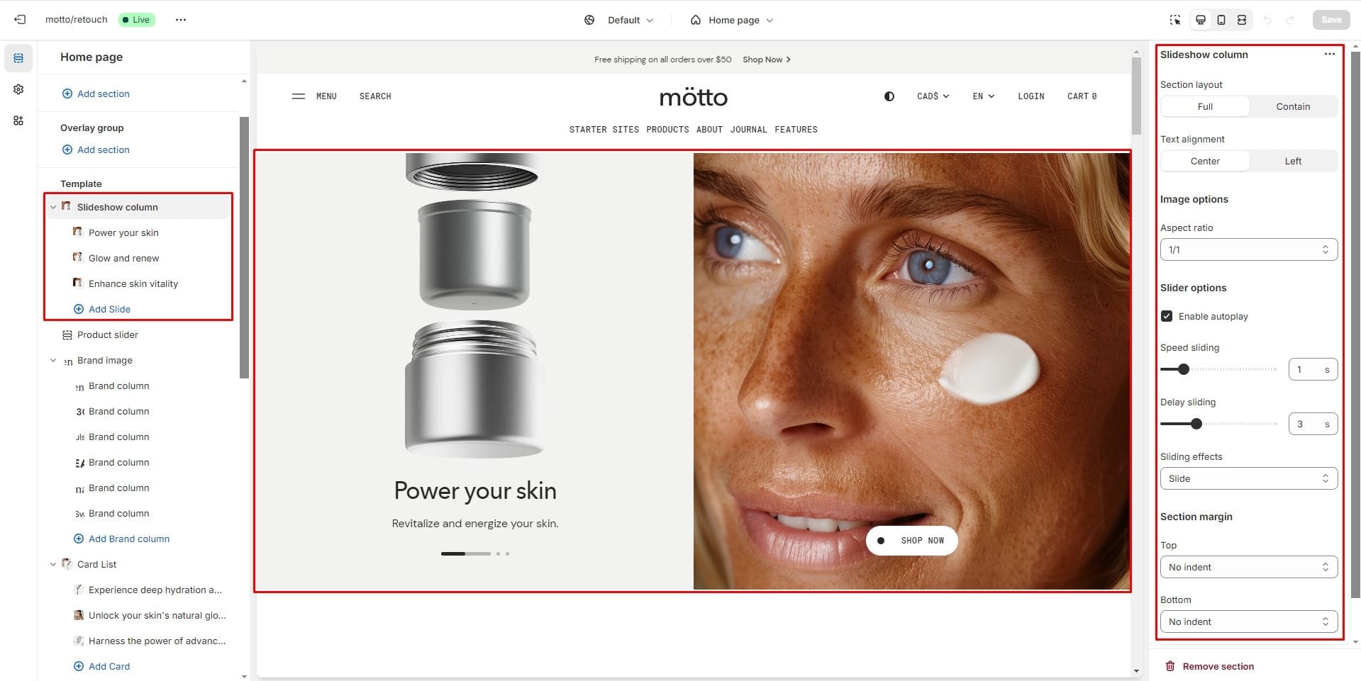
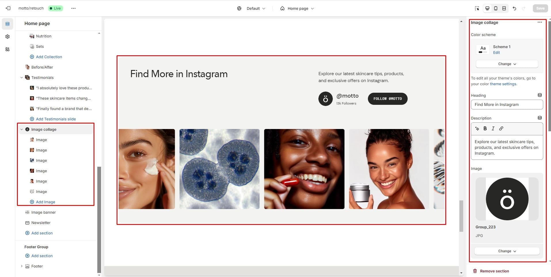
Image collage
The section allows you to create a collage from several images.
- Image allows you to add a picture for the logo.
- Aspect ratio sets the aspect ratio for the collage images.
- Author name adds the author's name next to the logo.
- Description adds a description under the author's name.
- The Image block allows you to add pictures to your collage.
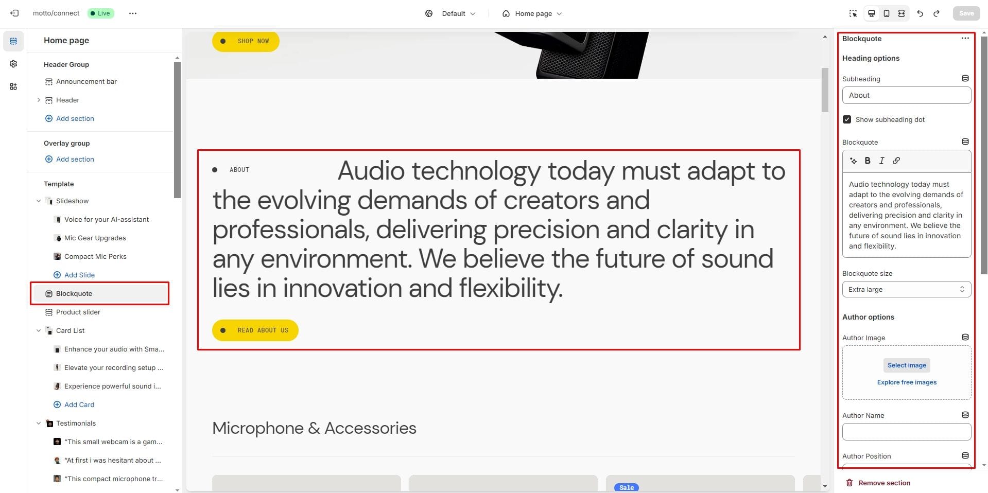
Blockquote
The section allows you to add the text of the quote, its author and a link.
- Subheading allows you to set a subheading for the section.
- Blockquote allows you to set a text of the quote.
- Author options allow you to set the author's image, name and position.
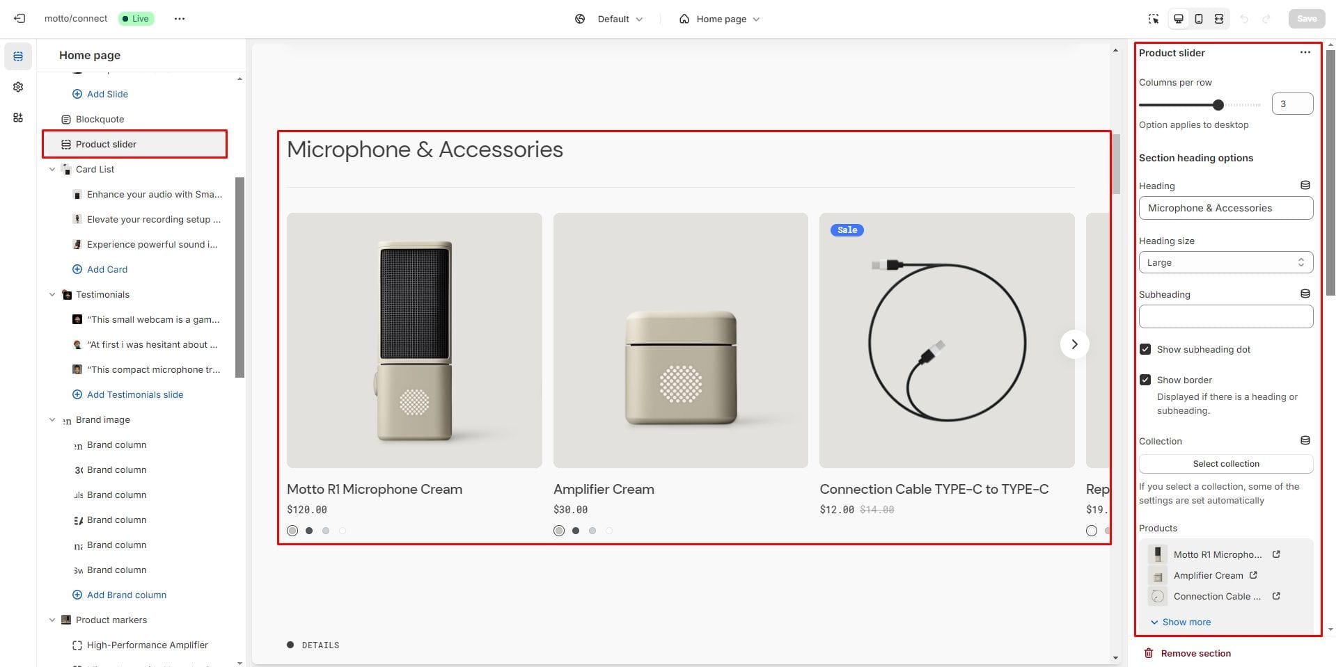
Product slider
The section allows you to select products and customize their display.
- Columns per row slider allows you to change the number of products per line only on desktop devices.
- You can choose a Collection or Products to be added to the section.
- Image aspect ratio selector allows you to set the aspect ratio of the product image.
- Enable autoplay checkbox field allows you to enable autoplay for slider.
- Disable sliding on hover checkbox field allows you to stop slider autoplay while hovering.
- Show arrows checkbox field enables the display arrows.
- Speed sliding checkbox field allows you to set the duration of the slide flip animation.
- Delay sliding checkbox field allows you to change delay after each slide.
- Product card options allow you to customize the display of hover images, brand, collection, product description and SKU.
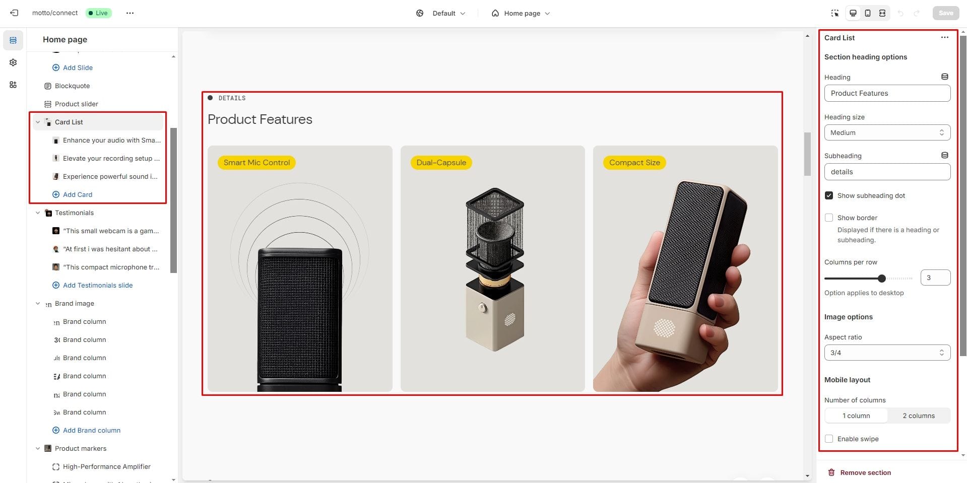
Card list
Allows you to add cards and customize them.
- Columns per row slider allows you to change the number of cards per line only on desktop devices.
- Image options allow you to set the aspect ratio of images.
- Mobile layout options allow you to customize the number of columns and enable the slider on mobile devices.
- For the Card block, you can add an image, badge and description.
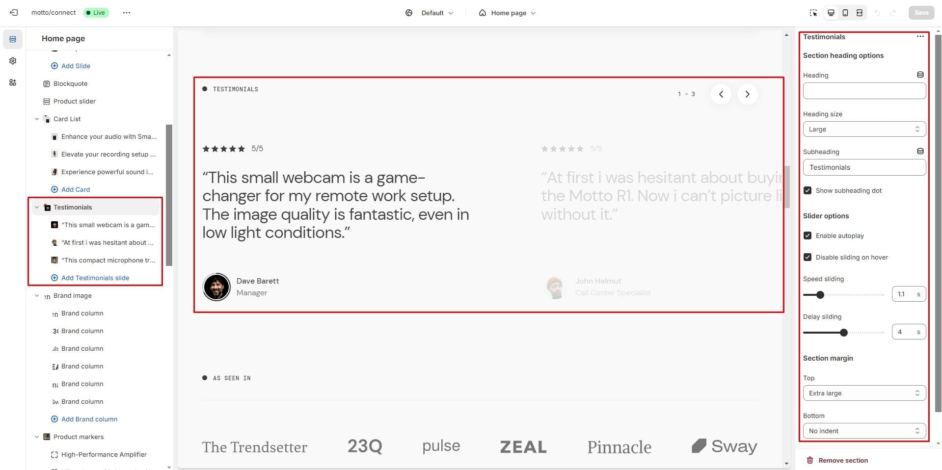
Testimonials
This section enables to add sliding product testimonials customer review.
- Enable autoplay checkbox field allows you to enable autoplay for slider.
- Disable sliding on hover checkbox field allows you to stop slider autoplay while hovering.
- Speed sliding checkbox field allows you to set the duration of the slide flip animation.
- Delay sliding checkbox field allows you to change delay after each slide.
- Block Testimonials slide option Image allows you to set an author's image.
- Block Testimonials slide option Text allows you to set a text for the testimonial.
- For Testimonials slide you can also set the Author name and Author position.
- Block Testimonials slide Review score allow you to add a rating from 1 to 5.
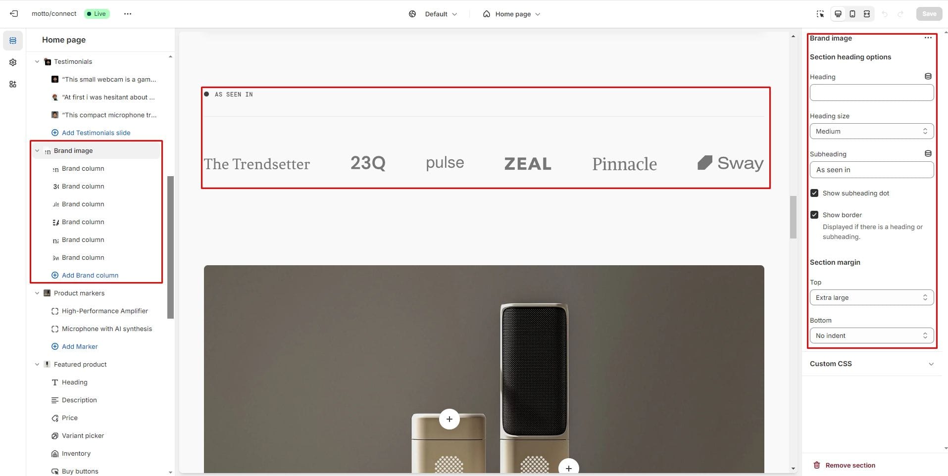
Brand image
Allows you to add company logos.
- Block Brand column option Image allows you to add company logo.
- Add Image dark mode for the Brand column block if you want a different image to be displayed in Dark Mode.
- Using the Image width option of the Brand column block, you can set the width of the uploaded images.
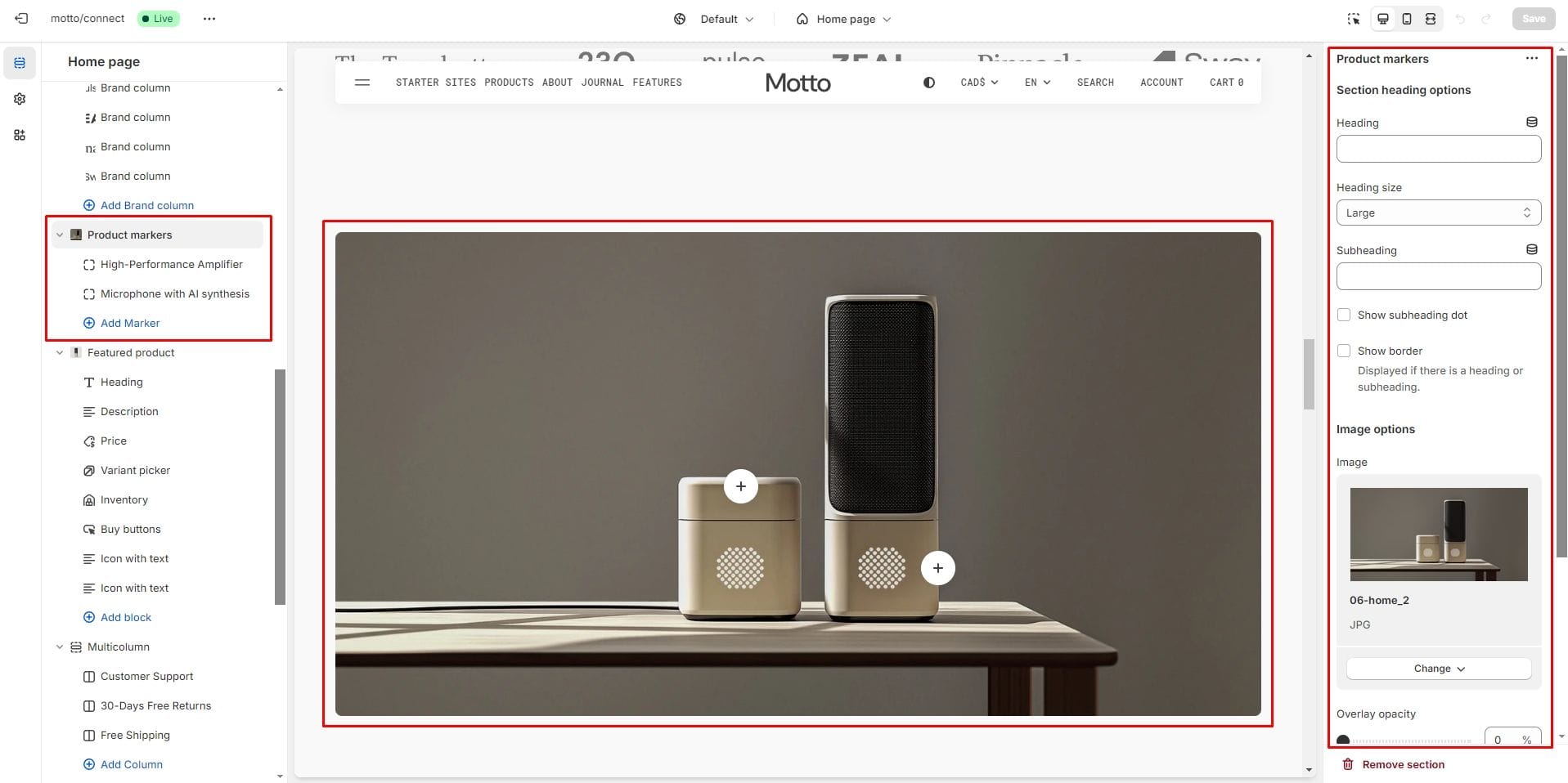
Product markers
The section allows you to add markers to the image and display product information directly on the picture.
- Image allows you to set a image for the section.
- Overlay opacity slider allows you to change the opacity of the overlay.
- In the block Marker, you can choose icons, add heading and description and choose the marker display position.
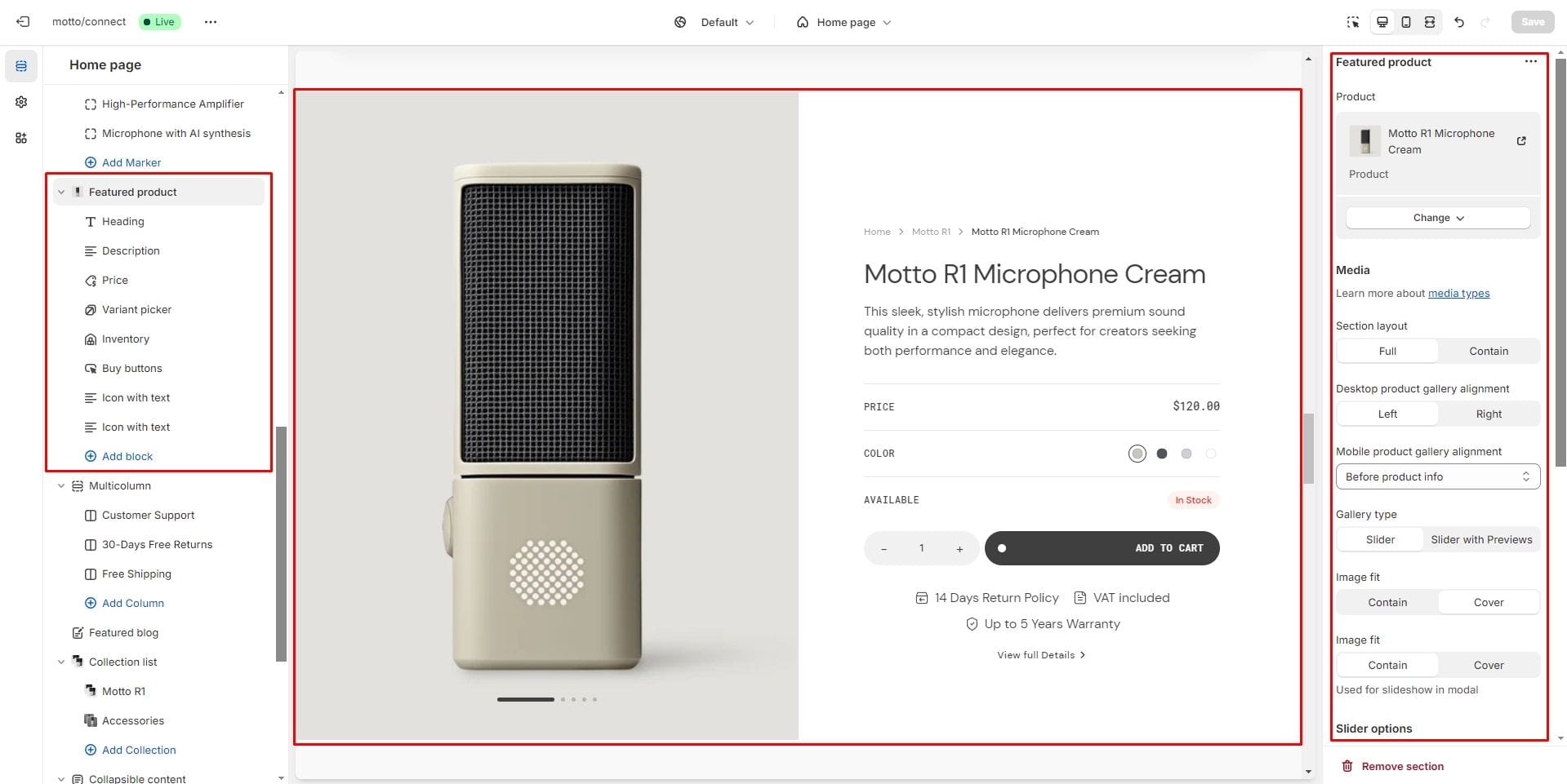
Featured product
Allows you to add one featured product.
See block descriptions in Pages → Product Page.
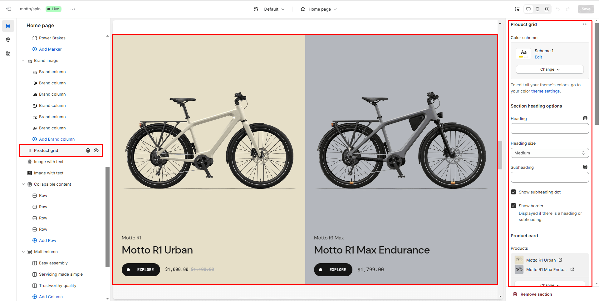
Product grid
The section allows you to select products and customize their display.
- Columns per row allows you to change the number of products per line only on desktop devices.
- Mobile layout options allow you to enable the slider on mobile devices.
- Overlay options allows you to add and change the opacity of the overlay for product card.
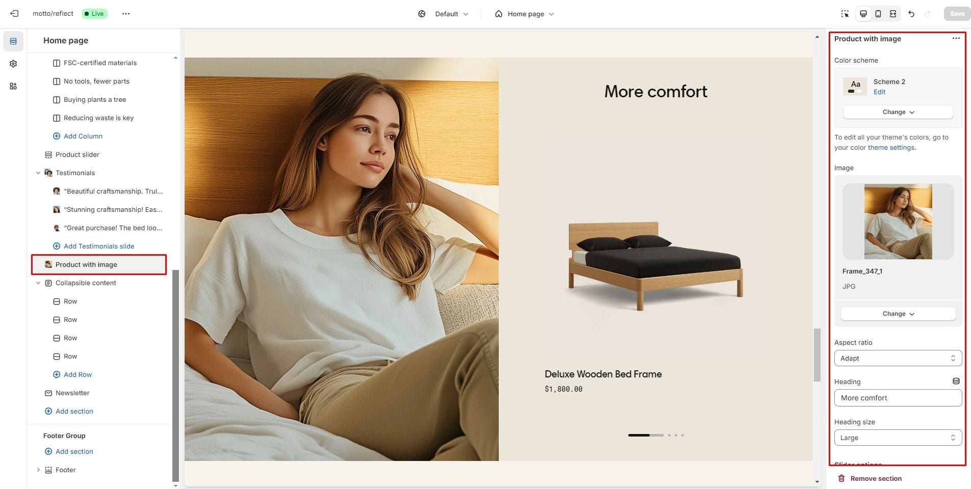
Product with image
The section allows you to add products and an image.
- Aspect ratio sets the proportions of the image.
- Enable autoplay checkbox field allows you to enable autoplay for products slider.
- Disable sliding on hover checkbox field allows you to stop products slider autoplay while hovering.
- Speed sliding checkbox field allows you to set the duration of the slide flip animation.
- Delay sliding checkbox field allows you to change delay after each slide.
- Product card options allow you to customize the display of hover images, brand, collection, product description and SKU.
Multicolumn
Allows you to add blocks and customize them.
- Columns per row slider allows you to change the number of blocks per line only on desktop devices.
- Use Content alignment selector to change the position of the text horizontally.
- Mobile layout options allow you to enable the slider on mobile devices.
- Heading options allow you to change the size of the block header.
- Block Column option Icon selector allows you to select icon.
- Block Column options Heading allows you to set a heading for the block.
- Block Column options Description allows you to set a description for the block.
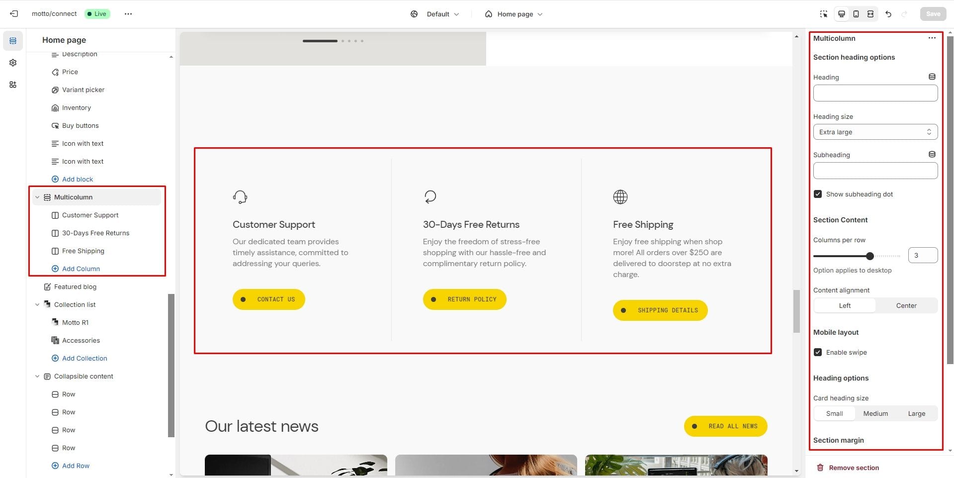
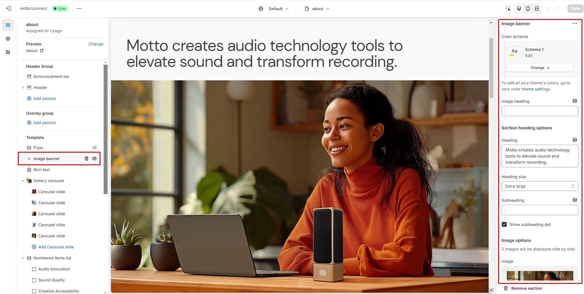
Image banner
The section allows you to add one or two images with text content.

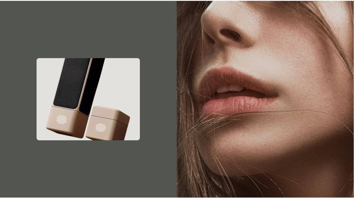
- Image heading sets a title above the image.
- Image options allow you to select an images and set their aspect ratio.
- Animation allows you to add animation to the image when scrolling. Works only with Full screen aspect ratio.
- Overlay options allows you to add and change the opacity of the overlay.
Gallery carousel
The section allows you to add images to scroll smoothly automatically.
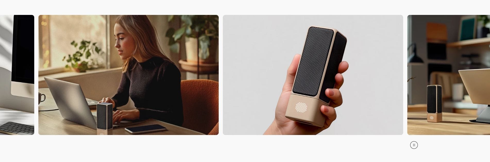
- Speed sliding checkbox field allows you to set the duration of the slide animation.
- Enable stop button allows you to toggle the visibility of the button.
- Aspect ratio sets the proportions of the carousel images.
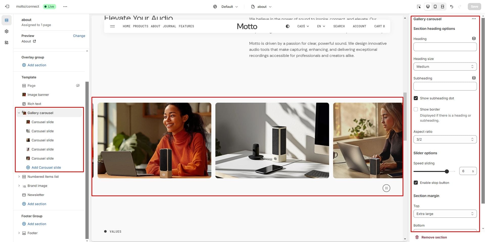
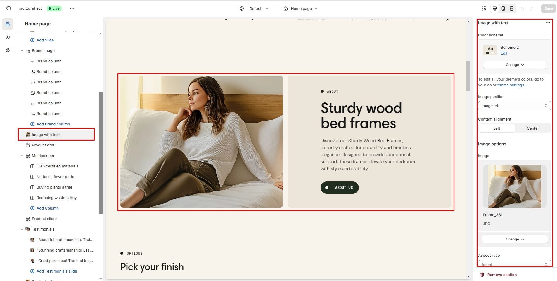
Image with text
The section allows you to add an image, text and button.
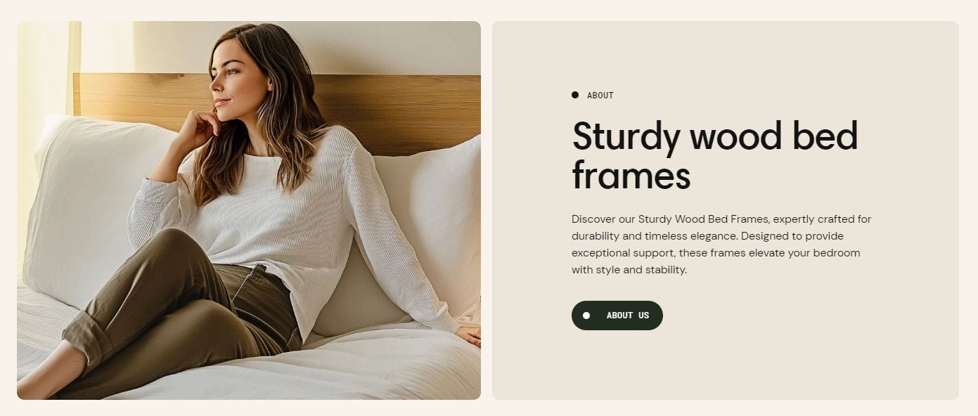
- Image position sets the position of the image relative to the content.
- Content alignment changes the horizontal position of text.
- Image options allow you to select an image and set its aspect ratio.
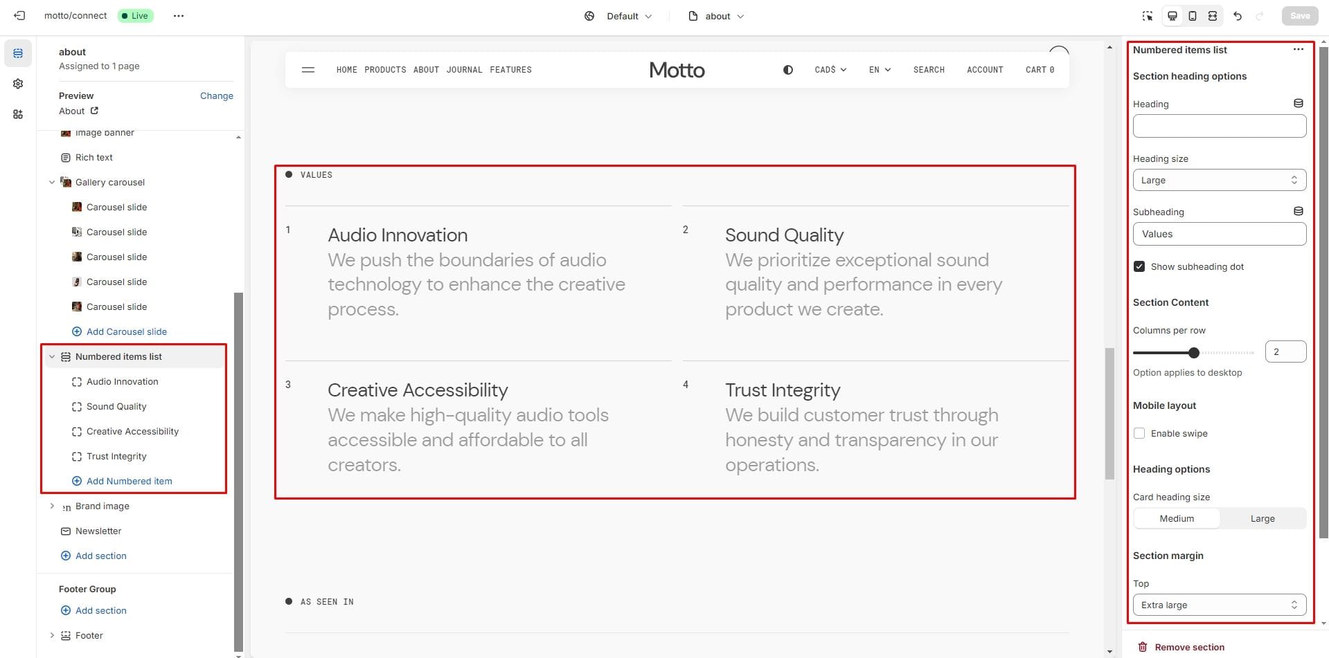
Numbered items list
The section allows you to create numbered blocks with text content.
- Columns per row slider allows you to change the number of blocks per line only on desktop devices.
- Mobile layout options allow you to enable the slider on mobile devices.
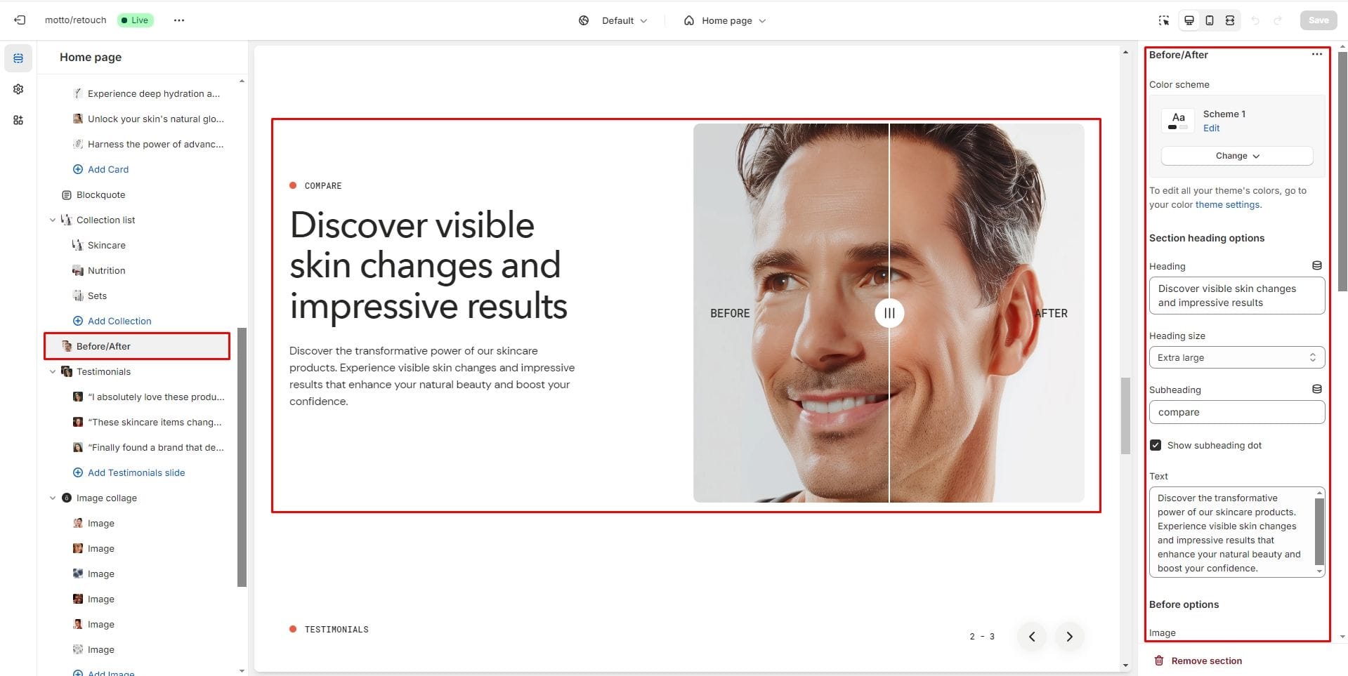
Before/After
Allows you to upload images for visual comparison before and after.
- Before options allows you to add a picture and description for the "before" state.
- After options allows you to add a picture and description for the "after" state.
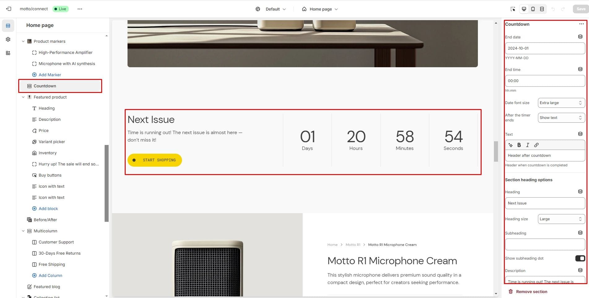
Countdown
The section allows you to add a countdown timer.
- End date and End time sets the date and time for the timer to end.
- After the timer ends allows you to set the text or hide the section after the timer ends.
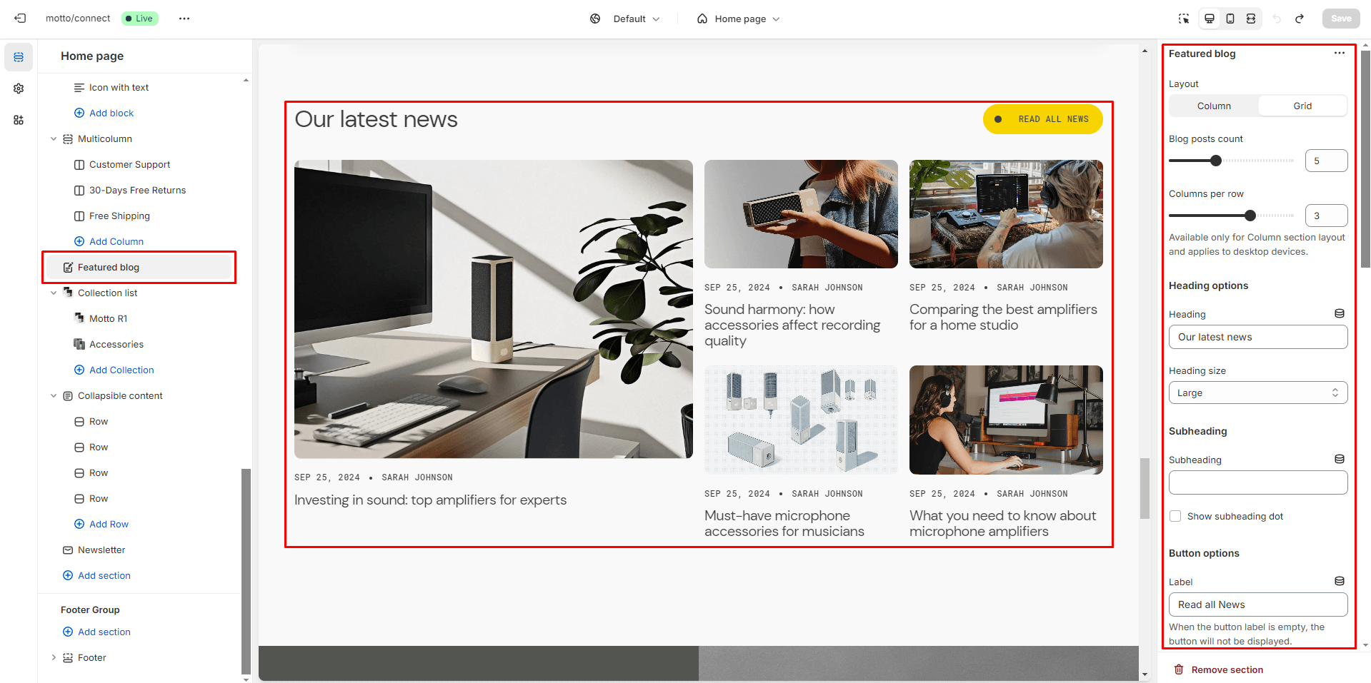
Featured blog
The section allows you to select a blog and customize it.
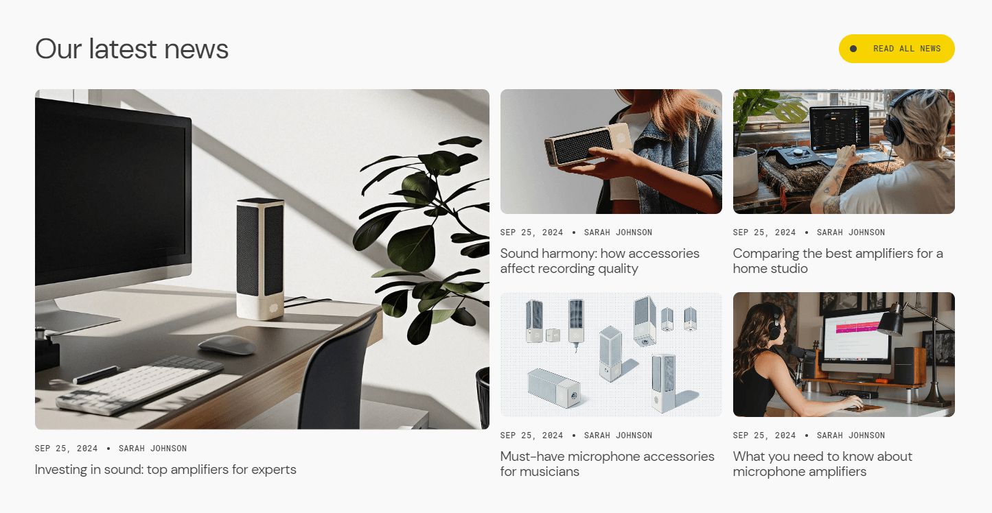
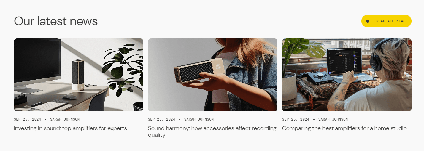
- Layout allows you to customize the appearance of a section.
- Blog field allows you to choose a blog.
- Blog posts count allows you to change the posts display limit.
- Columns per row allows you to change the number of posts per line only on desktop devices. Available only for Column section layout.
- Heading allows you to set a heading for the section.
- Show featured image field enables the display of an image for the blog post.
- Show tags field enables the display of tags for the blog post.
- Show date field enables the display of the date for the blog post.
- Show author field enables the display of the author for the blog post.
- Show excerpt field enables the display of the excerpt for the blog post.
- Show count comments field enables the display of the number of comments if it are enabled in the blog settings.
- Mobile layout options allow you to customize the number of columns and enable the slider on mobile devices.
- Image options allow you to set the aspect ratio of the post image.
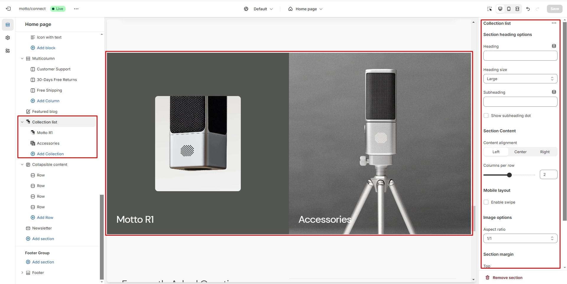
Collection list
Allows you to add collections.
- Content alignment selector to change the position of the text horizontally.
- Columns per row allows you to change the number of collections per line only on desktop devices.
- Mobile layout options allow you to enable the slider on mobile devices.
- Image options allows you to set the aspect ratio of collection card.
- In the Collection block option Collection allows you to set a collection for the block.
- In the Collection block option Color scheme allows you to set the color scheme for collection card.
- Overcover image in the Collection block allows you to set an image instead of the featured image of the collection.
- In the Collection block Enable image container changes the display of the image inside the block.
- In the Collection block Overlay options allows you to add and change the opacity of the overlay.
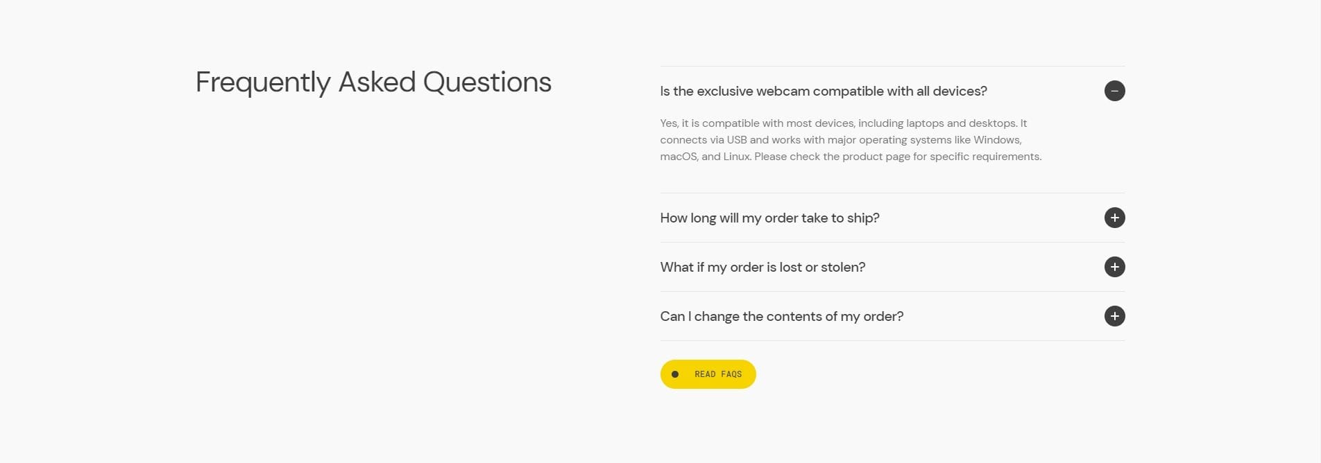
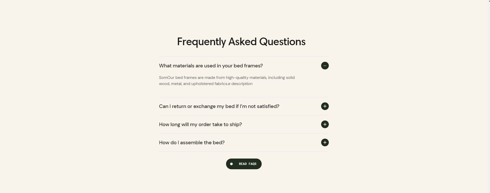
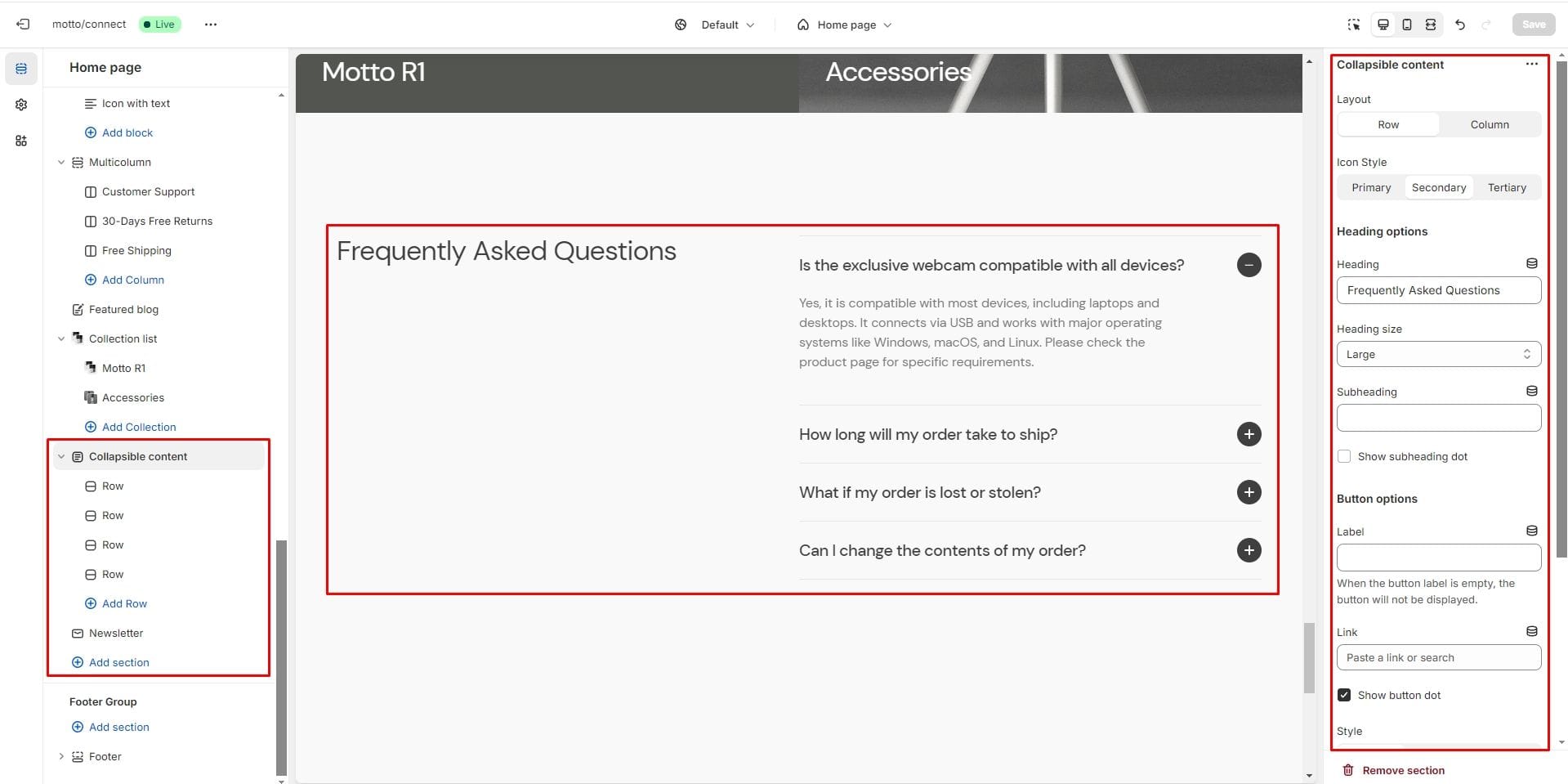
Collapsible content
You can add and customize a collapsible content section, such as using it for FAQs.
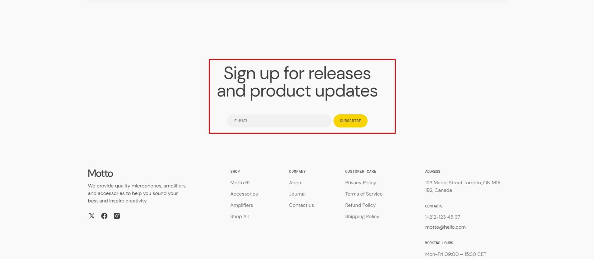
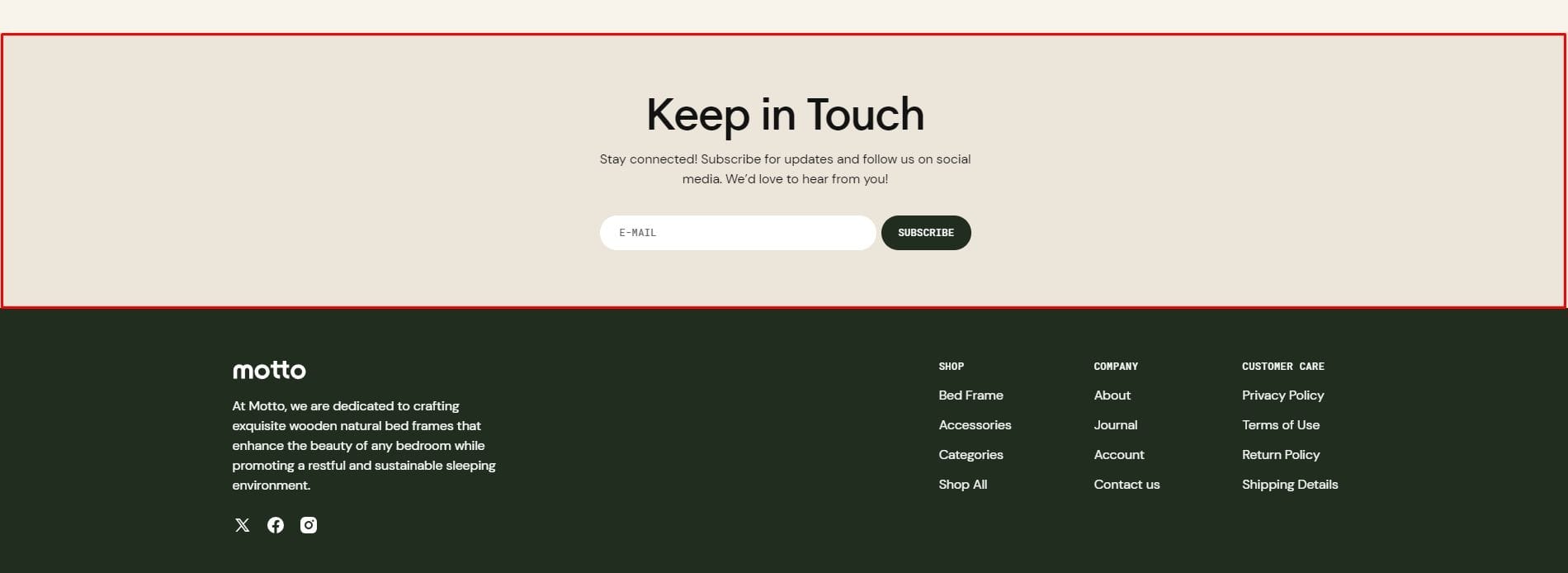
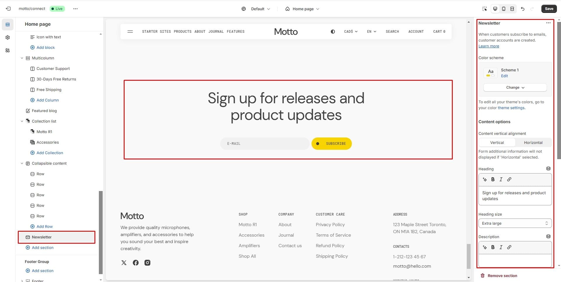
Newsletter
You can add a newsletter subscription form.
Pages
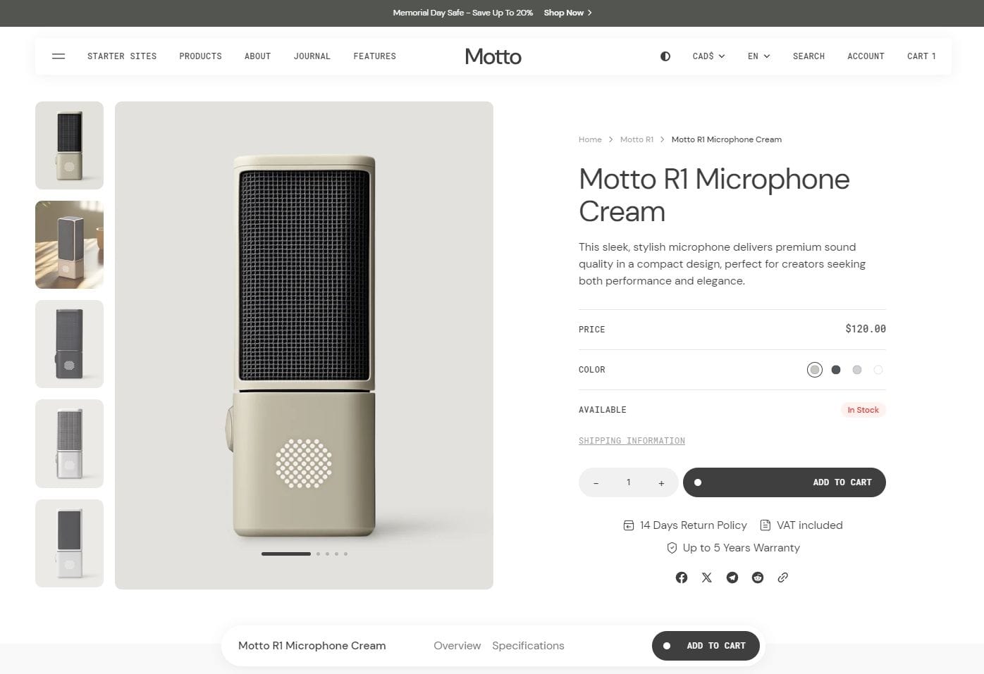
Product page
- Header overlay checkbox allows you to have a overlay header when the section is the first.
- Show floating bottom bar checkbox allows you to display a bottom bar that allows you to return to the product section after scrolling.
- Section layout selector allows you to choose the width of the section.
- Desktop product gallery alignment selector allows you to choose alignment type on desktop devices.
- Mobile product gallery alignment selector allows you to choose alignment type on mobile devices.
- Block Text allows you to enable brand/vendor.
- Block Inventory allows you to enable inventory status.
- Block Pickup availability allows you to display store availability.
- Block Popup allows you to enable and customize popup modals.
- Block Buy buttons option Show dynamic checkout buttons using the payment methods available on your store, customers see their preferred option, like PayPal or Apple Pay.
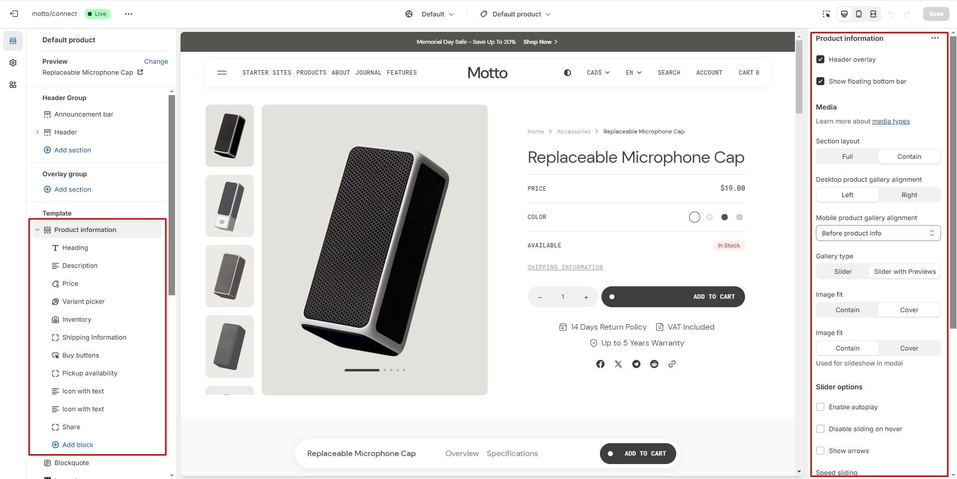
There’re 2 types of Gallery:
1. Slider with Previews
2. Slider
Gift card recipient
To add recipient and message fields to gift card products, navigate to the customizer → Product page → Buy buttons block. Check the "Show recipient information form for gift card products" option that enables the display of recipient information form for gift card products.
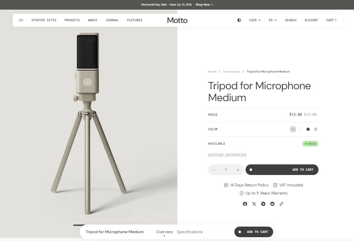
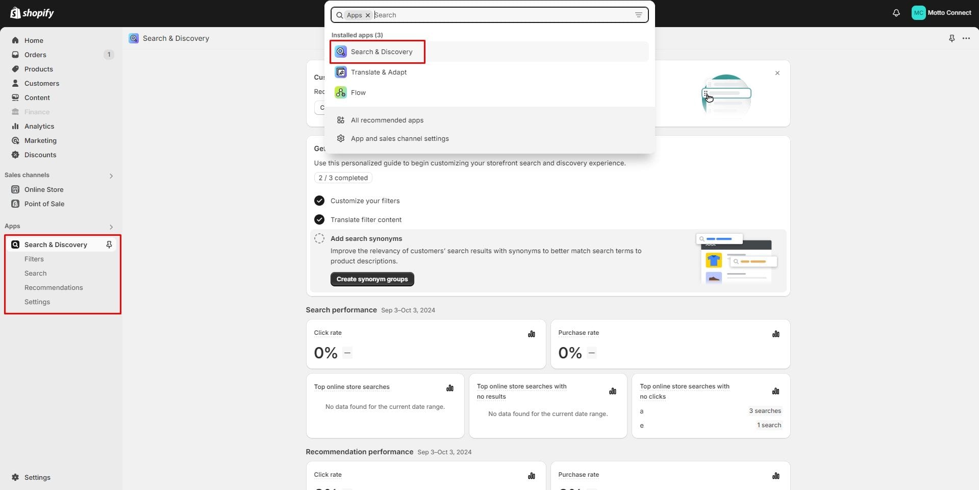
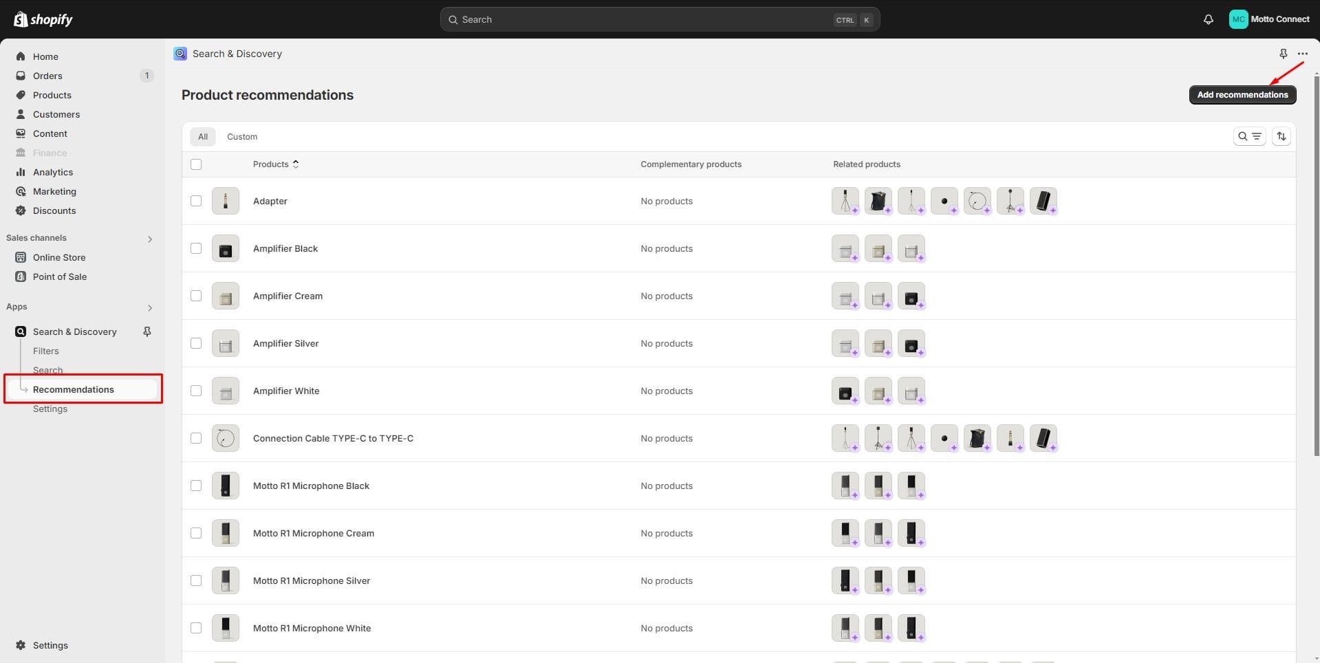
Product recommendations and Complementary products
To add and edit product recommendations, follow these steps:
- Install the Search & Discovery app by Shopify from the Apps page in the Admin panel.
- Once installed, open the app and go to the Recommendations tab to add recommendations to your products.
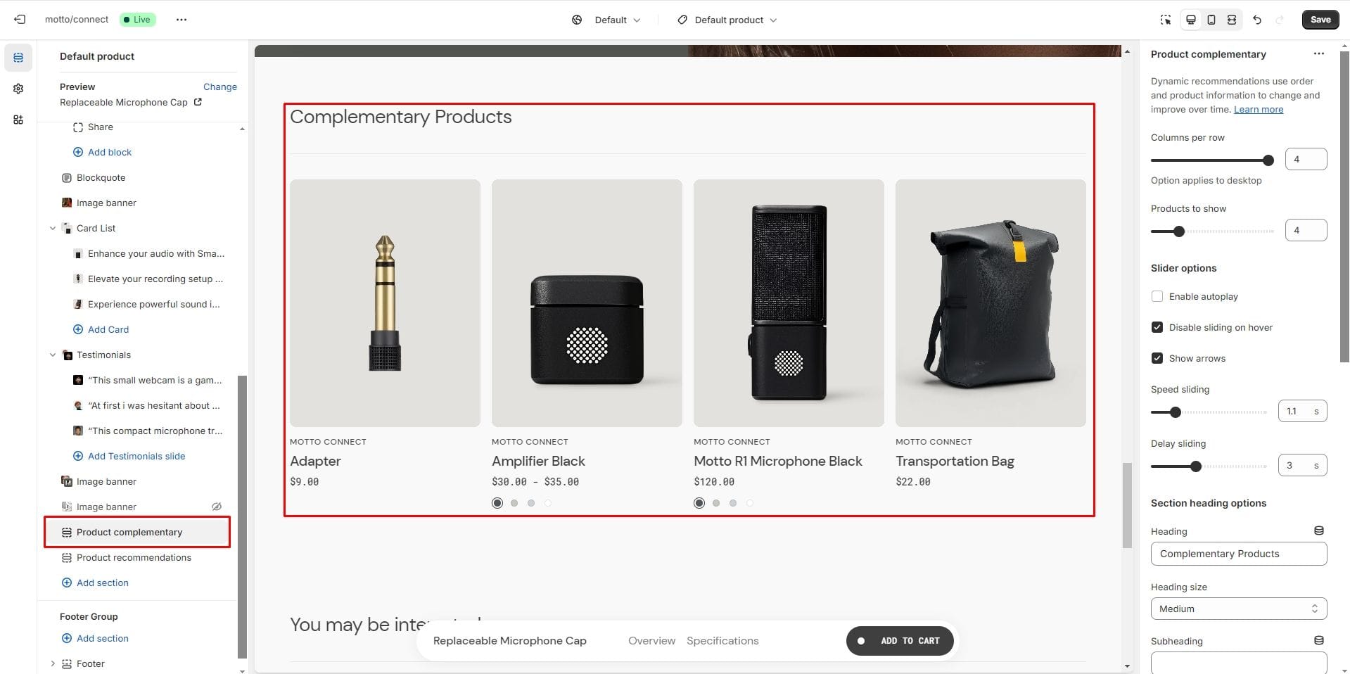
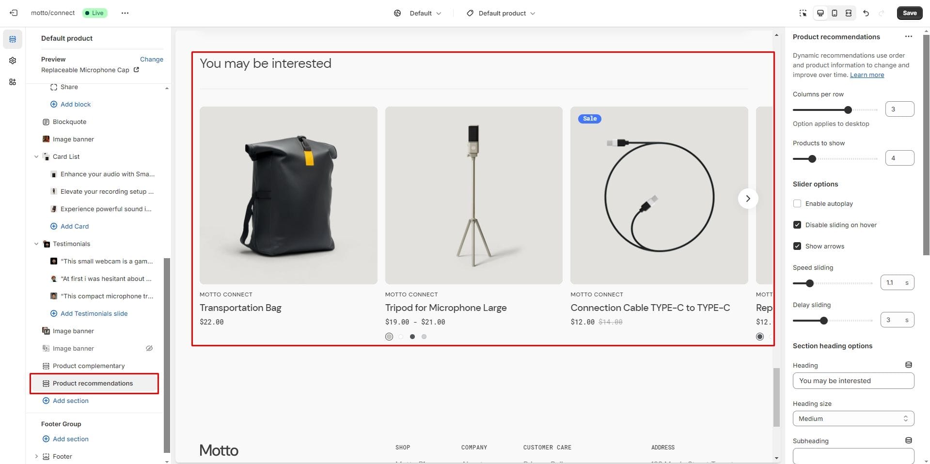
- Products to show slider allows you to select the number of product displays.
- Product card options allow you to customize product cards in the section.
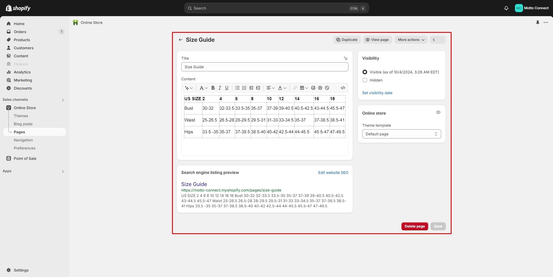
Size chart
To add a size chart, follow these steps:
- Create new page with a table.
- Add a "Popup" block to the product page.
- Select "Size chart" page.
Product specifications
Allows you to add product characteristics.
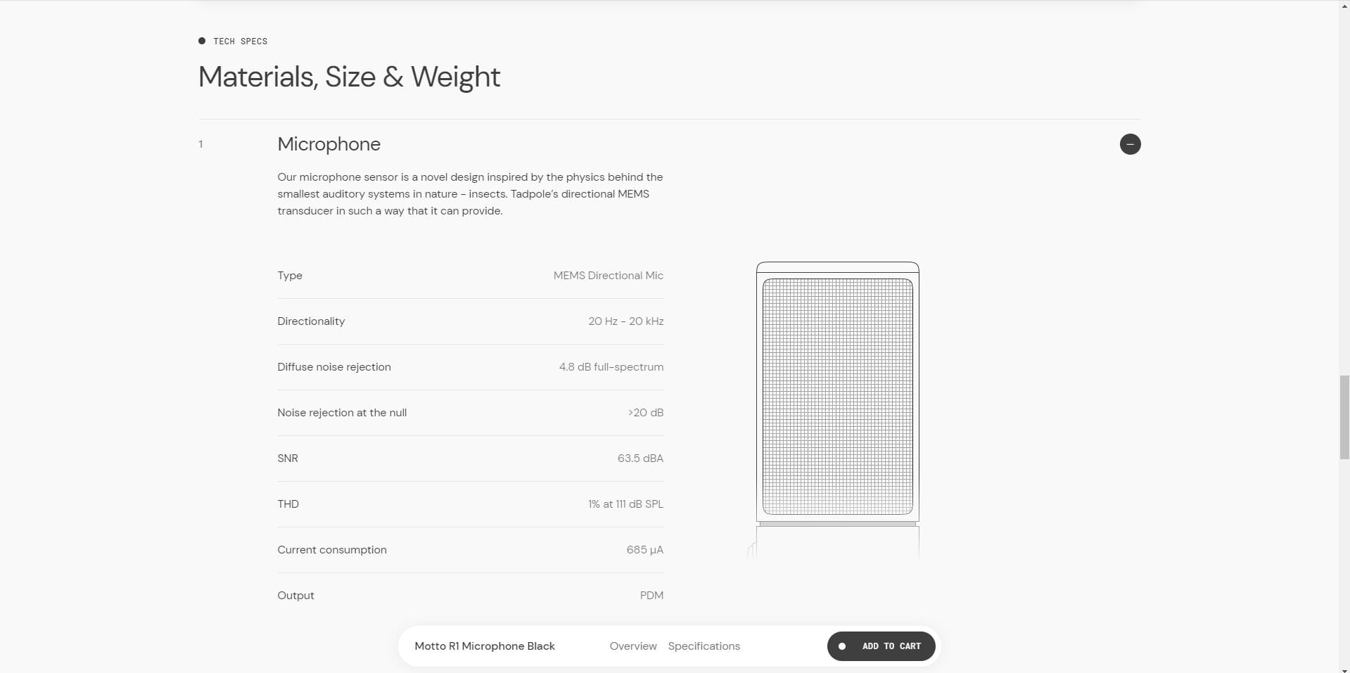
To display content in this section, you first need to add the Product specifications metaobject.
1. Go to Shopify admin → Settings → Custom data → Under Metaobject definitions click the Add definition button.
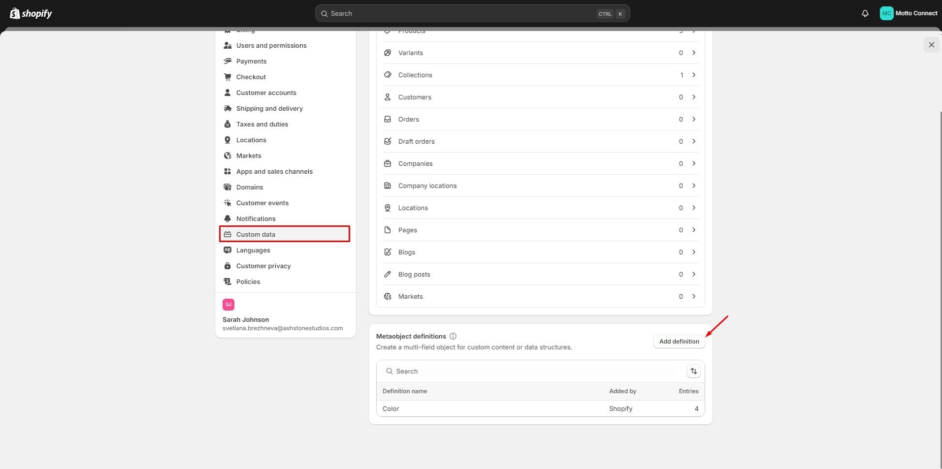
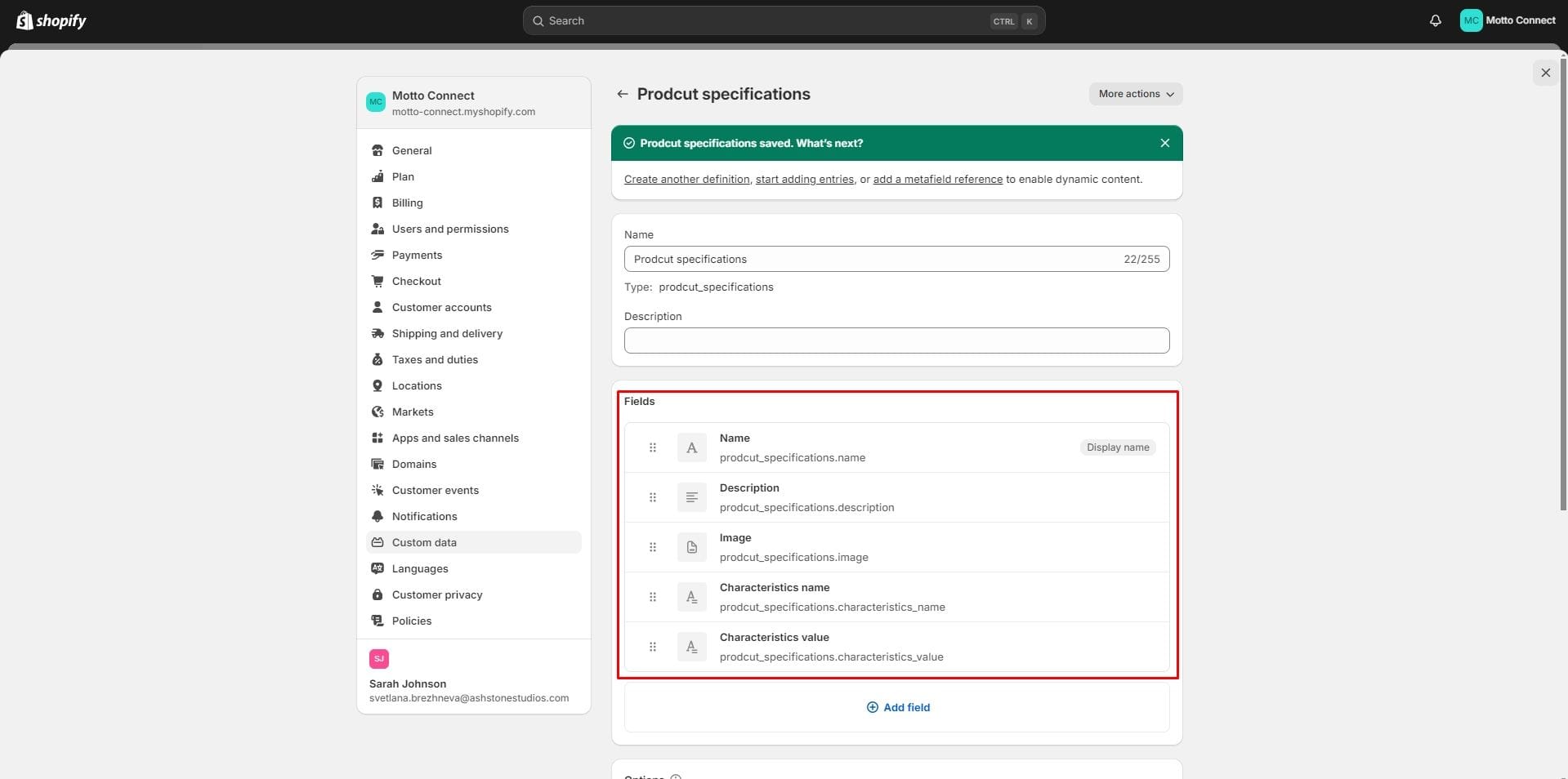
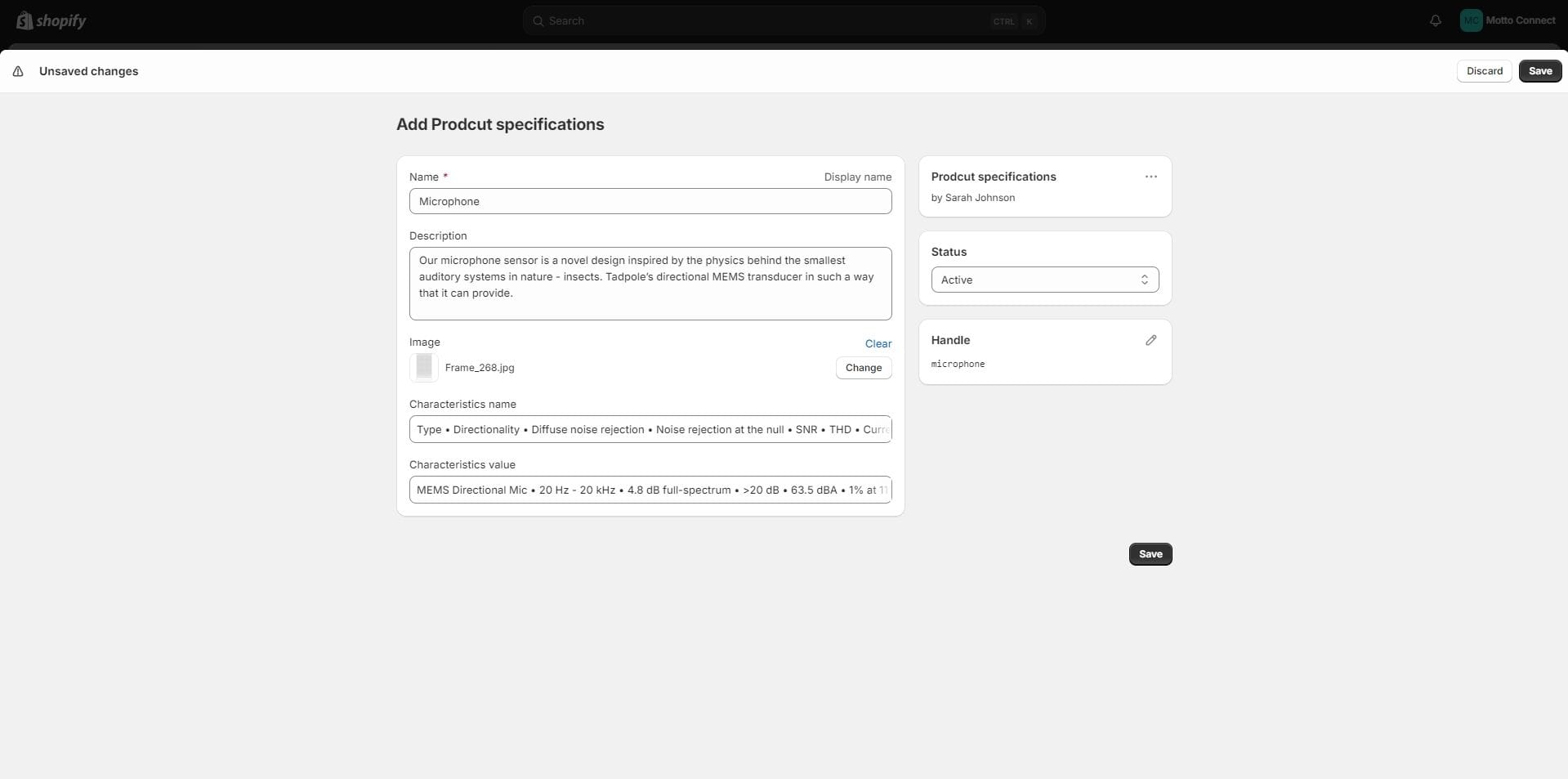
2. Create a metaobject called Prodcut specifications with the following fields:
- Name field with type Single line text with one value. Key must be prodcut_specifications.name. This field is required.
- Description field with type Multi-line text. Key must be prodcut_specifications.description.
- Image field with type File with one value and file type Images. Key must be prodcut_specifications.image.
- Characteristics name field with type Single line text with list of values. Key must be prodcut_specifications.characteristics_name.
- Characteristics value field with type Single line text with list of values. Key must be prodcut_specifications.characteristics_value.
3. Go to Shopify admin → Settings → Custom data → Products → Click the Add definition button.
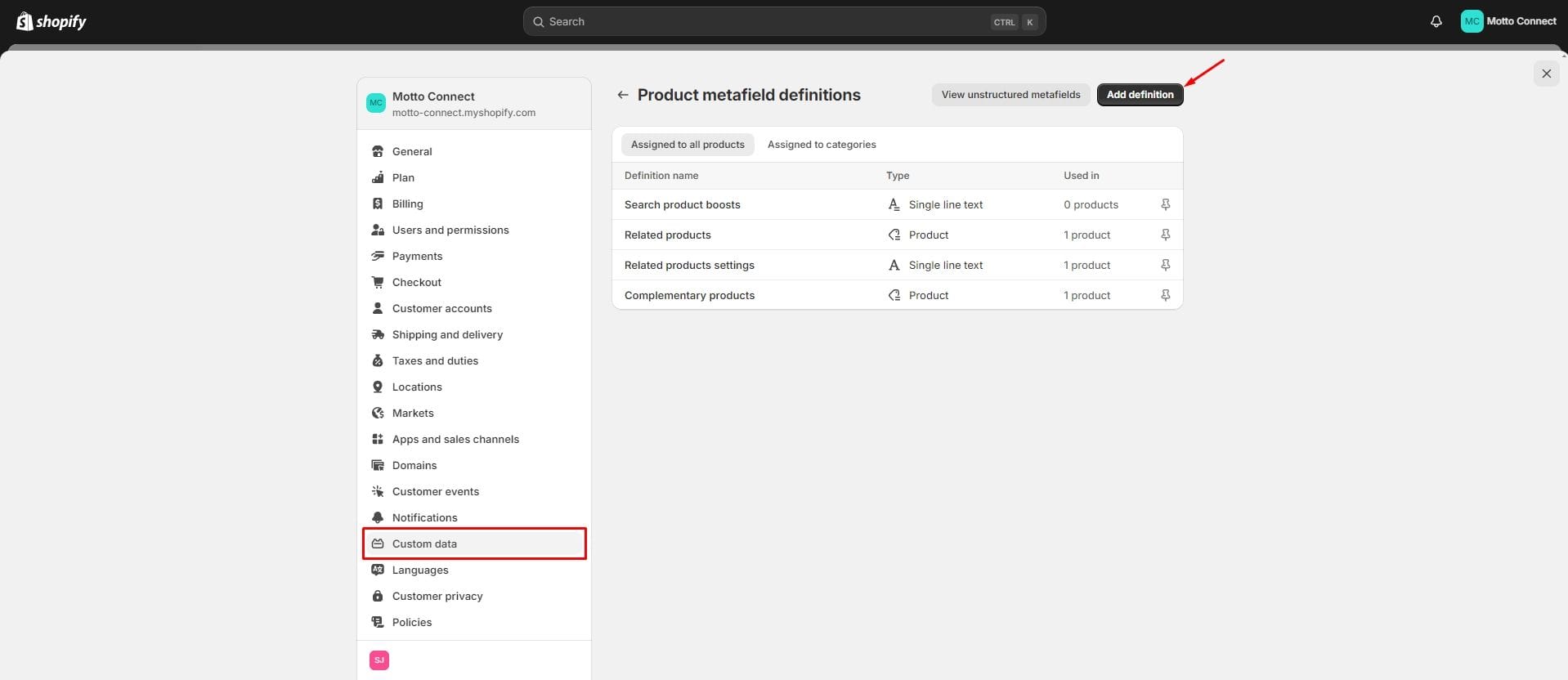
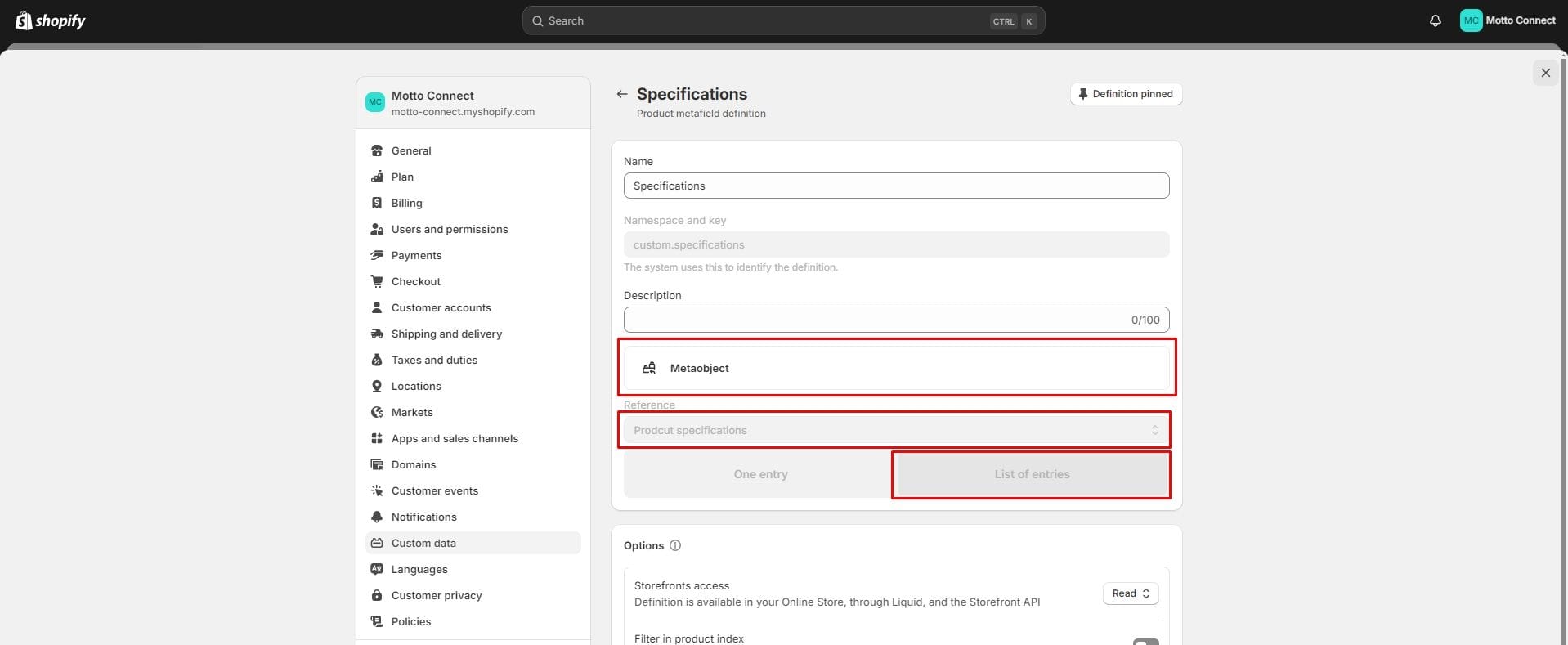
4. Create a metafield called Specifications. The Namespace and key field must contain the value custom.specifications. → Select Metaobject type → In the Reference field, select the metaobject Prodcut specifications → Select List of values.
5. In the Shopify admin, go to the product you want to add features for. → In the Product metafields section, select the Specifications field and click Add new entry.
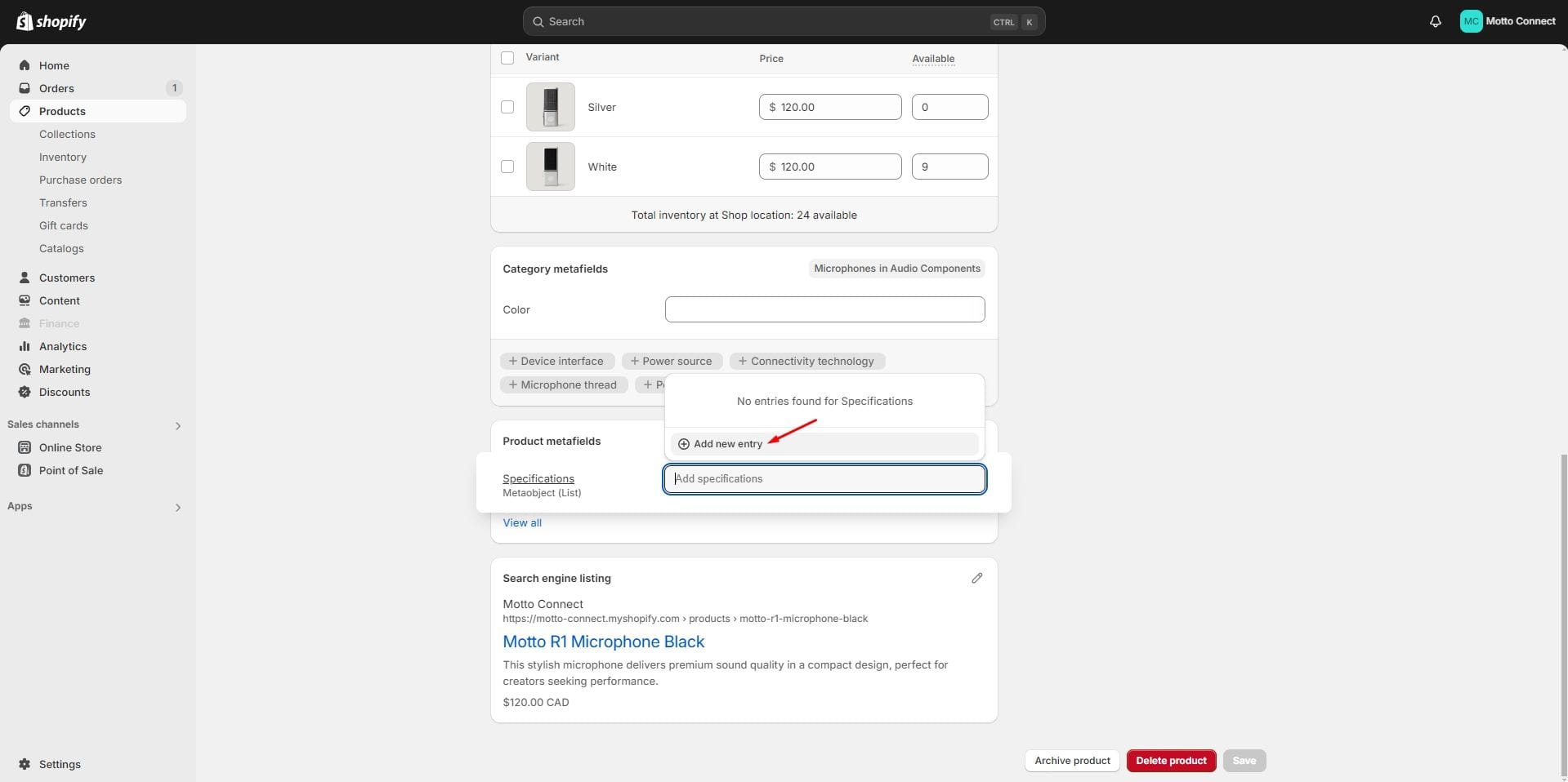
6. Fill in the metaobject fields. The Characteristics name and Characteristics value fields are related: each Characteristics name value corresponds to a Characteristics value in order. If you do not enter values for Characteristics name, the values from the Characteristics value field will not be displayed.
You can add multiple metaobject values for one product. One value corresponds to one dropdown block.
Collections page
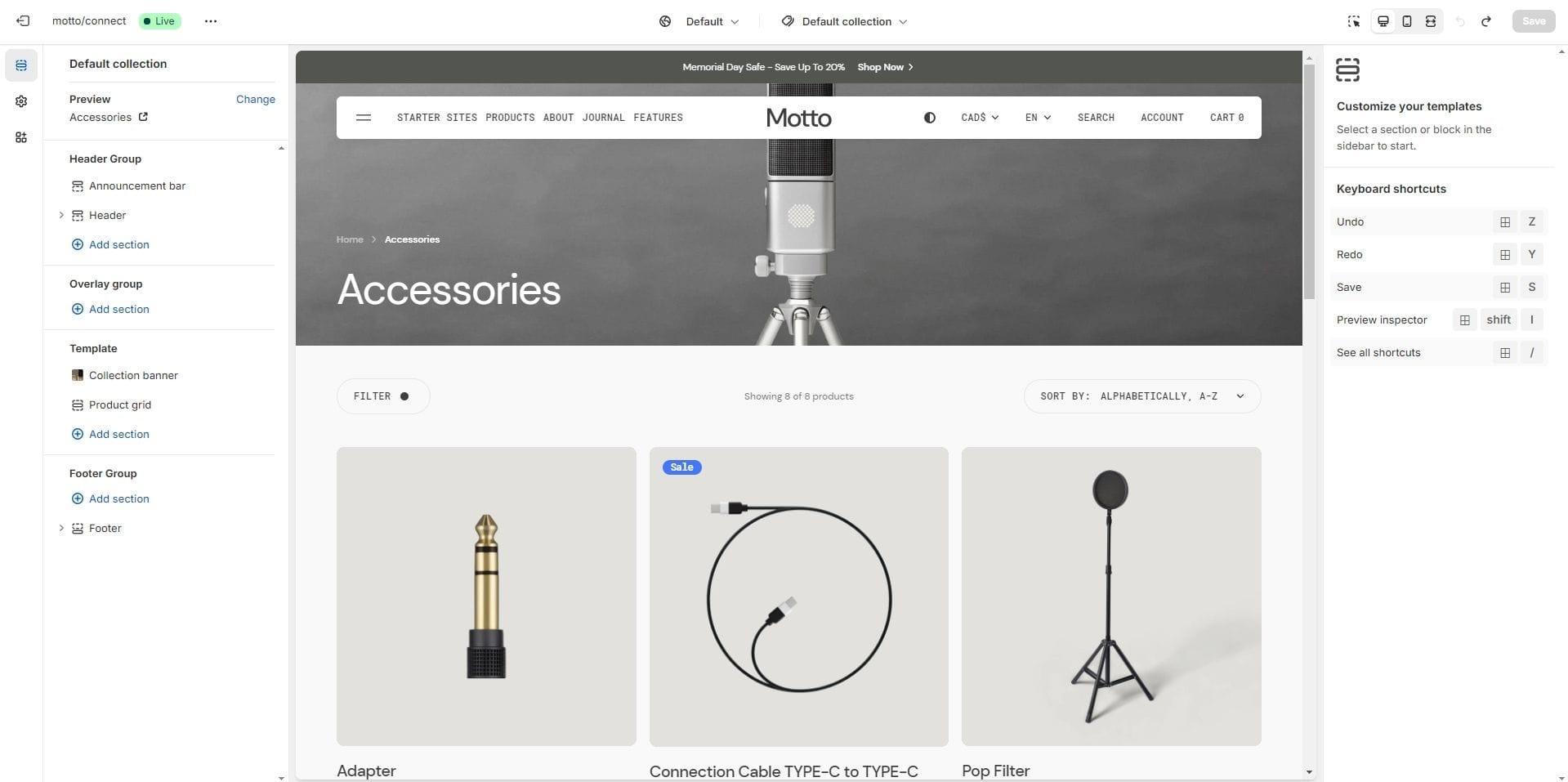
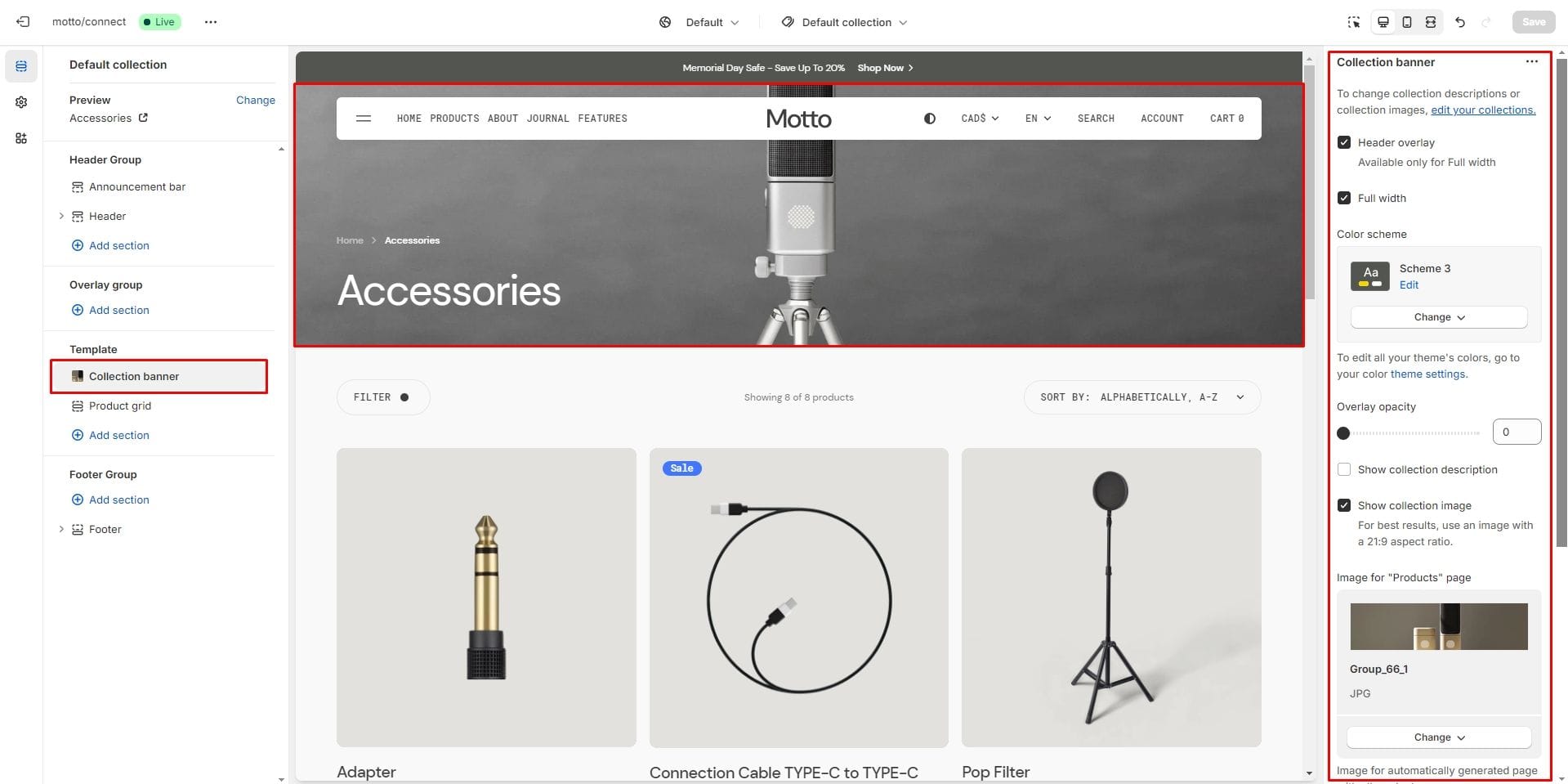
Collection banner
- Header overlay checkbox allows you to have a overlay header when the section is the first and the Full width setting is enabled.
- Overlay opacity allows you to change the opacity of the overlay.
- Show collection description allows you to display the collection description.
- Show collection image allows you to display the collection image.
- Aspect ratio sets the aspect ratio for the collection image.
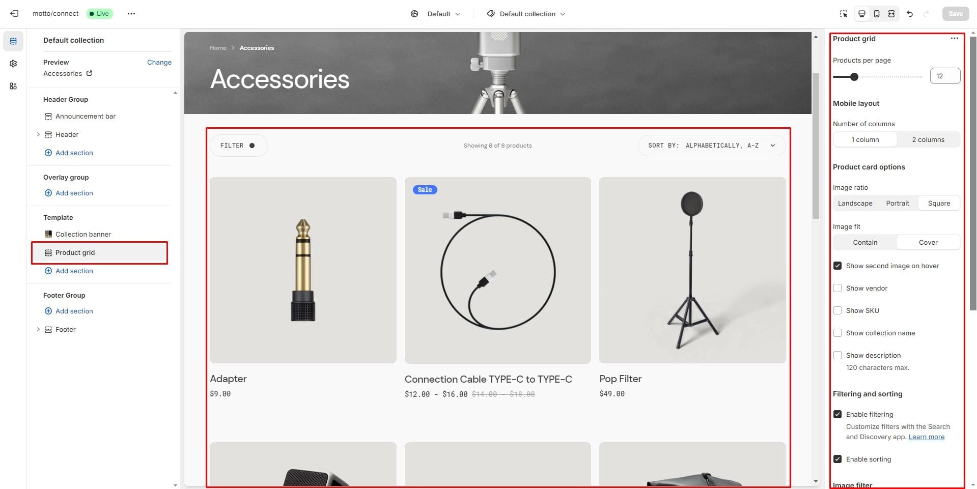
Product grid
- Products per page field sets the number of displayed cards.
- Product card options allow you to customize product cards in the section.
- Enable filtering field turn filtering.
- Enable sorting field turn sorting.
- Image filter sets the settings for filters represented by images.
- Mobile layout options allow you to customize the number of columns.
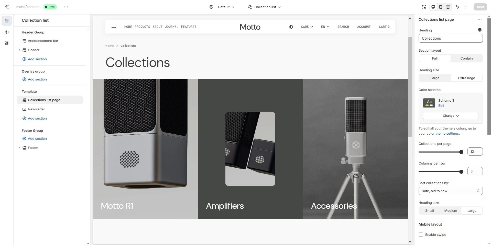
Collections list page
Displays a list of all collections.
- Section layout selector allows you to change the width of a section to Full or Contain (within a container).
- Collections per page field sets the number of displayed cards.
- Columns per row slider allows you to change the number of collections per line only on desktop devices.
- Sort collections by field filters the collection by the specified parameters.
- Mobile layout options allow you to enable the slider on mobile devices.
- Image source allows you to specify an additional image for collections instead of the collection image using the metafield.
- Fit collection image into container specifies the display type for collection images.
- Aspect ratio sets the aspect ratio of collection images.
- Overlay options allows you to add and change the opacity of the overlay.
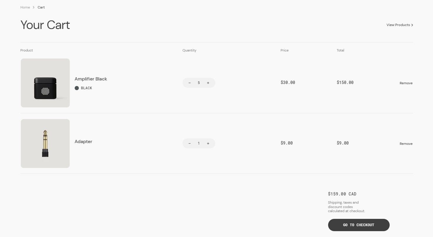
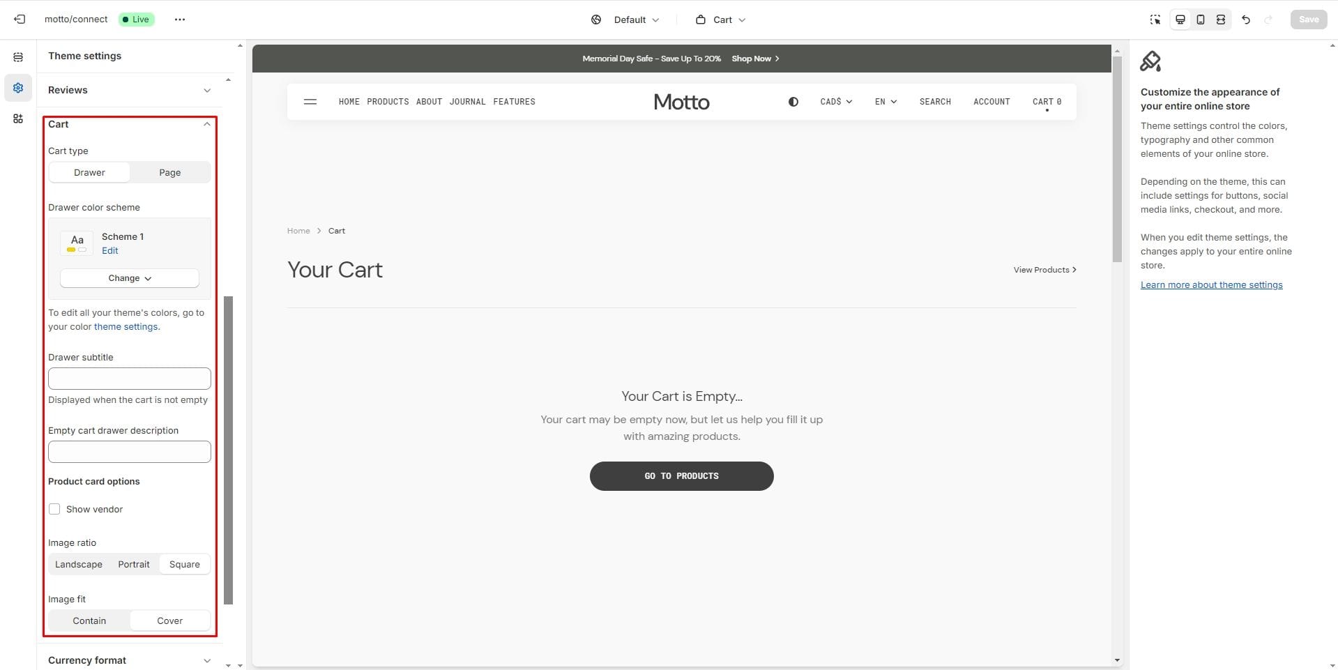
Cart page
Items section displays the products added to the cart.
- Heading size sets the size of the page heading.
- You can set the text for the empty cart using the Empty cart drawer description setting.
- Enable cart note allows you to enable cart note.
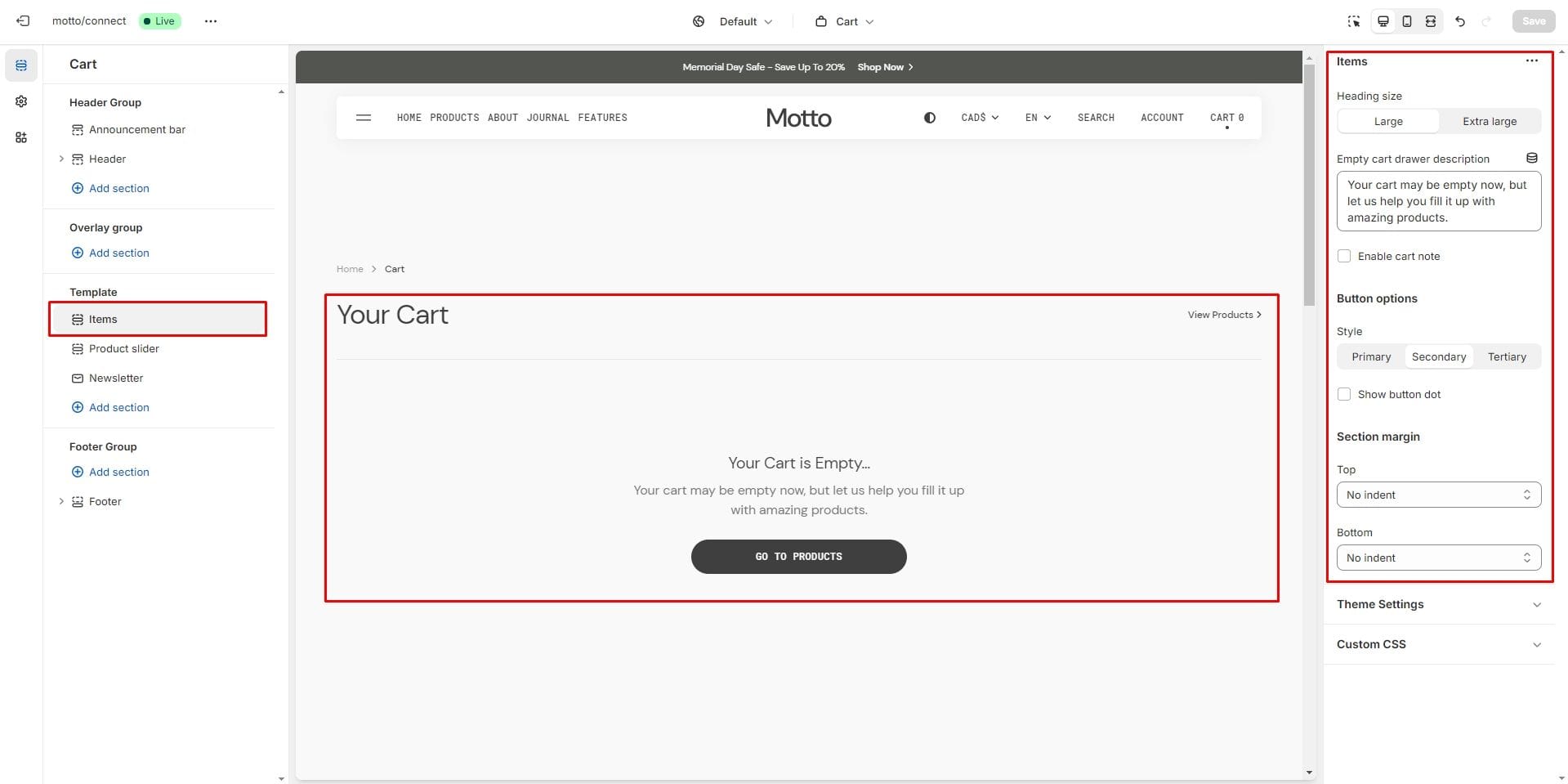
To configure the display of a product card in the cart, you can go to Theme Settings → Cart.
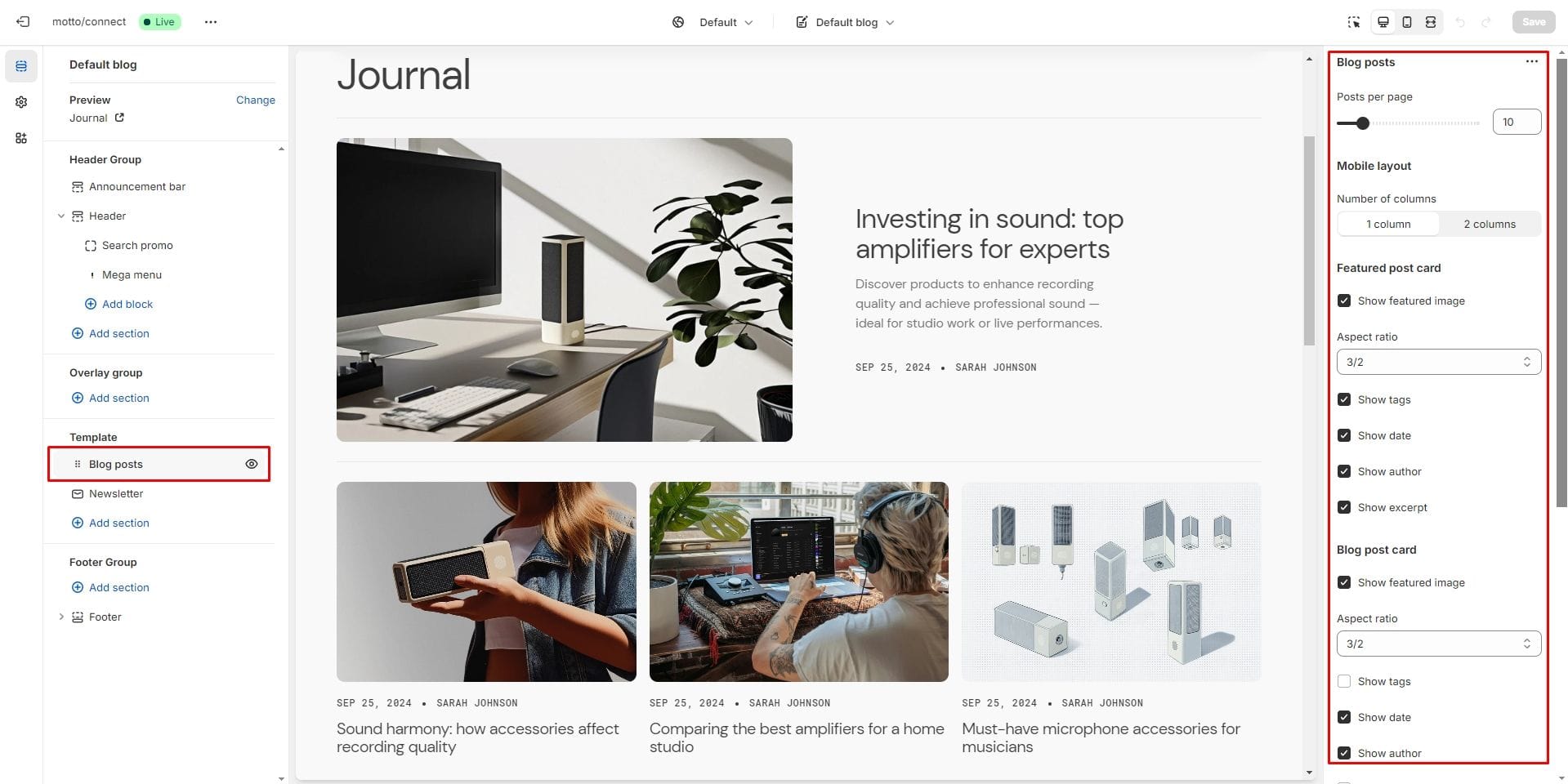
Blog page
- Posts per page
- Mobile layout options allow you to customize the number of columns.
- Featured post card sets the settings for the first article on the page.
- Show featured image field enables the display of an image for the blog post.
- Aspect ratio allows you to customize the image dimensions.
- Show tags field enables the display of tags for the blog post.
- Show date field enables the display of the date for the blog post.
- Show author field enables the display of the author for the blog post.
- Show excerpt field enables the display of the excerpt for the blog post.
- Show count comments field enables the display of the number of comments if it are enabled in the blog settings.
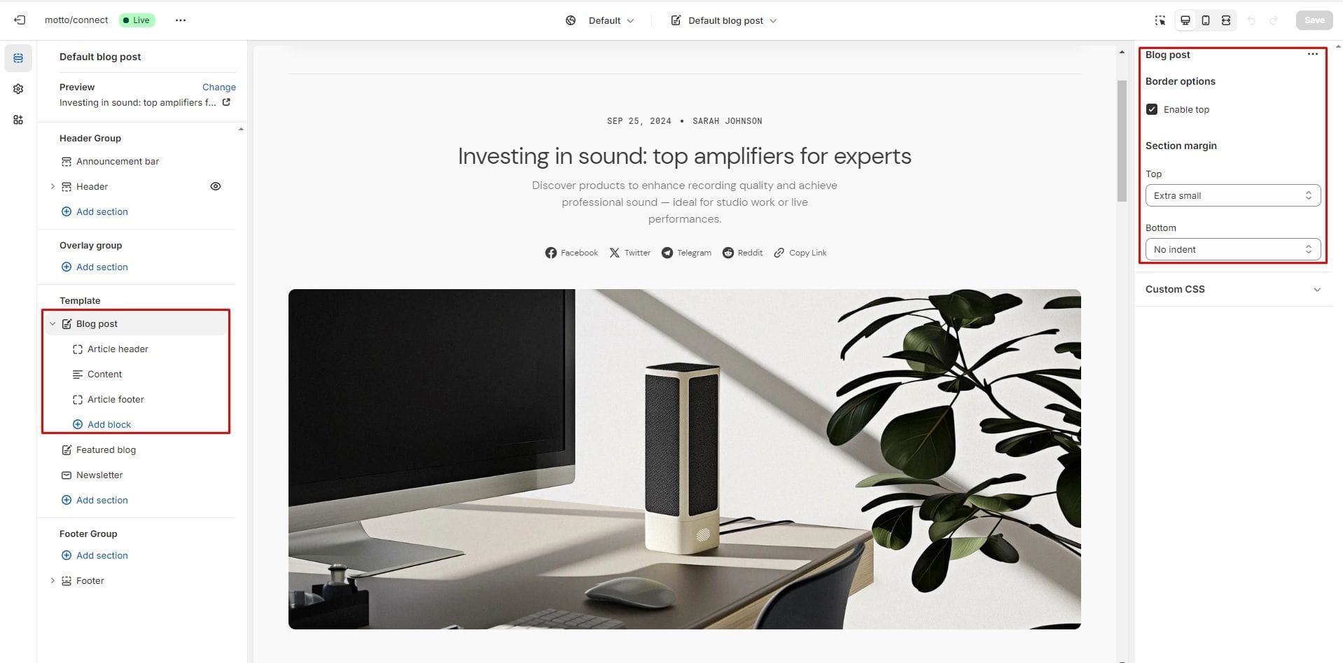
Blog post page
- Border options setting allows you to enable the top border.
- Block Article header allows toggling the display of tags, image, excerpt, author, date and social media share block.
- Block Article header option Share allows enable links from the list.
- Content block displays the article content from the Shopify admin.
- Block Article footer allows toggling the display of date and and social media share block.
- Block Article footer option Share allows enable links from the list.
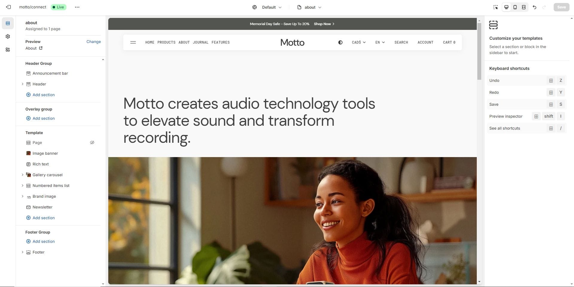
About page
Allows you to add sections describing the store.
Importing our demos
You can also copy the structure of any of our 5 demos in a few steps.
- Download the settings file to copy the demo settings from there.
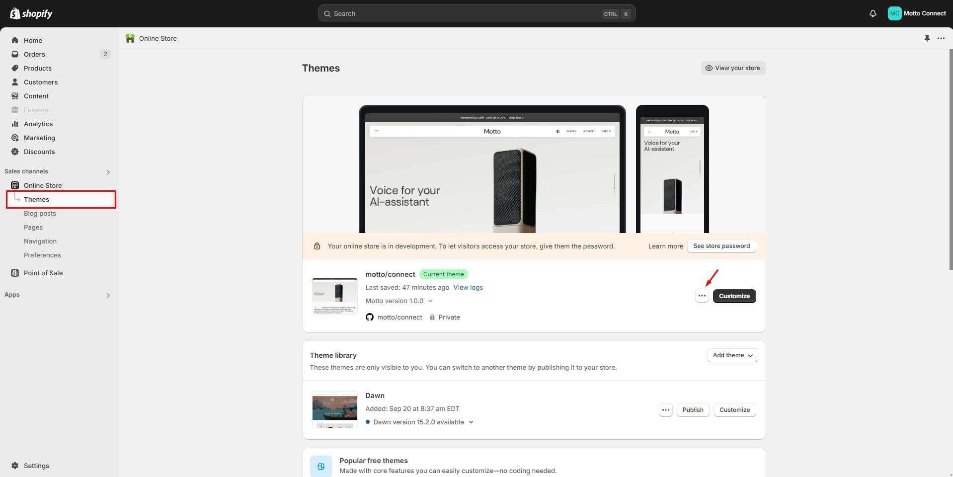
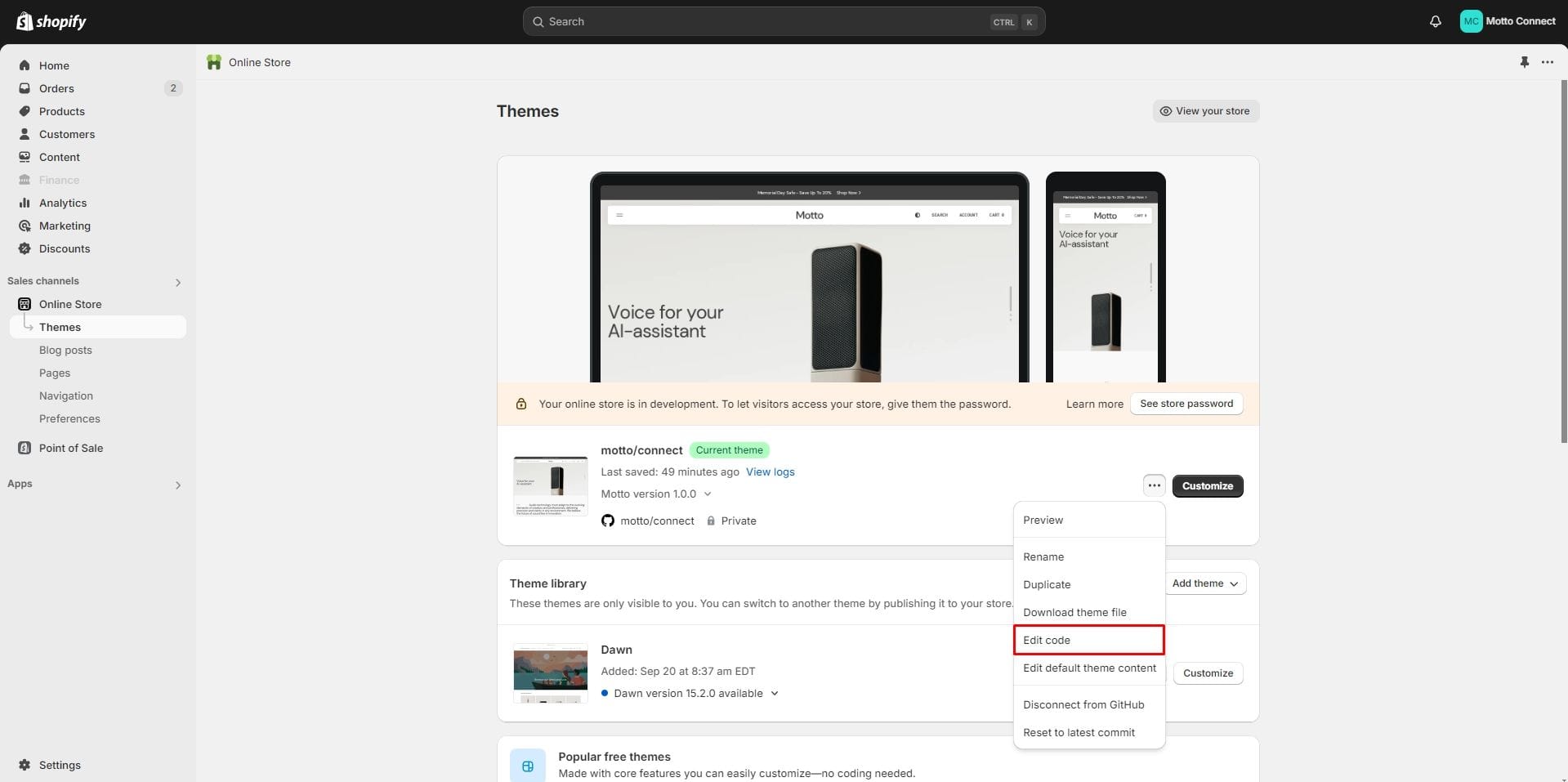
- Go to section Online Store → Themes your store. Click on the three dots button of your theme.
- Go to the code editor by clicking the edit code button.
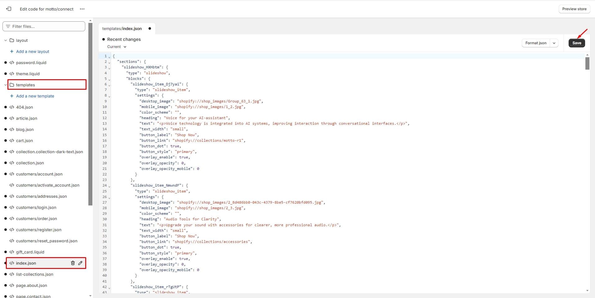
- In the code editor, search for the file index.json and change the code to the demo code you want to transfer. Click Save to save your changes.
Demos structure
Click on the demo name to download the file with the appropriate structure.
Support
You can ask any questions about the theme and our support agent will help you within 24 hours on business days.