General Settings
Settings that are used in almost all sections.
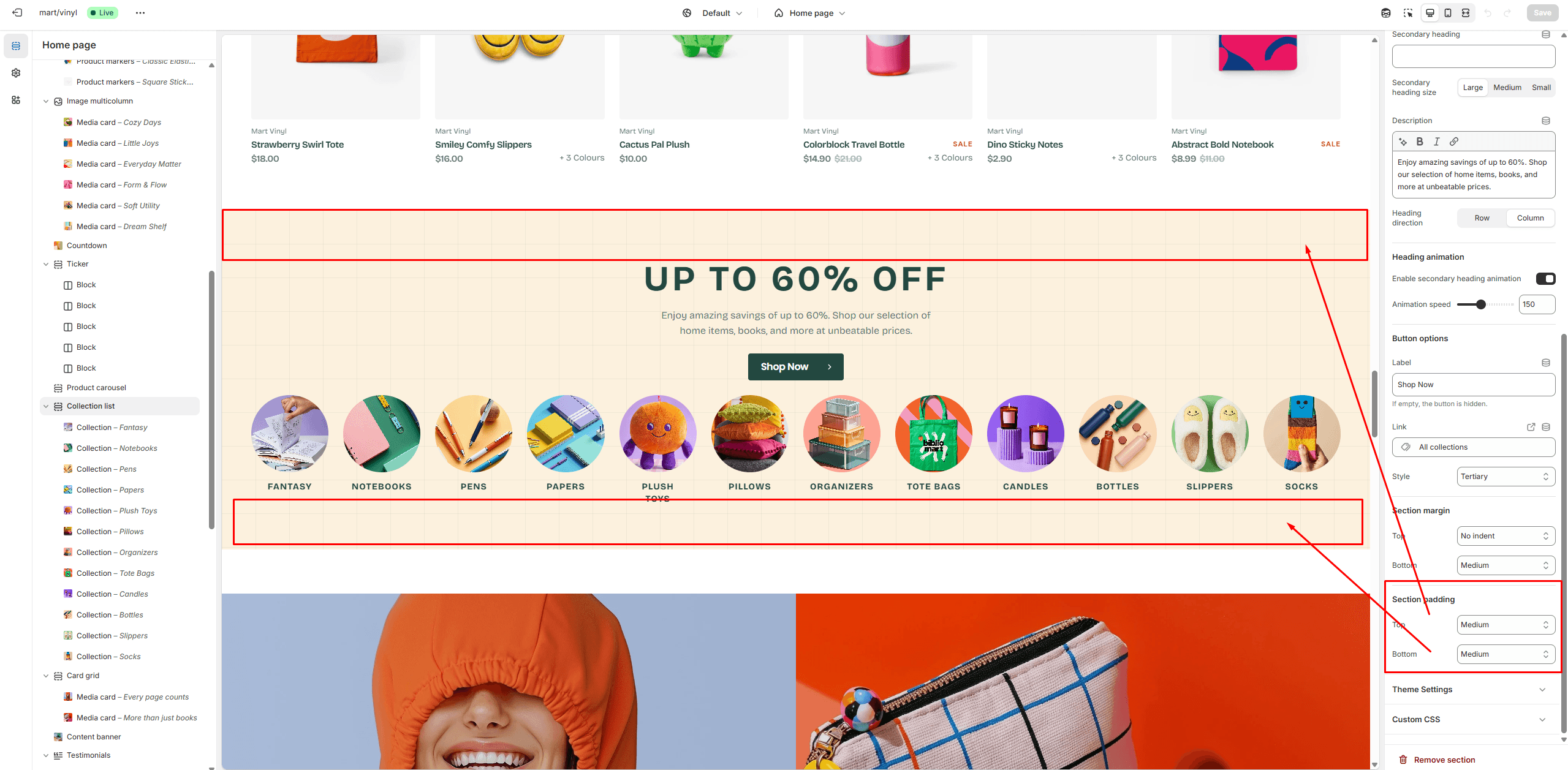
Section Margin
This option lets you adjust the top and bottom margins of the section.
- Top margin slider allows you to change the top margin in the section.
- Bottom margin slider allows you to change the bottom margin in the section.
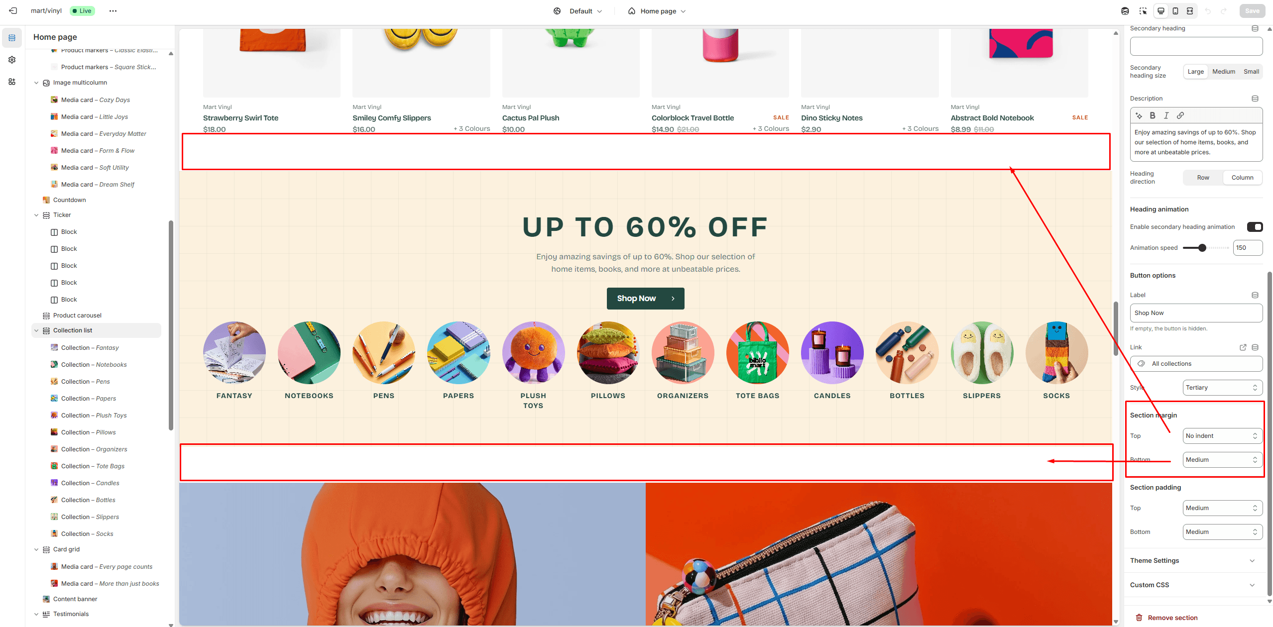
Section Padding
This option lets you adjust the top and bottom paddings of the section.
- Top padding slider allows you to change the top padding in the section.
- Bottom padding slider allows you to change the bottom padding in the section.
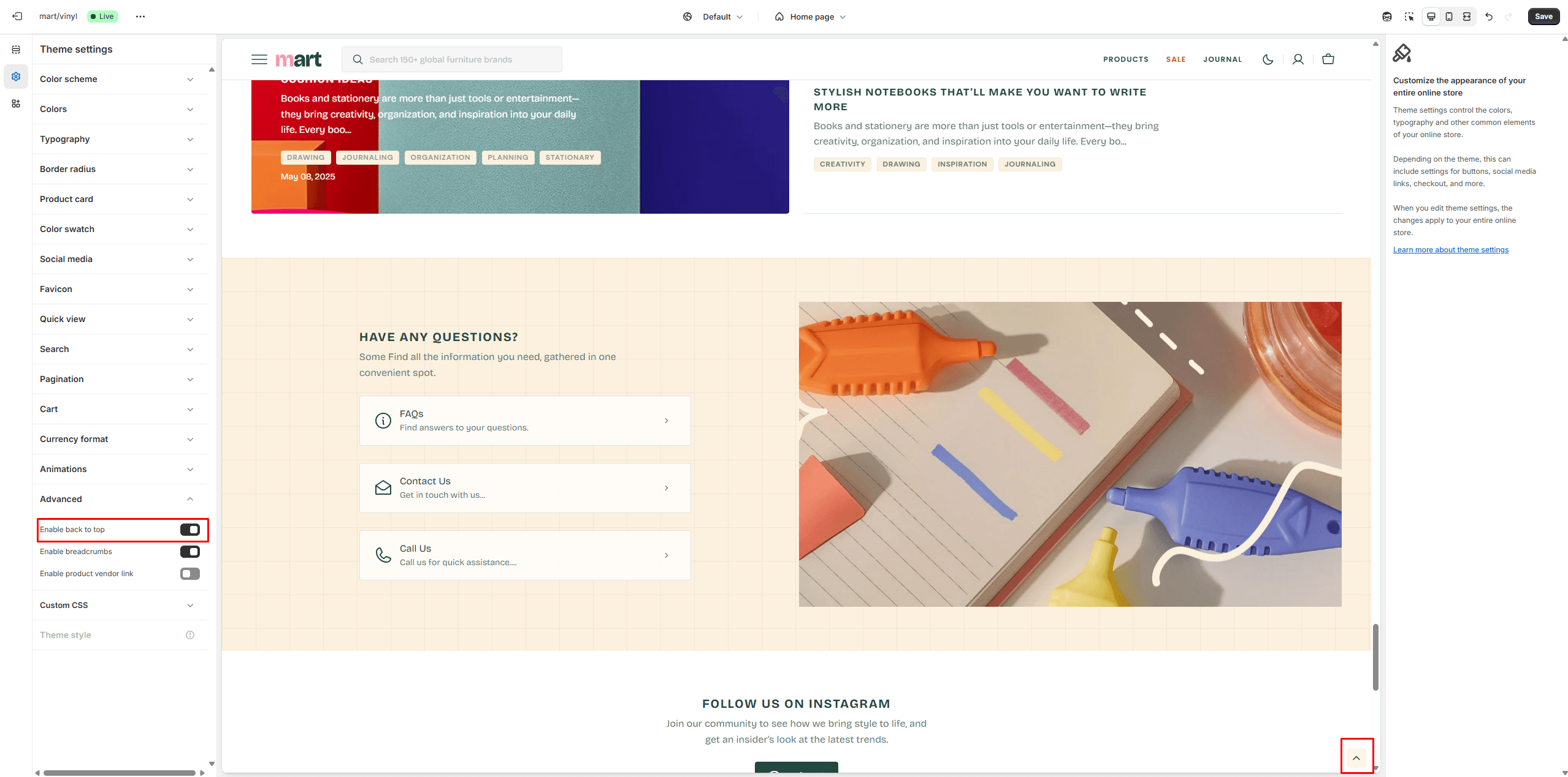
Back to Top
To enable Back to Top button, navigate to Theme settings > Advanced.
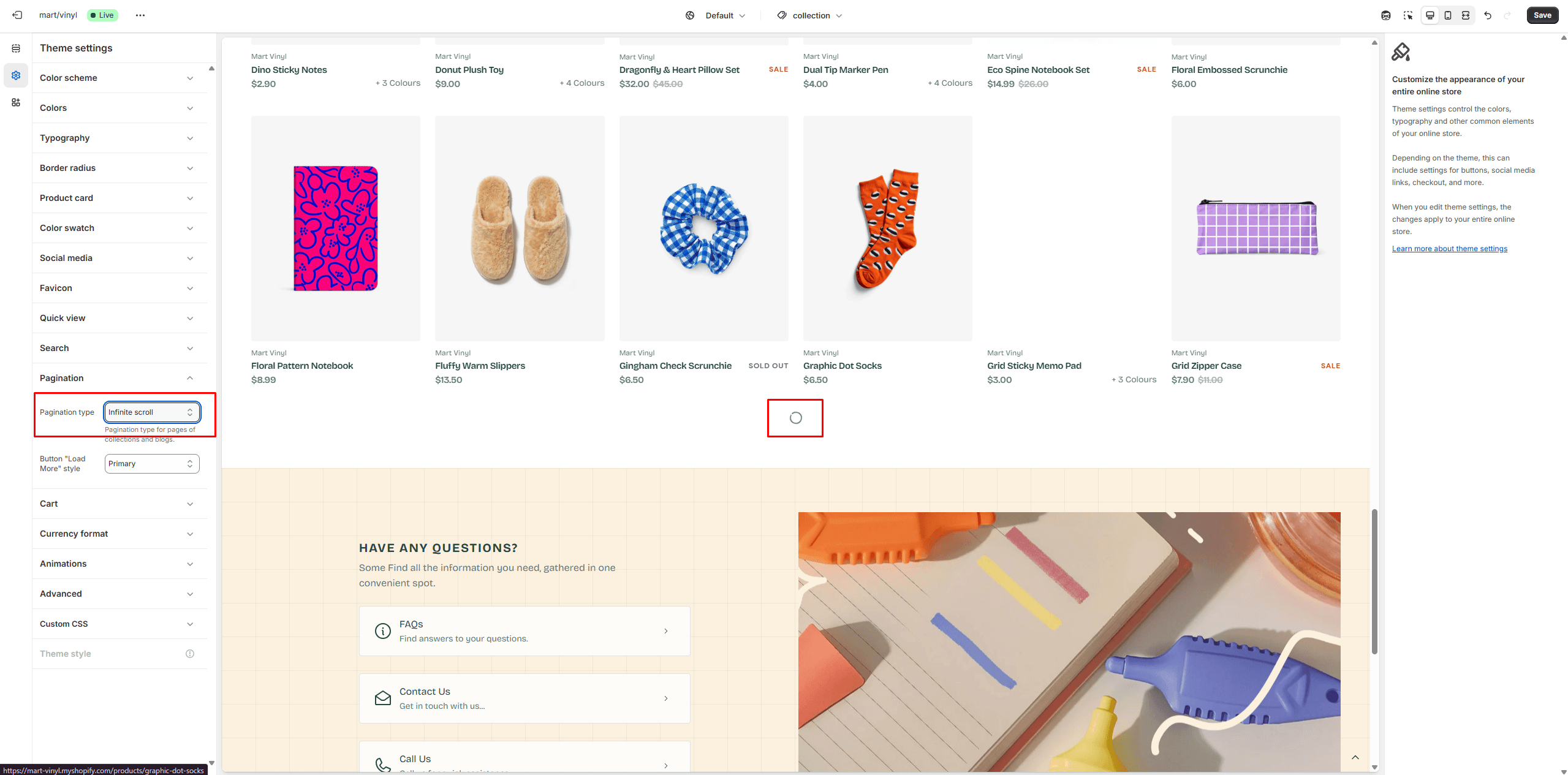
Infinite Scroll
To enable and customize Infinite Scroll, go to Theme settings > Pagination > Pagination type.
Custom Product Badges
To enable and edit Custom badges, navigate to Theme settings > Product card.
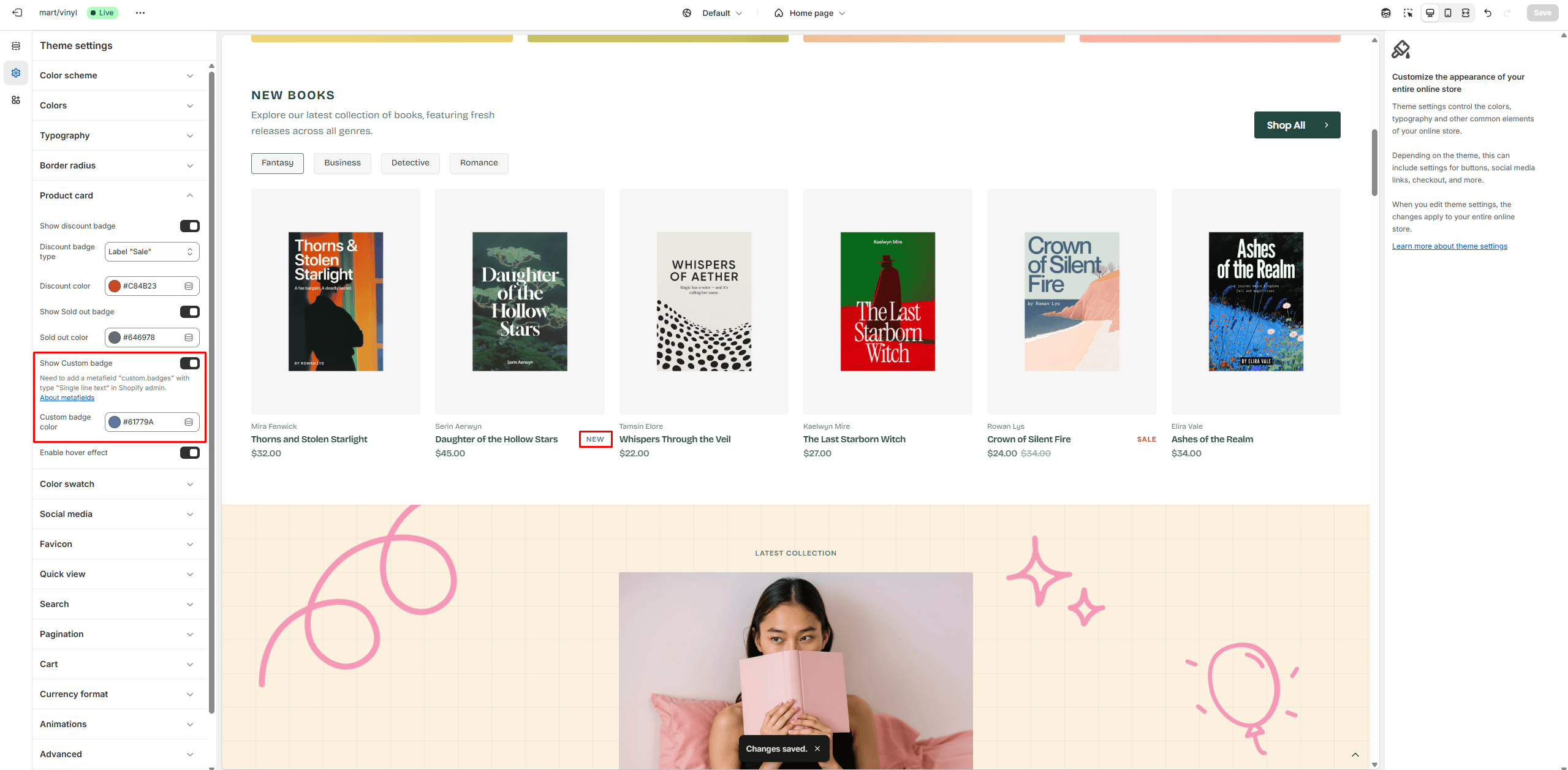
The next step is to add metafields to the products.
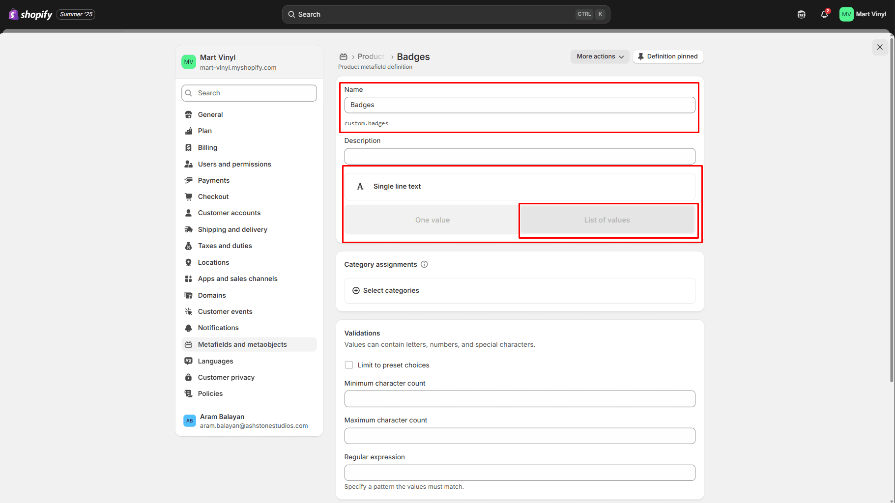
To add and edit metafields, follow these steps:
- Go to Settings > Metafields and metaobjects in the Admin Panel.
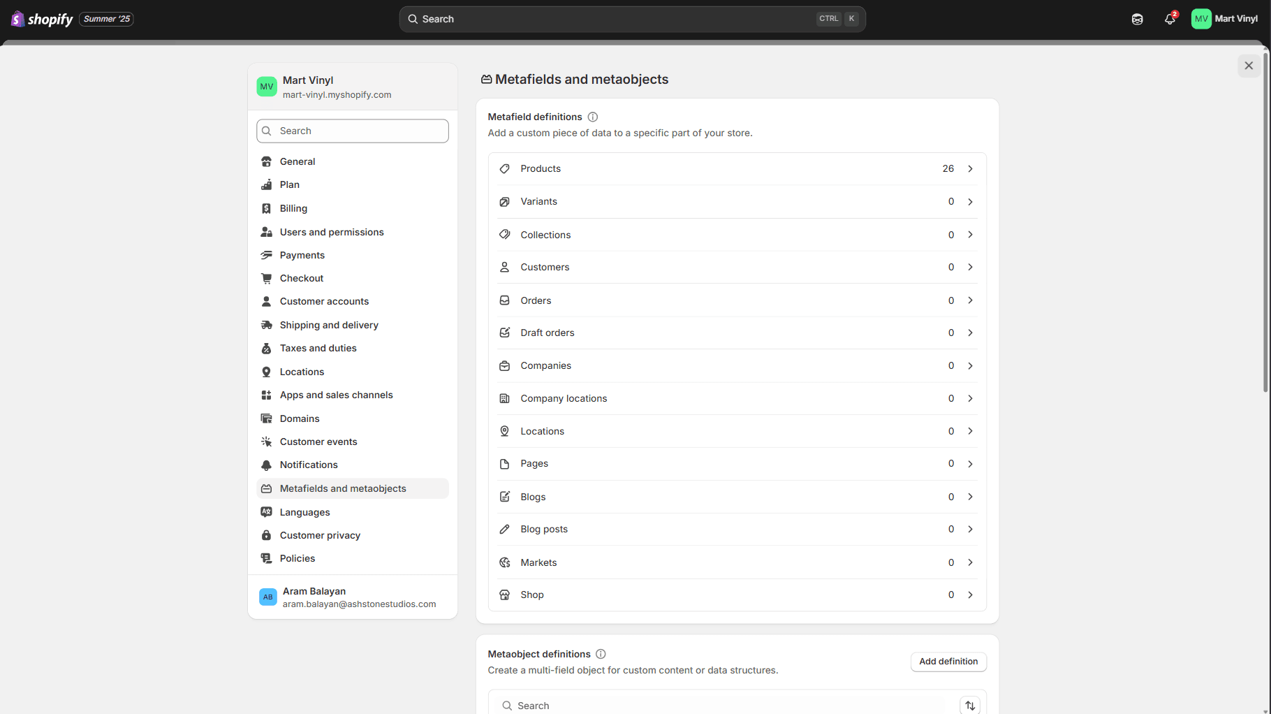
- Select Products.
- Click the button "Add definition" and fill the fields.
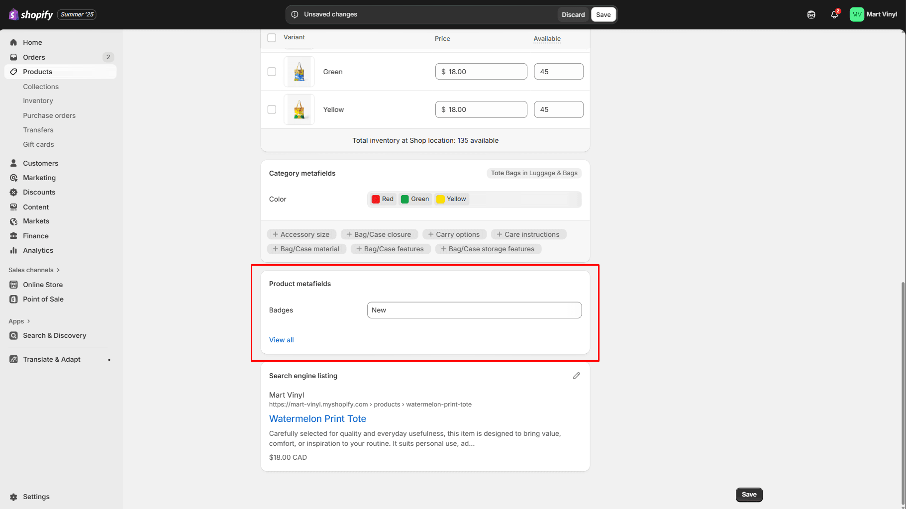
- Navigate to the product and add information below.
Header Group
Sections that are used on all pages by default.
Header
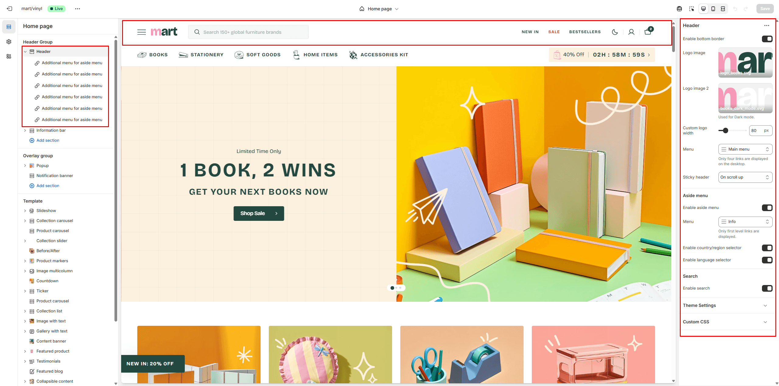
- Enable bottom border field allows you to connect the lines under the header.
- Use the Logo image file selector to select or upload your logo file.
- Use the Logo image 2 file selector to select or upload your logo, which can be seen in Dark mode.
- If a logo is added, you can adjust its size using the Custom logo width slider.
- Choose a Menu to be displayed in the header. On desktop layouts up to 1600px wide, only the first four menu links are displayed. On smaller screens, the menu is moved to the Aside menu.
- Use the Sticky header to select a header variant that remains visible as the user scrolls the page.
- Enable country/region selector field enables the display of country/region in the Aside menu.
- Enable language selector field enables the display of language in the Aside menu.
- Search options allows you to add Search modal and customize it.
Aside menu
The Aside menu displays:
- Links from blocks – Collect the links you want and choose whether each should be a clickable link or an opener for a new popup.
- The main header menu – Displays multiple tabs, including Level 2 and Level 3 links. This layout is used when the desktop width exceeds 1600px.
- An additional menu – Displays only Level 1 links.
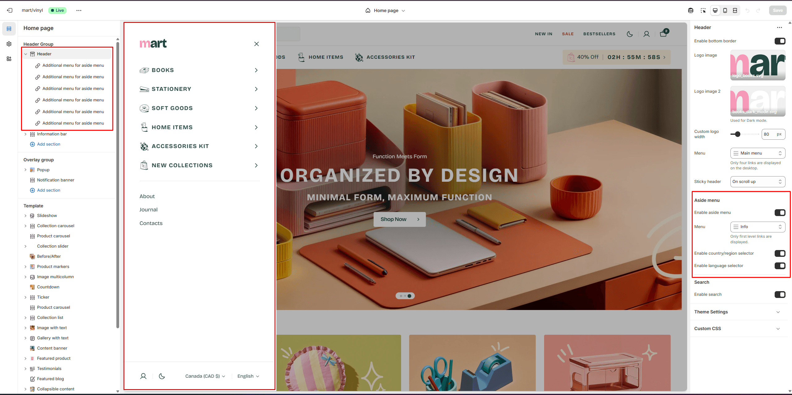
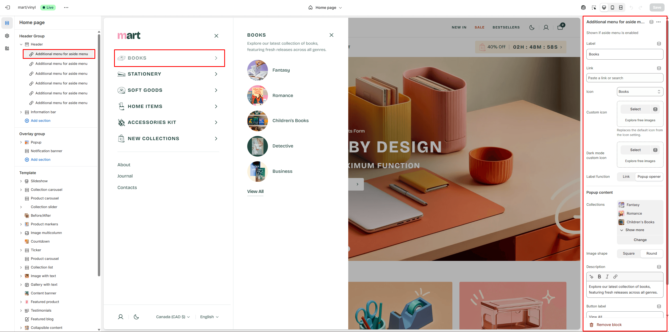
Add block and choose Additional menu for aside menu to add new menus
- Label field sets the menu label.
- Link field allows you to add a link to any source.
- Icon options allow you to choose an icon from our list or add your special icons.
- Label function allows you to choose whether it will be a Link or a Popup.
- Popup content options allow you to choose Collections, add Description and Link.
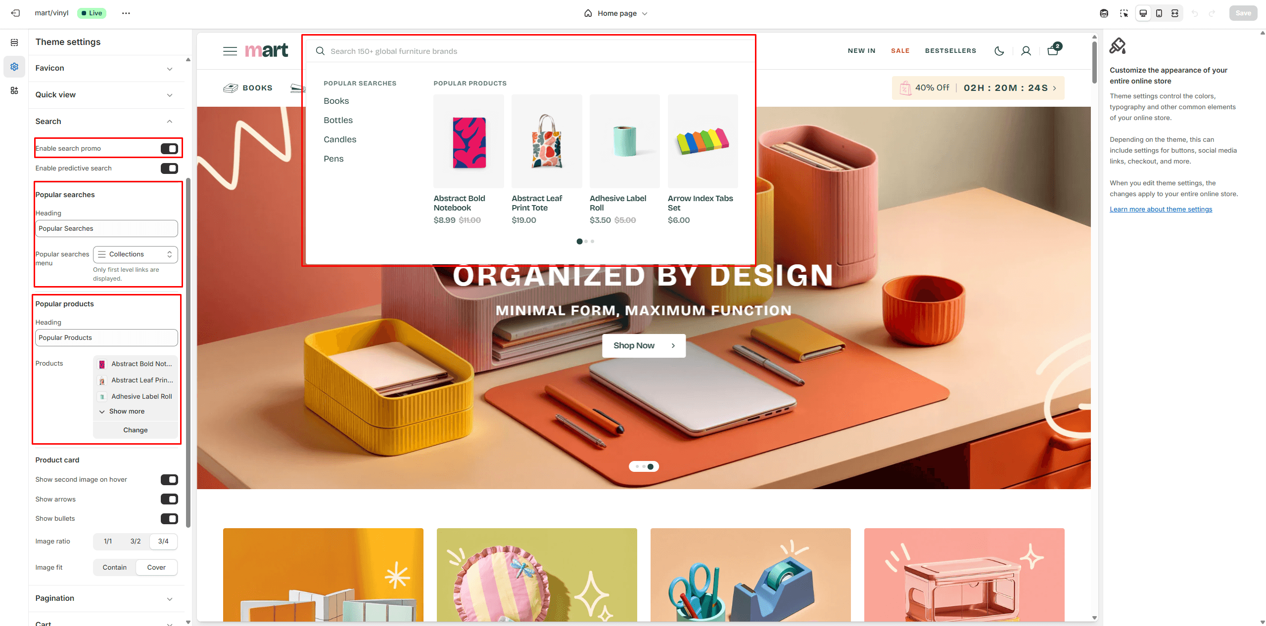
Search
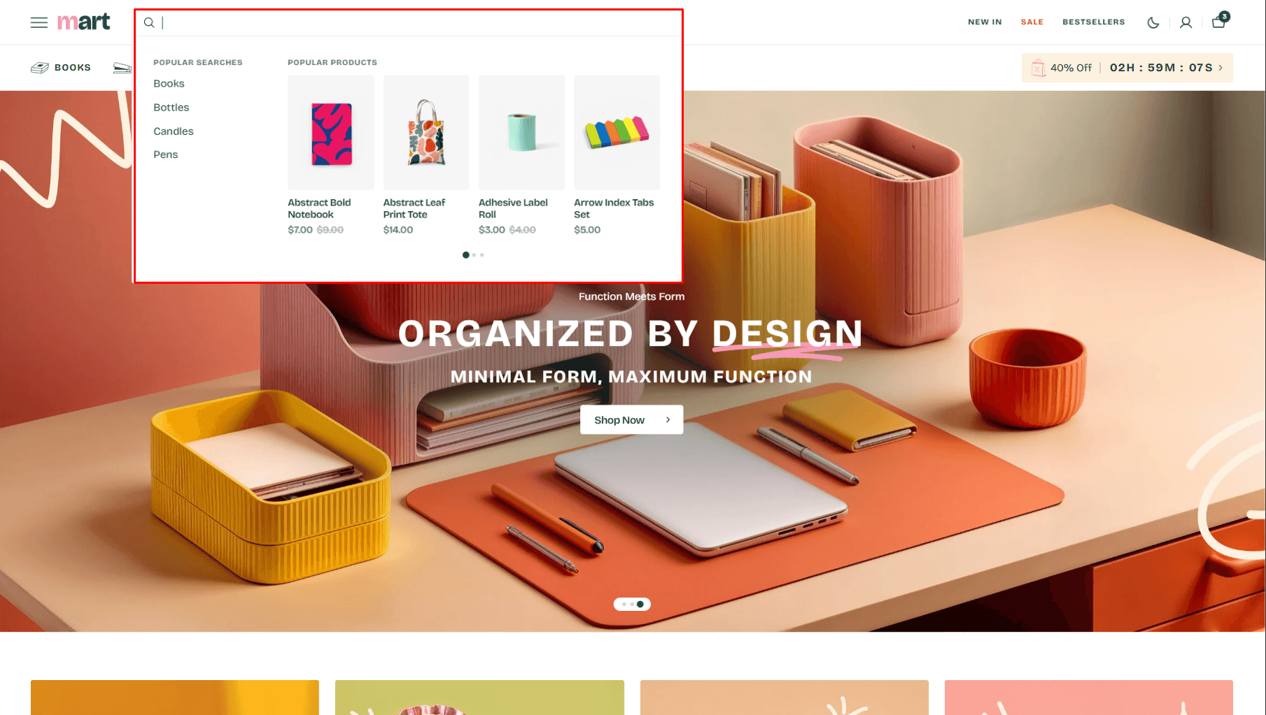
This theme offers predictive search, enabled by default. You can disable it in Theme settings > Search.
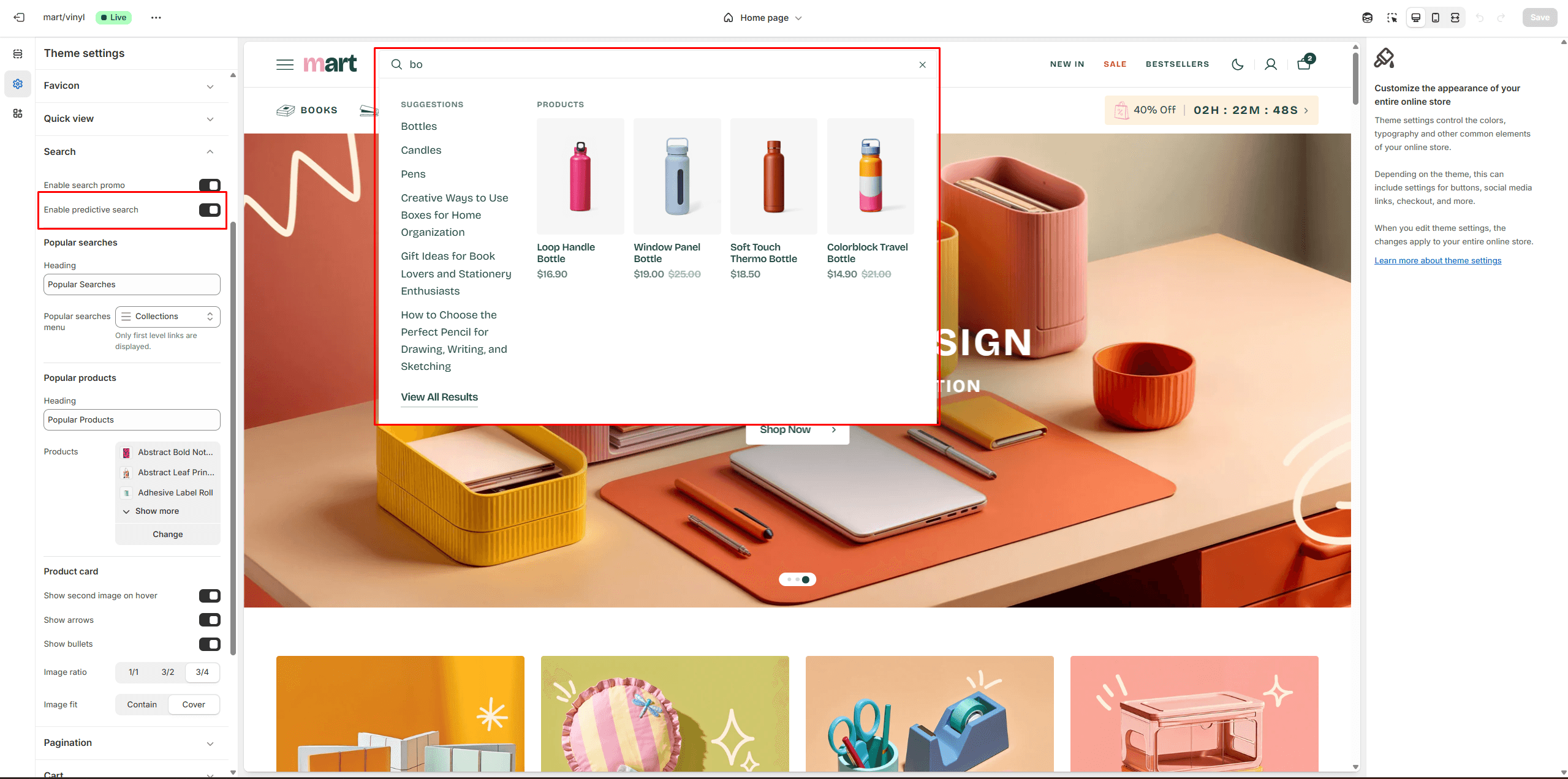
You can also enable the Search promo and display Popular searches and Popular products.
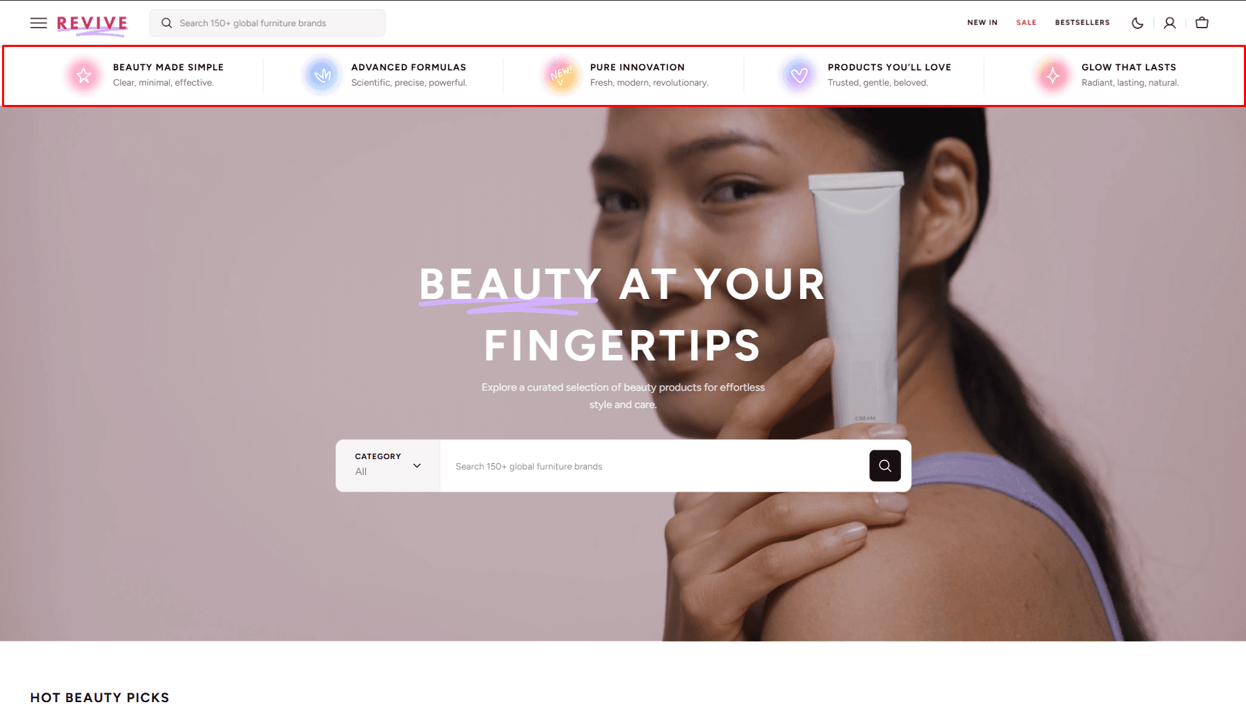
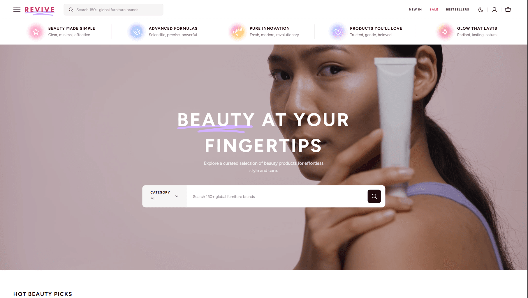
Announcement Bar
The announcement bar appears at the top of every page and displays custom messages with optional links. It's ideal for promoting sales or important updates.
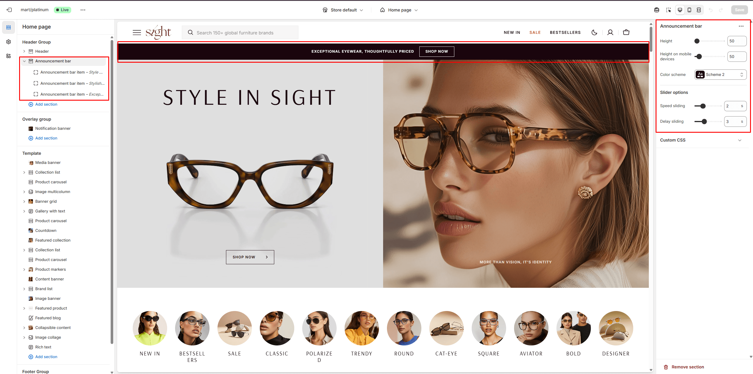
- Height slider allows you to change the announcement height only on desktop devices.
- Height on mobile devices slider allows you to change the announcement height only on mobile devices.
- Slider options allows you to customize slider.
- Color scheme selector allows you to change the color scheme. You can change the background color in the Theme settings.
- Text field allows you to add and edit text.
- Button options allows you to set a button and customize it.
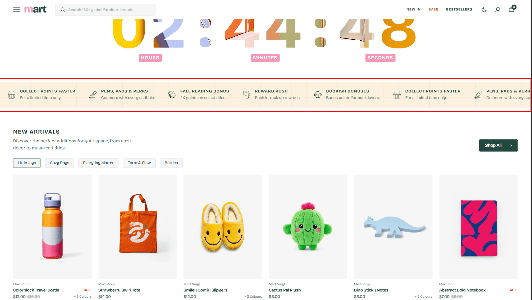
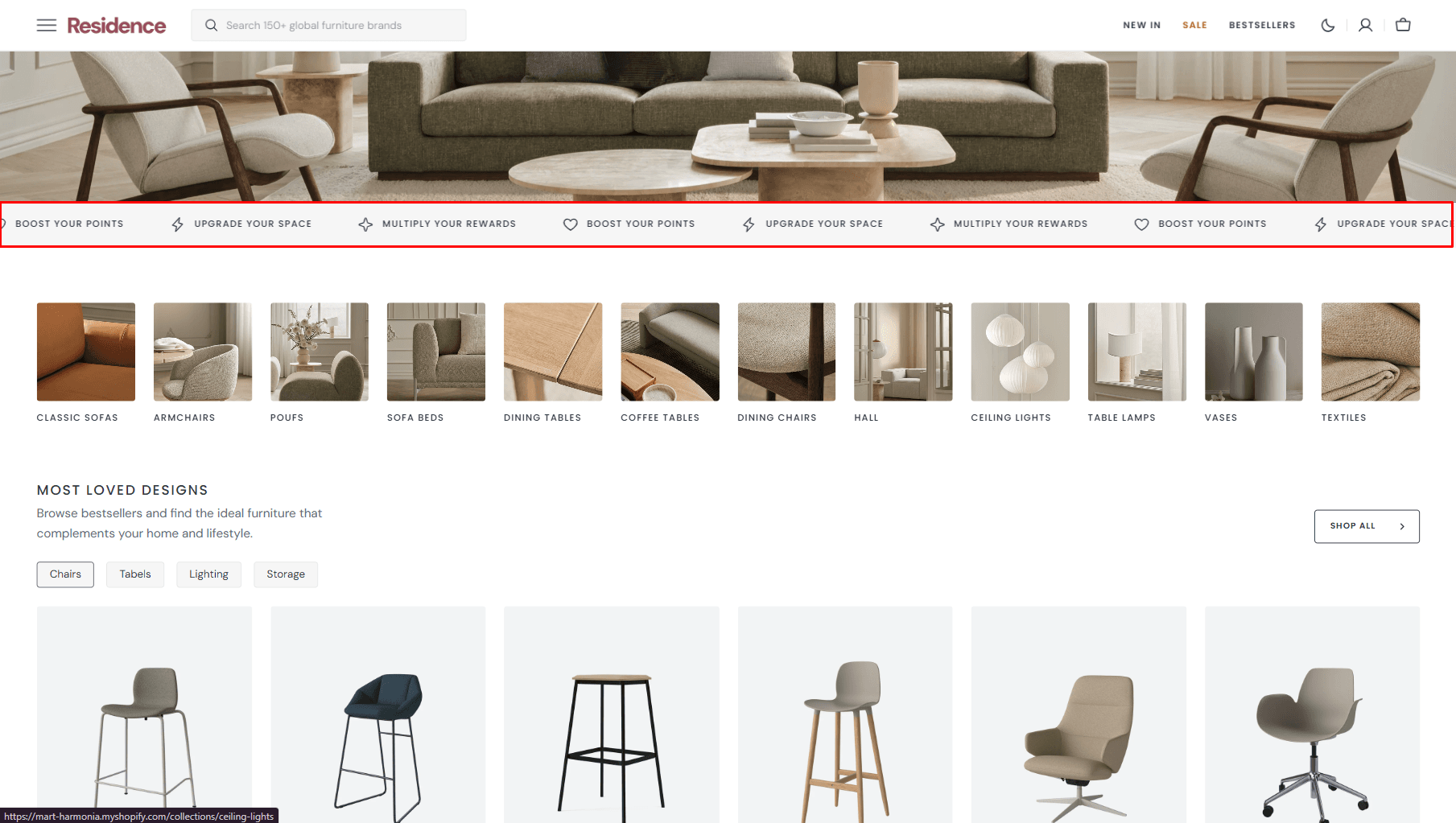
Information Bar
The Information Bar appears at the top of every page and displays more links and a countdown to promotions.
On mobile, the menu list appears in the burger menu. Countdown shown on desktop only.
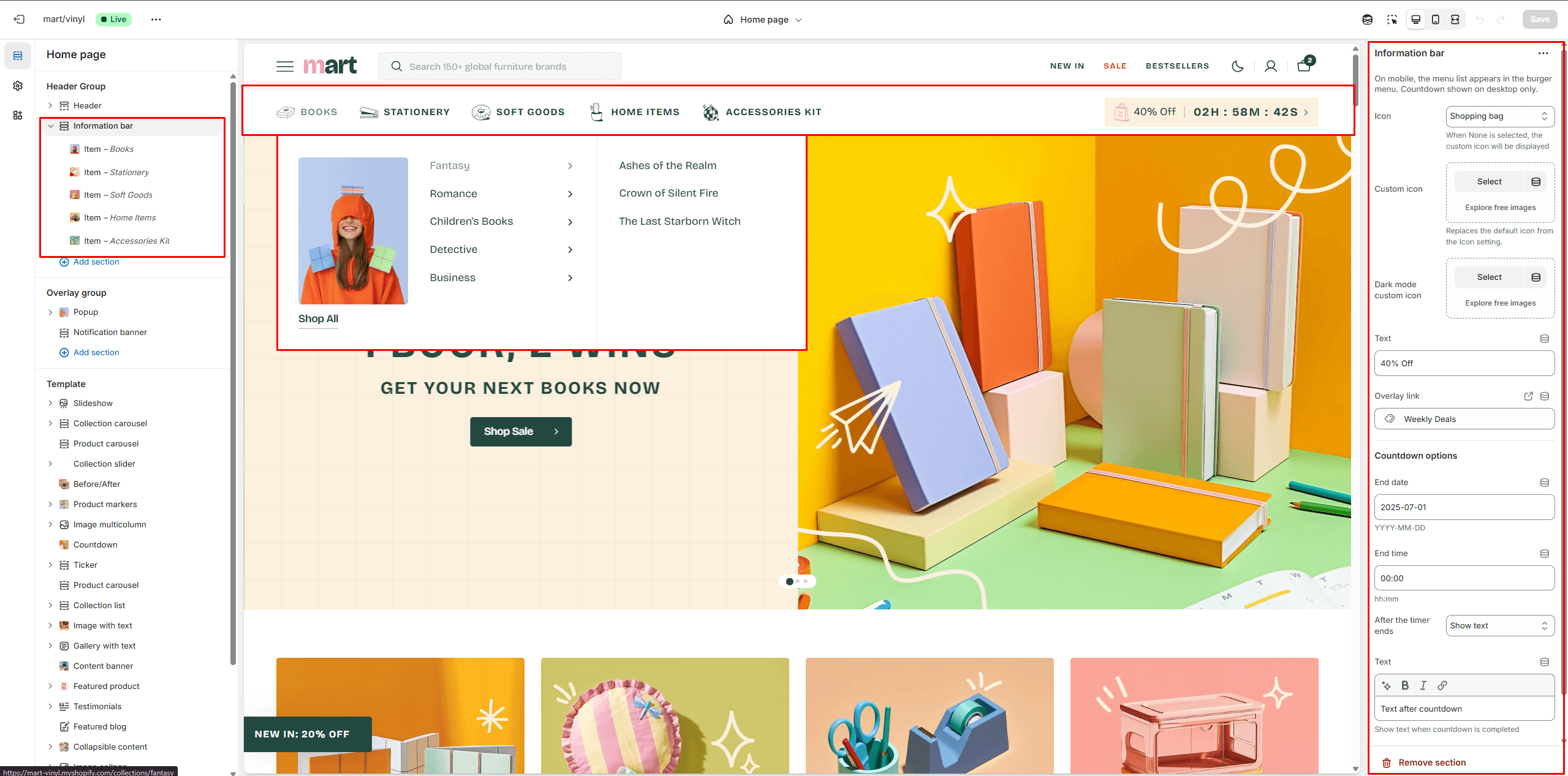
- In section settings you can customize countdown.
In the block settings, you can choose an icon for each link, add a new menu, and a promo image.
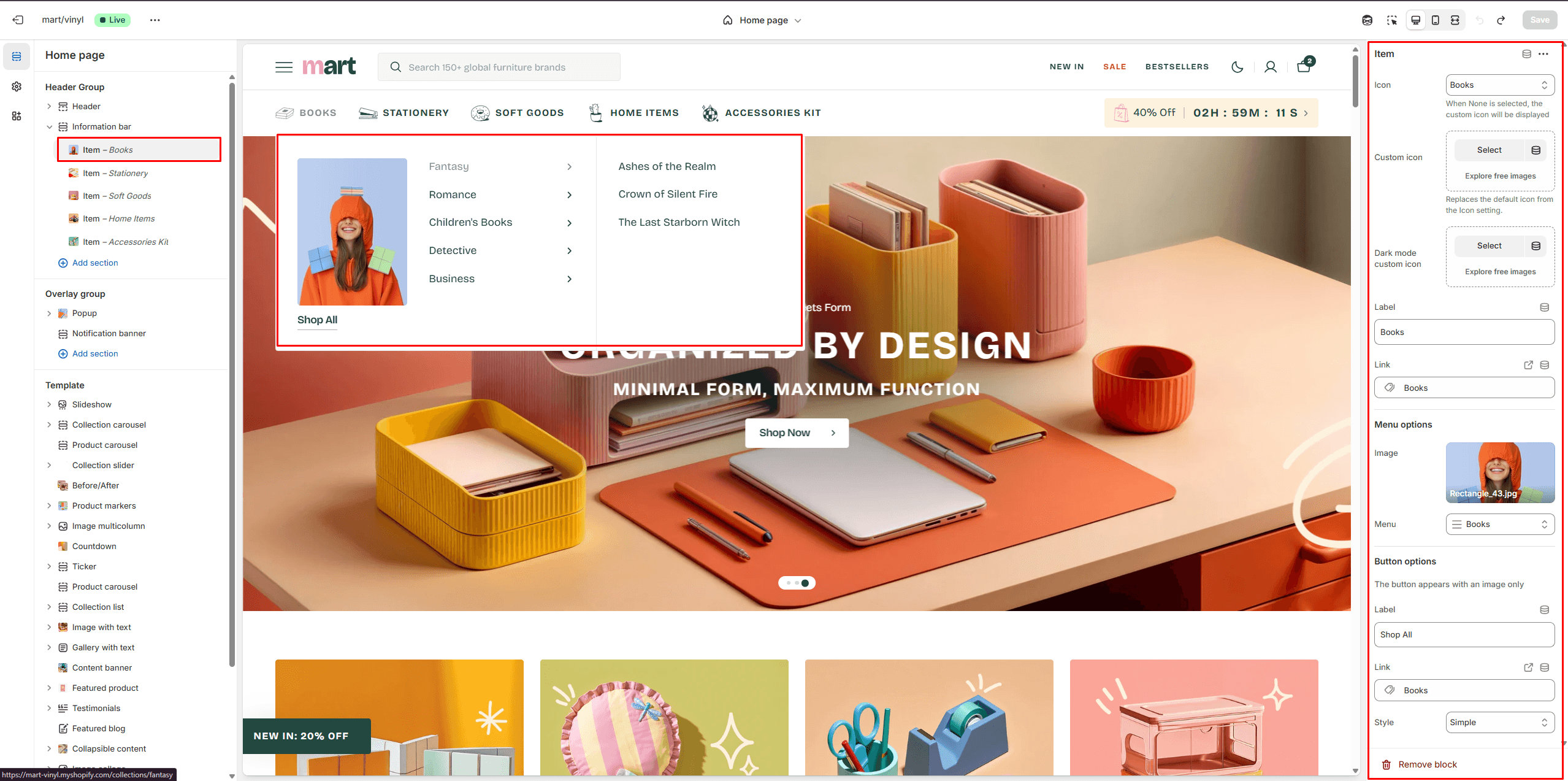
- Icon options allow you to choose an icon from our list or add your special icons.
- Select a Menu to display in each block.
- Image allows you to set a image for the block.
- Button options allows you to set a button and customize it.
Overlay Group
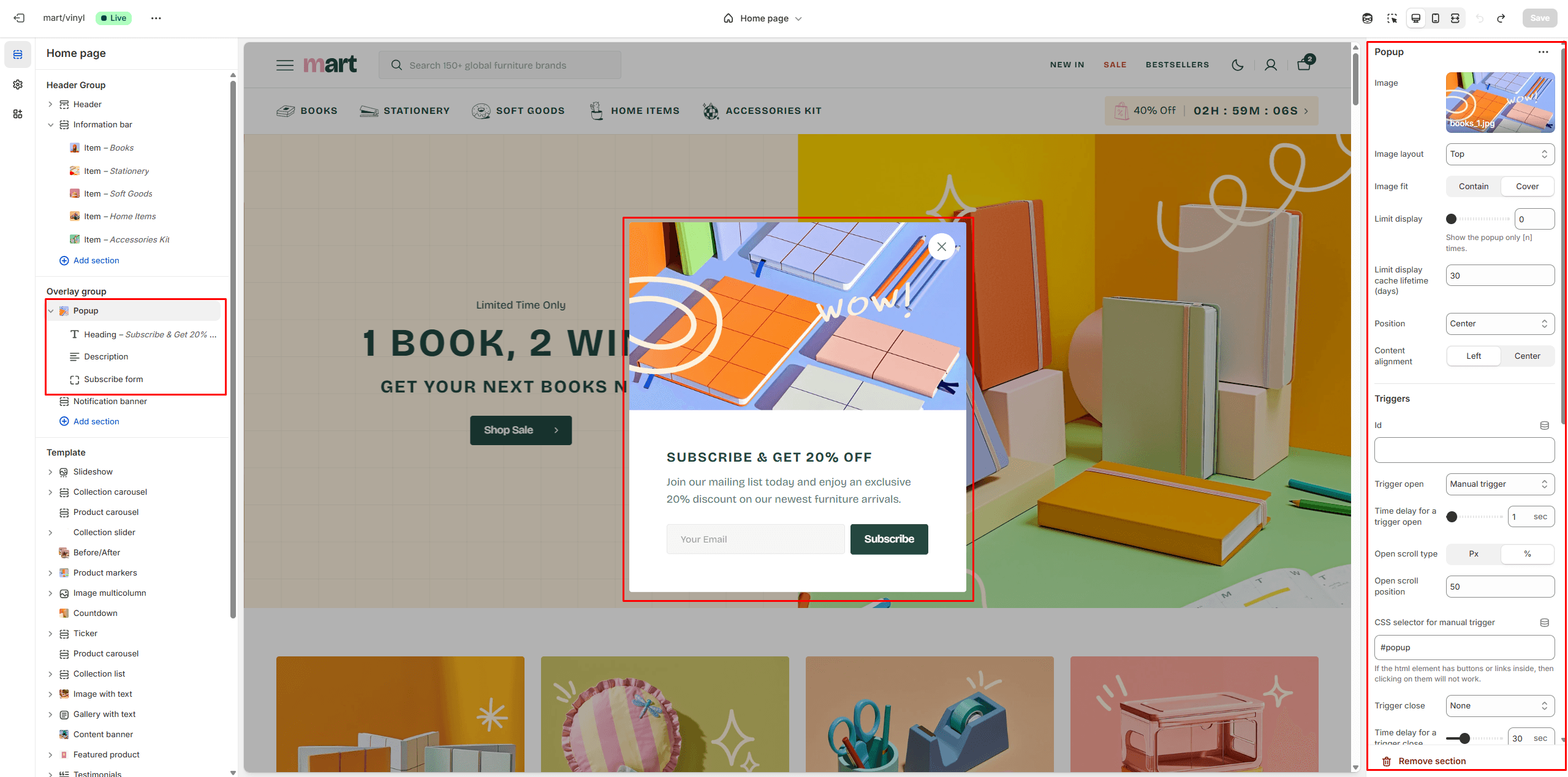
Popup
In the Popup settings, you can adjust the layout, add an image, customize the subscribe form, edit the position, and modify open/exit animations and options.
You can also use this popup as a button-trigger to open another popup or notification bar by following these steps:
- Add the ID of the popup/notification bar you want to open to the ID field in the Triggers section (e.g. "popup").
- Navigate to the popup/notification bar settings and add the ID (with "#" at the beginning) in the "CSS selector for manual trigger" field.
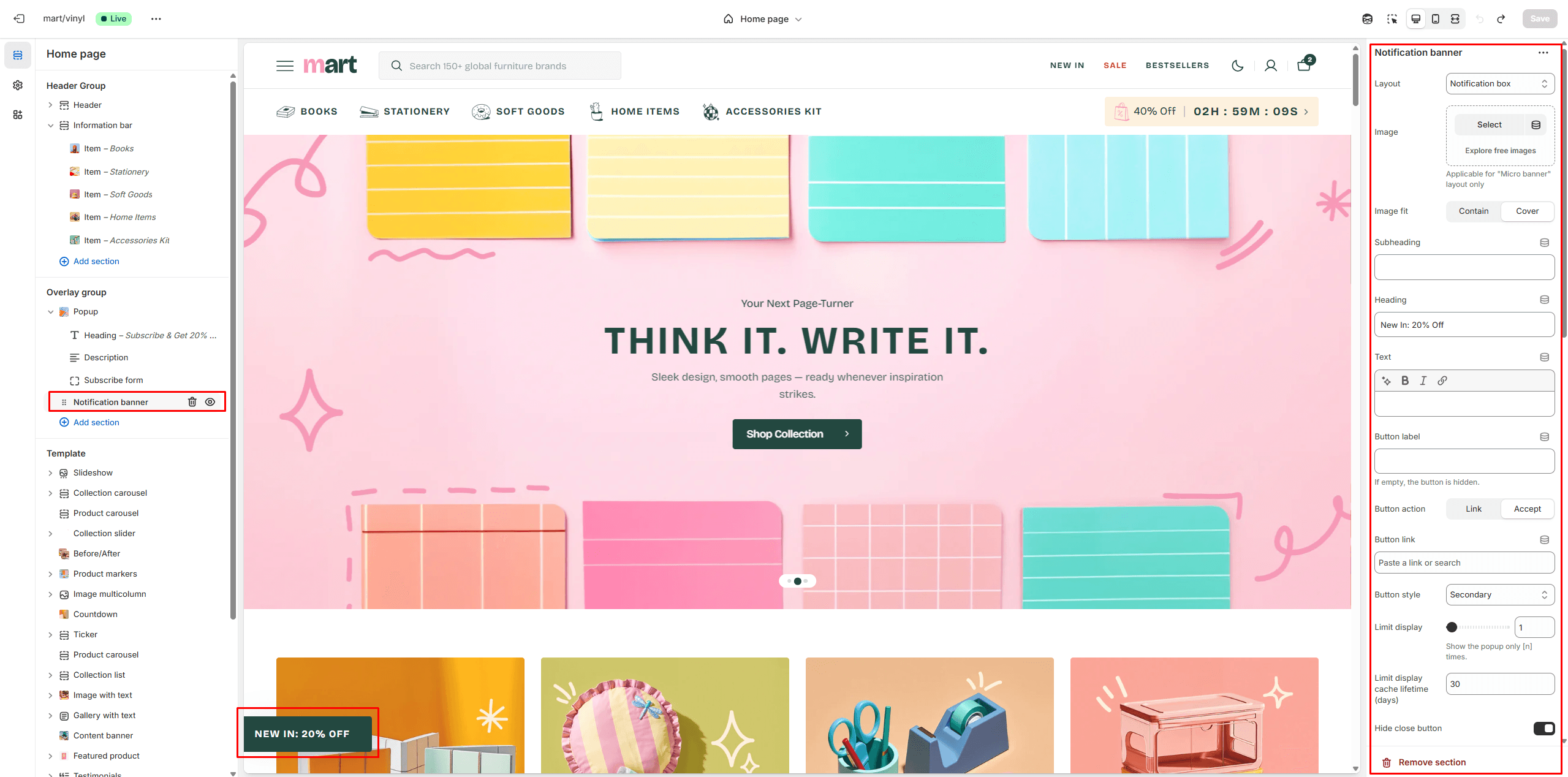
Notification Banner
In the Notification Banner settings, you can change layout, add image, texts, edit banner position, change open and exit animations and options.
You can also use this banner as a button-trigger for opening another notification bar or a popup by following these steps:
- Add the ID of the popup/notification bar you want to open in the ID field under the Triggers section (e.g., "popup").
- Navigate to the popup/notification bar settings and add the ID (with "#" at the beginning) in the "CSS selector for manual trigger" field.
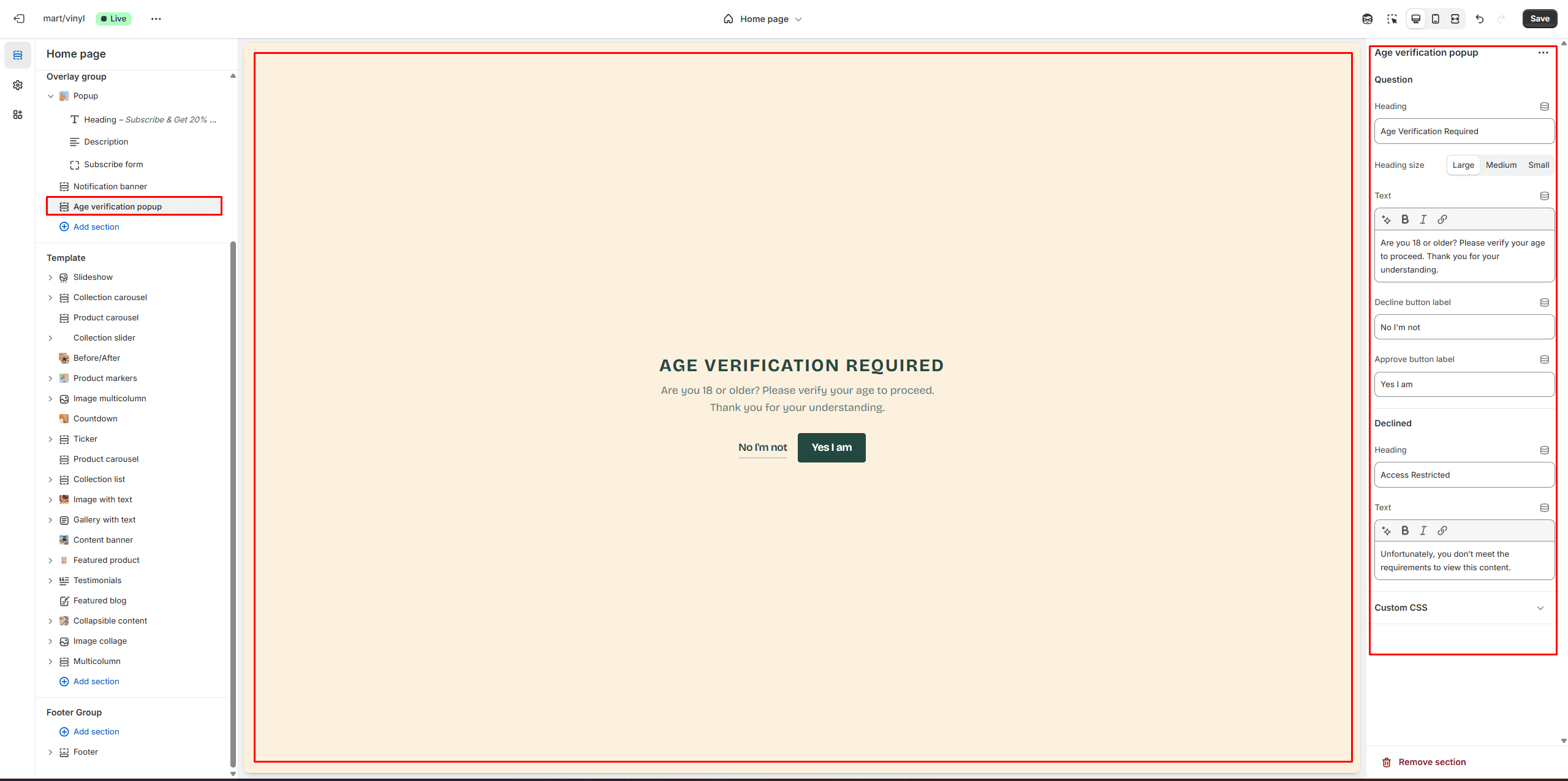
Age Verification Popup
An Age verification popup prompts users to confirm their age before accessing restricted content. In the Age verification popup settings, you can customize the text and buttons.
Footer Group
Sections are used on all pages by default.
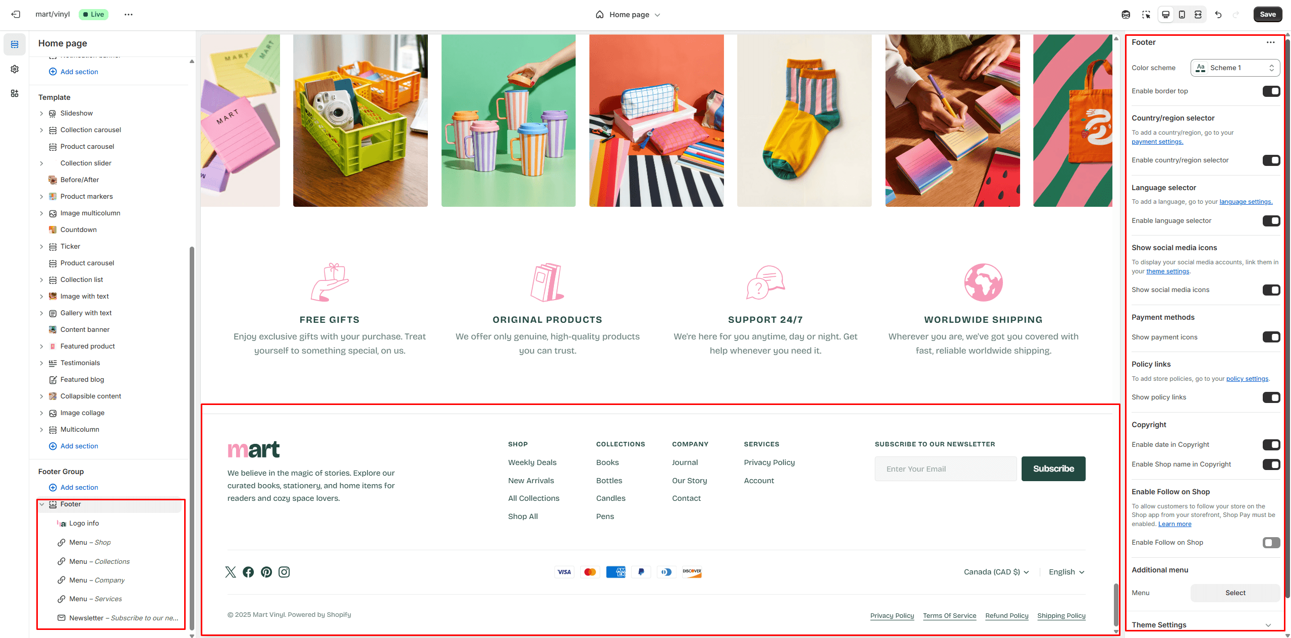
Footer
Footer appears at the bottom of every page. You can customize it to fit your brand and product offerings.
- Use Color scheme selector to change the color scheme.
- Country/region selector field enables the display of the region selector in the footer.
- Language selector field enables the display of the language selector in the footer.
- Social media icons enable the display of social media icons in the bottom line of the footer.
- Payment methods field enables the display of payment methods in the bottom line of the footer.
- Policy links allow you to display policy links in the footer.
- Follow on Shop allows customers to follow your store on the Shop app from your storefront, but Shop Pay must be enabled.
- Use the Logo image file selector allows you to select or upload your logo file.
- Use the Logo image 2 file selector to select or upload your logo, which can be seen in Dark mode.
- If you add a logo, use the Custom logo width slider to adjust its size.
- Block Menu lets you select menus to be displayed on the top line of the footer.
- Block Newsletter allows you to add and customize subscribe form.
- Block Contacts allows you to add additional description, which will be displayed on the top line of the footer.
All Sections
The theme contains several customizable sections that you can add to your page in any order.
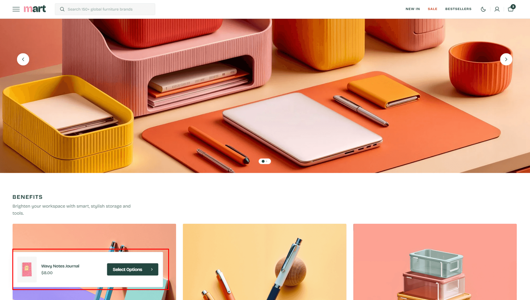
Slideshow
The section allows you to add slides with image, heading and text.
- Header overlay checkbox allows you to have a transparent header when the slideshow section is the first.
- Aspect ratio selector allows you to set the aspect ratio of the image.
- Slider options allows you to customize slider.
- Heading animation allows you to control typewriter animation speed for Heading
- Block Slide options Color scheme selector to change the color scheme for the block.
- Block Slide options Notebook canvas allows you to add a notebook canvas pattern to the background.
- Block Slide options Layout selector allows you to change the slide to Overlay or Simple
- Block Slide options Image allows you to set an image for the block.
- Block Slide options Video allows you to set a video for the block.
- Block Slide options Overlay opacity slider allows you to change the opacity of the overlay.
- Block Slide options Content options allows you to add headings and description.
- Block Slide options Button options allows you to set a button and customize it.
Collection carousel
Allows you to add collections.
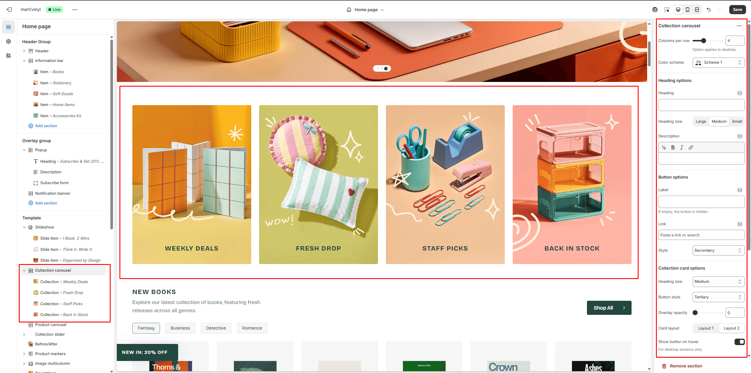
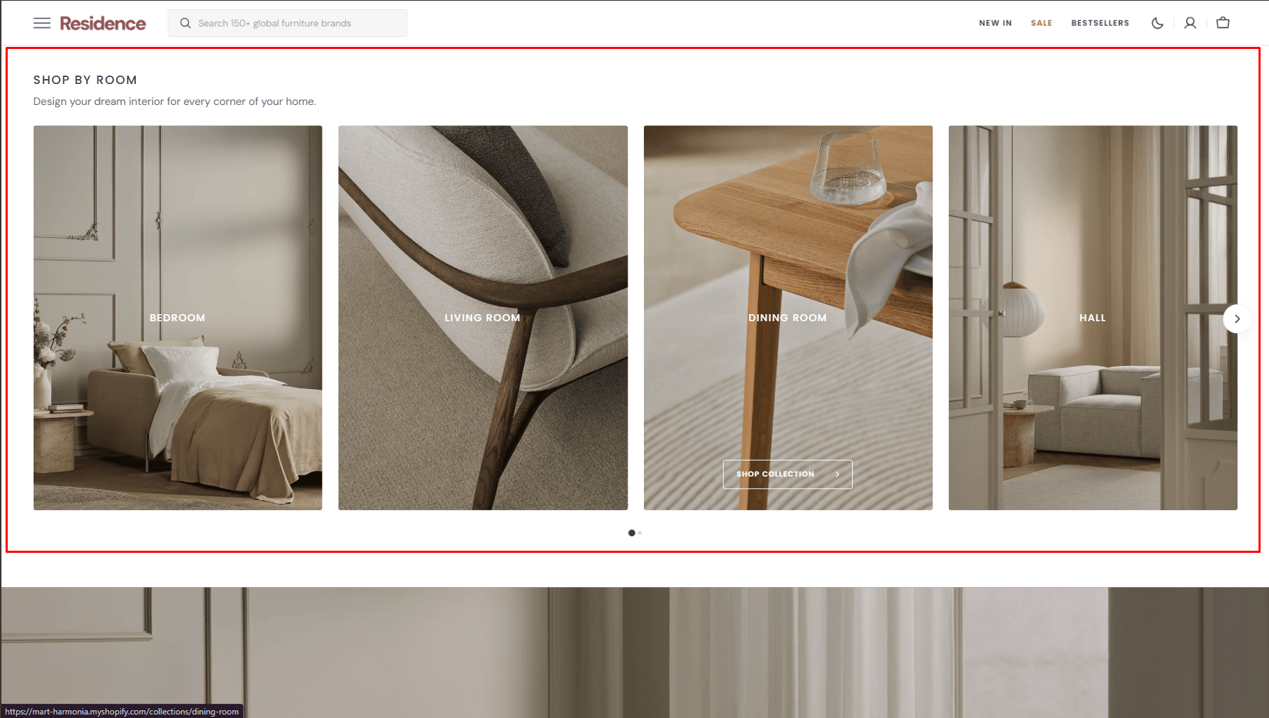
- Columns per row slider allows you to change the number of collections per line only on desktop devices.
- Color scheme allows you to set the color scheme for collection cards.
- Heading options allows you to set a heading and description for the section.
- Button options allows you to set a button and customize it.
- Collection card options allows customize collection cards.
- Image options allows you to set the aspect ratio of collection card.
- Slider options allows you to customize slider.
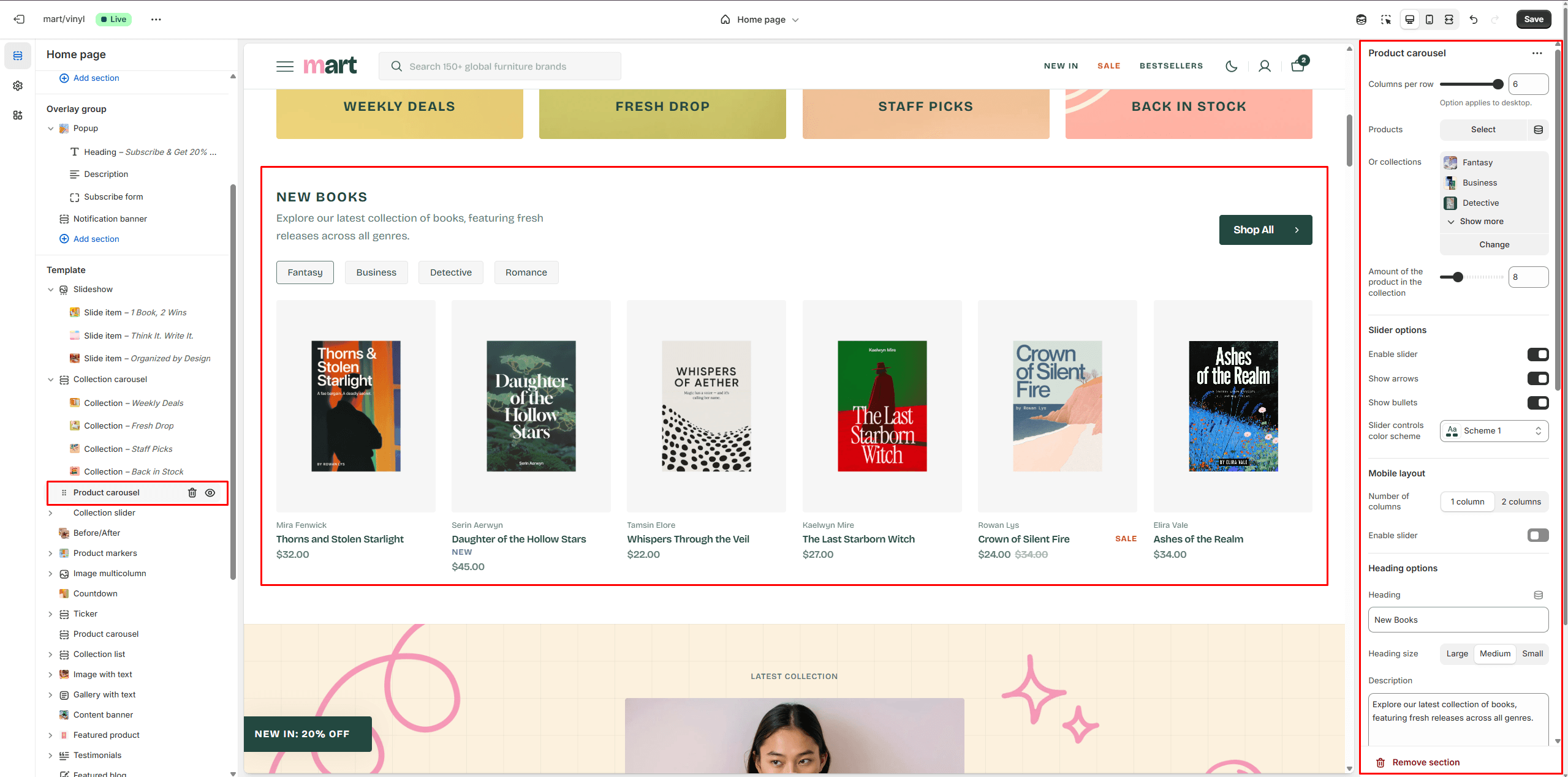
Product Carousel
The section allows you to select products or collections and customize their display.
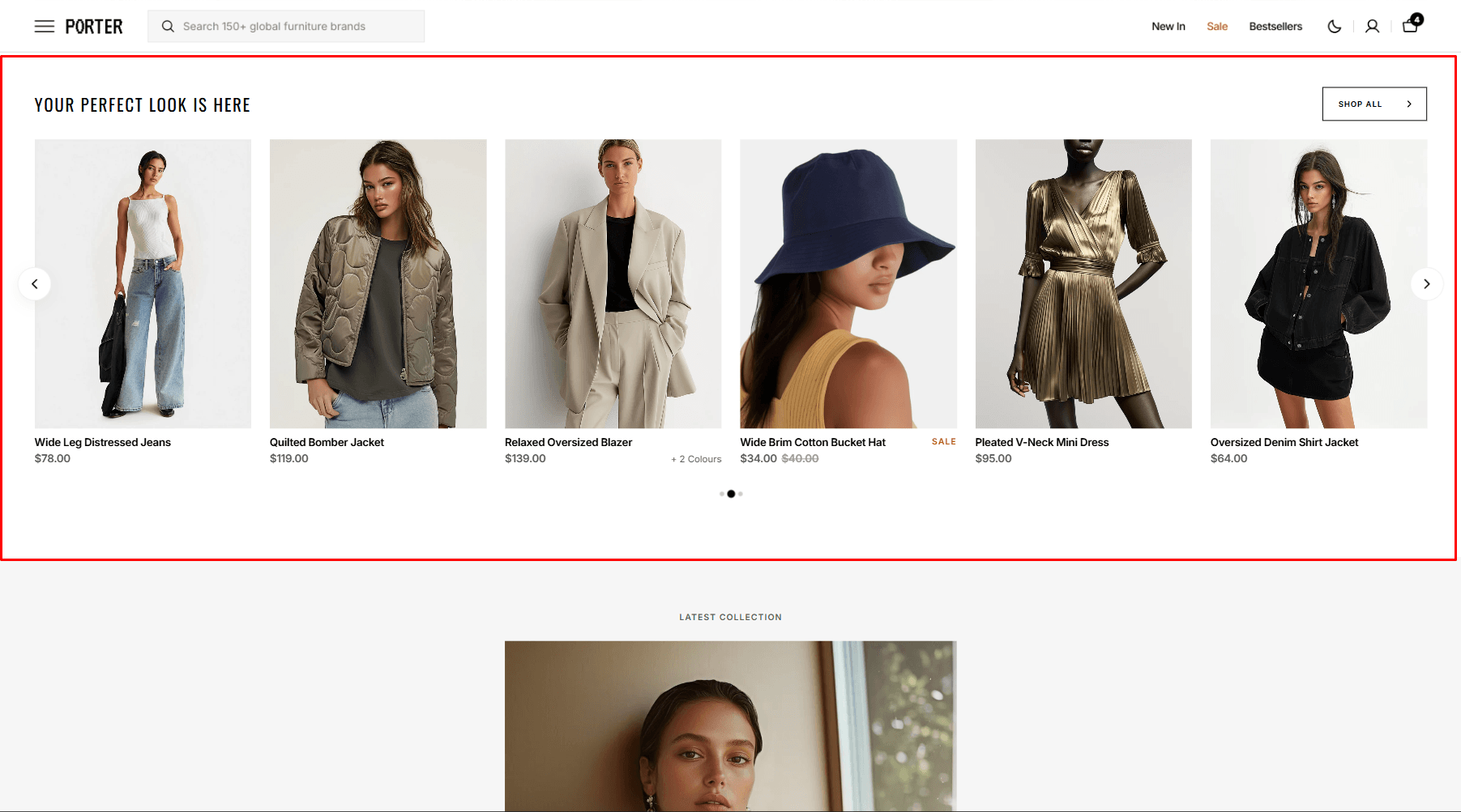
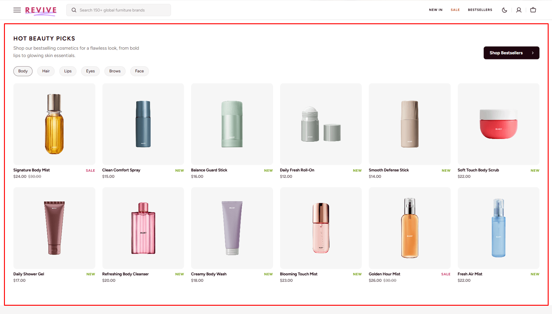
- Columns per row slider allows you to change the number of products per line only on desktop devices.
- Products select products to be added to the section.
- Or you can select Collections and its products will be displayed.
- Slider options allows you to customize slider.
- Mobile layout options allow you to enable the slider on mobile devices.
- Heading options allows you to set a heading and description for the section.
- Button options allows you to set a button and customize it.
- Product card options allow you to customize product cards in the section.
Collection slider
Allows you to add collections.
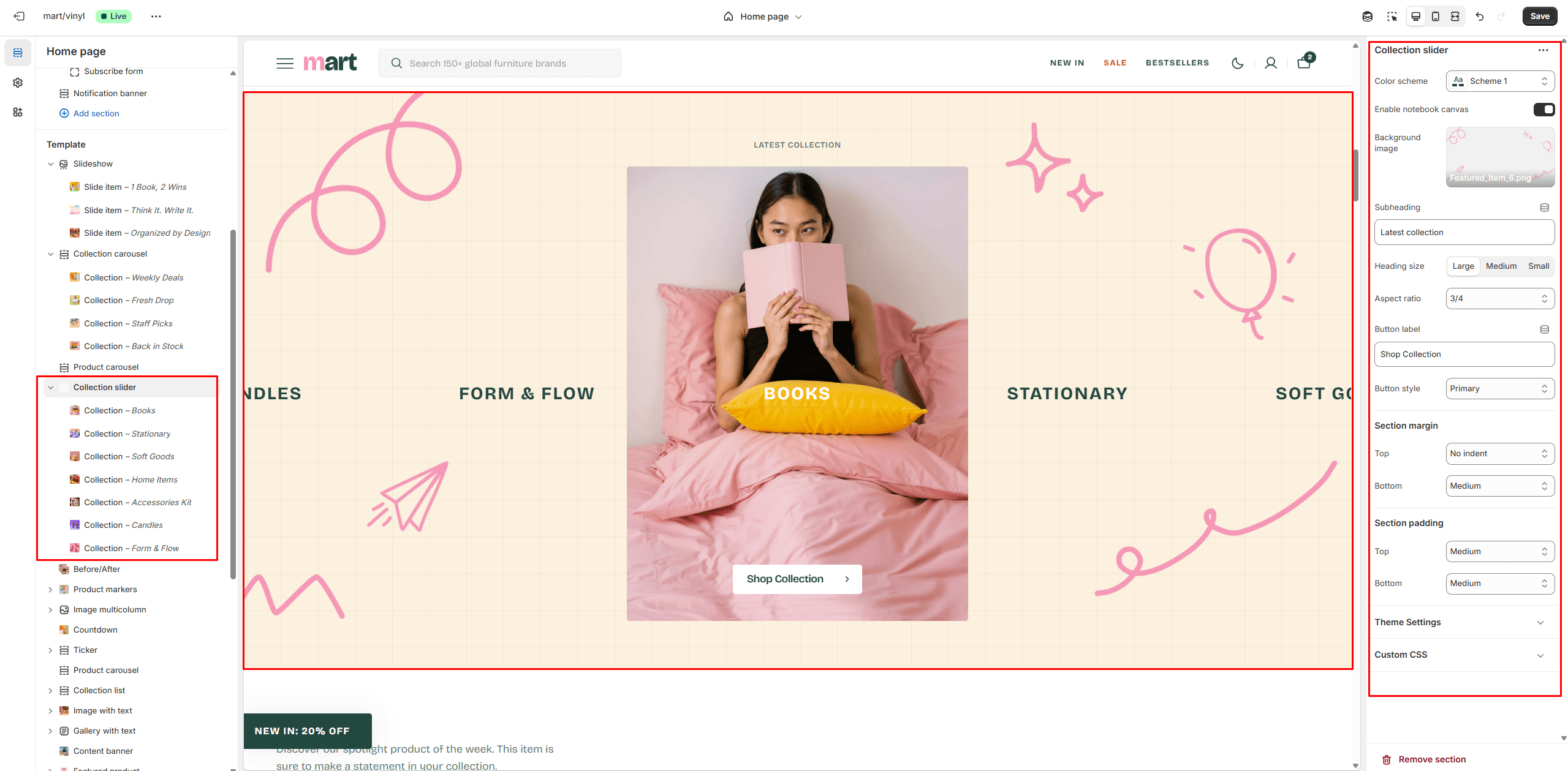
- Use Color scheme selector to change the color scheme.
- Notebook canvas allows you to add a notebook canvas pattern to the background.
- Background image allows you to set an background image for the section.
- Heading options allows you to set a heading and description for the section.
- Button options allows you to set a button and customize it.
- Collection card options allows customize collection cards.
- Image options allows you to set the aspect ratio of collection card.
- Slider options allows you to customize slider.
Before/After
The section allows you to compare products results.
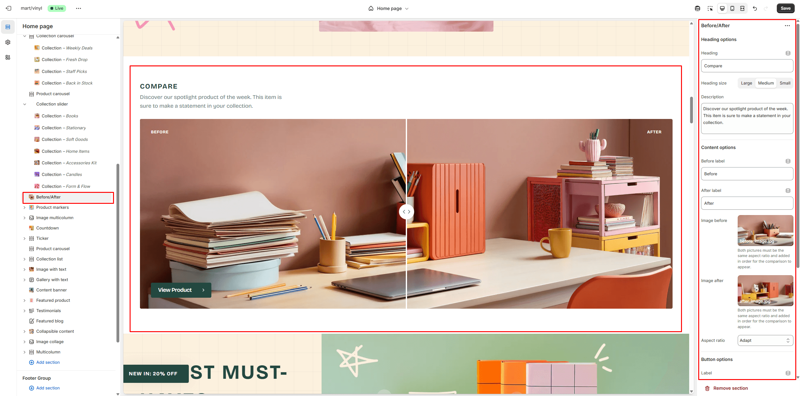
- Heading options allows you to set a heading and description for the section.
- Button options allows you to set a button and customize it.
- Content options allows you to add images and texts for compare.
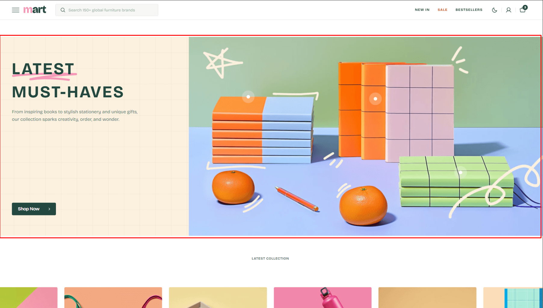
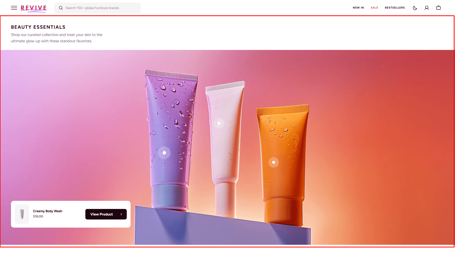
Product Markers
The section lets you mark products in the image and choose their display position.
- Layout selector allows you to select the layout type.
- Use Color scheme selector to change the color scheme.
- Notebook canvas allows you to add a notebook canvas pattern to the background.
- Heading options allows you to set a heading and description for the section.
- Button options allows you to set a button and customize it.
- Image options allows you to set a image for the section.
- Product Card options allow you to customize product cards in the section.
- Button options allows you to set a button and customize it.
- Block Markers options Product select product that will be displayed.
- Block Markers options Position allow you to choose display position for the marker.
- Block Markers options Opening direction allow you to choose product marker window direction.
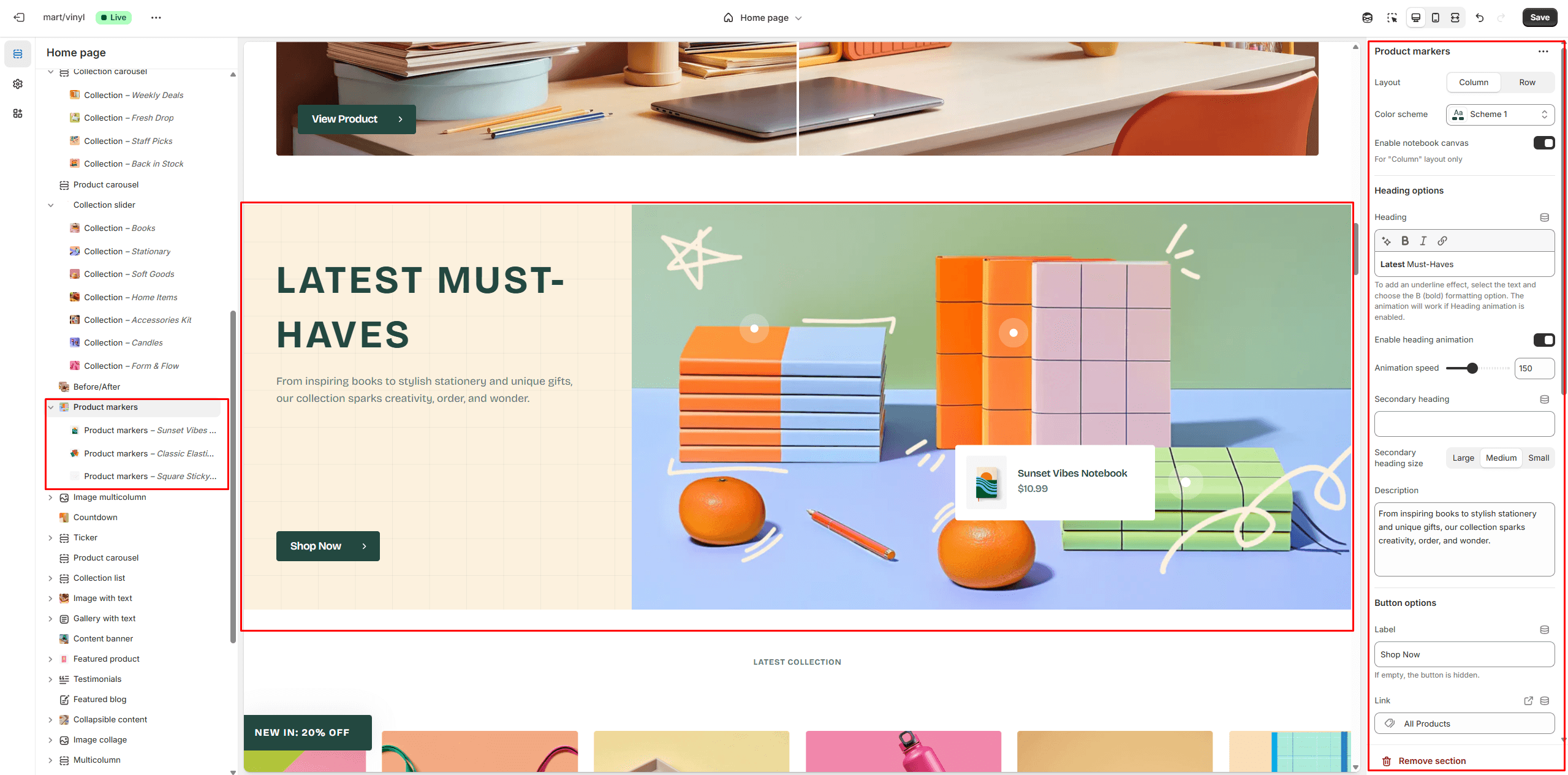
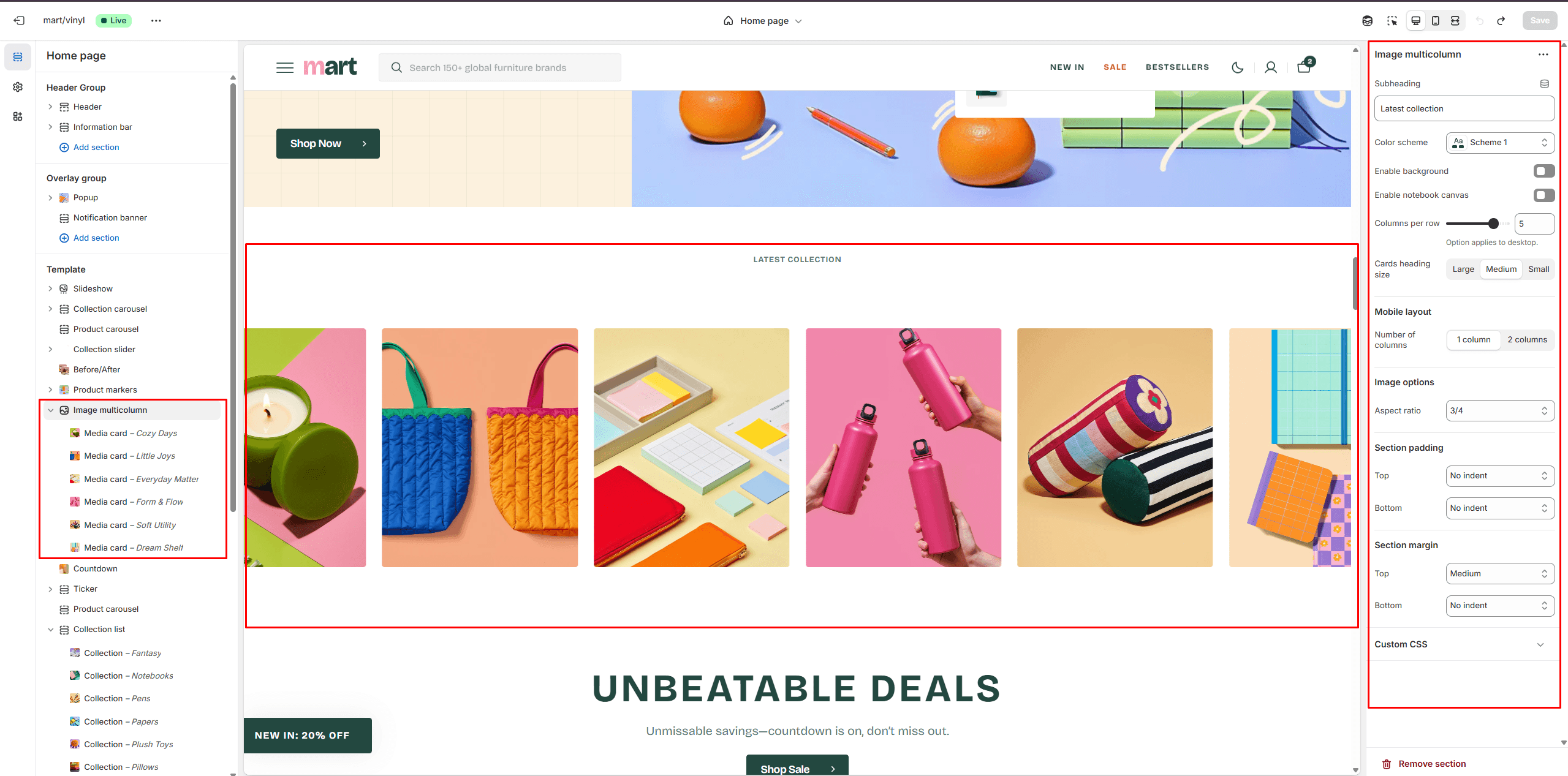
Image multicolumn
- Columns per row slider allows you to change the number of blocks per line only on desktop devices.
- Use Color scheme selector to change the color scheme.
- Notebook canvas allows you to add a notebook canvas pattern to the background.
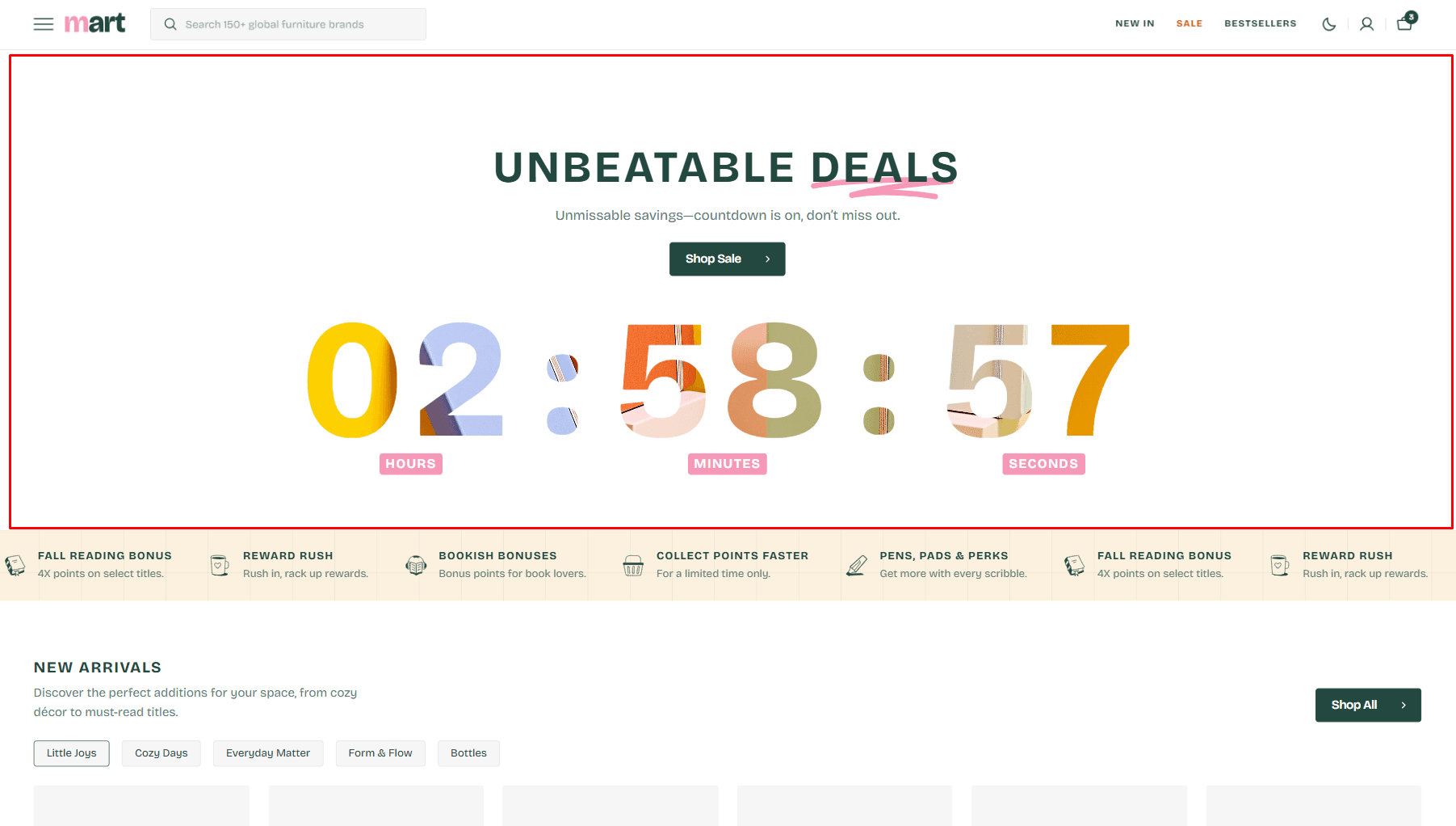
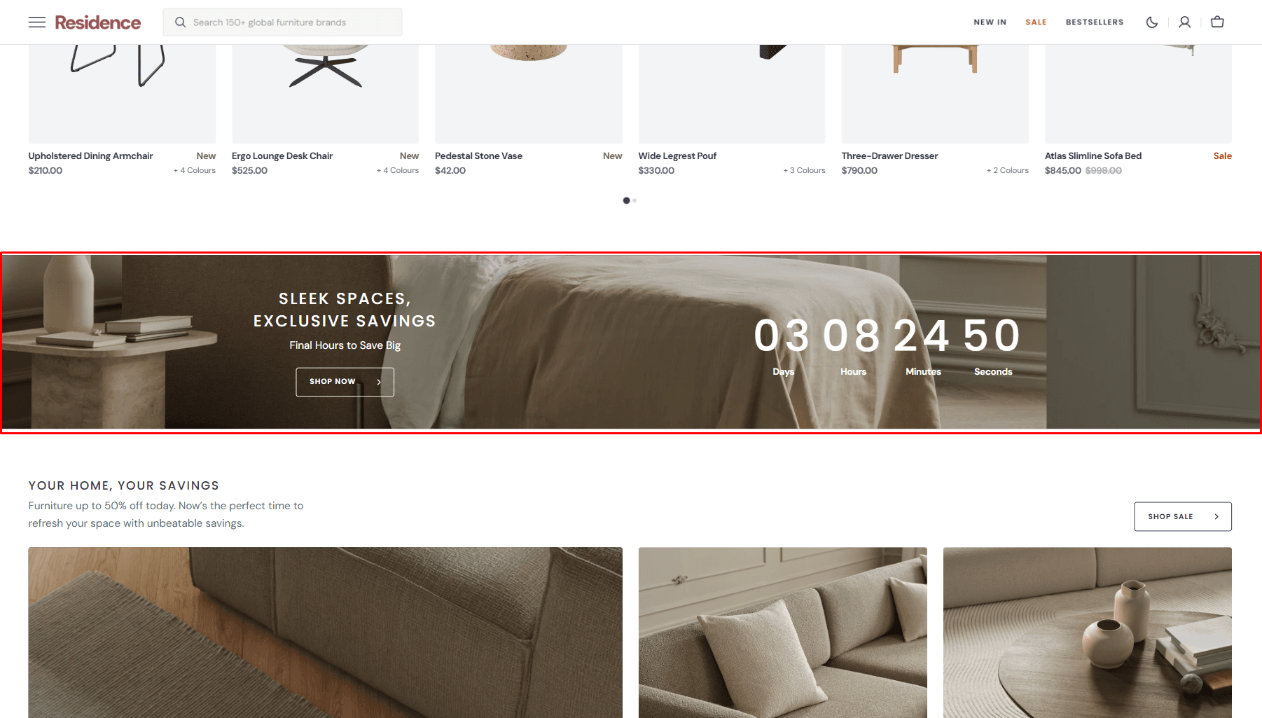
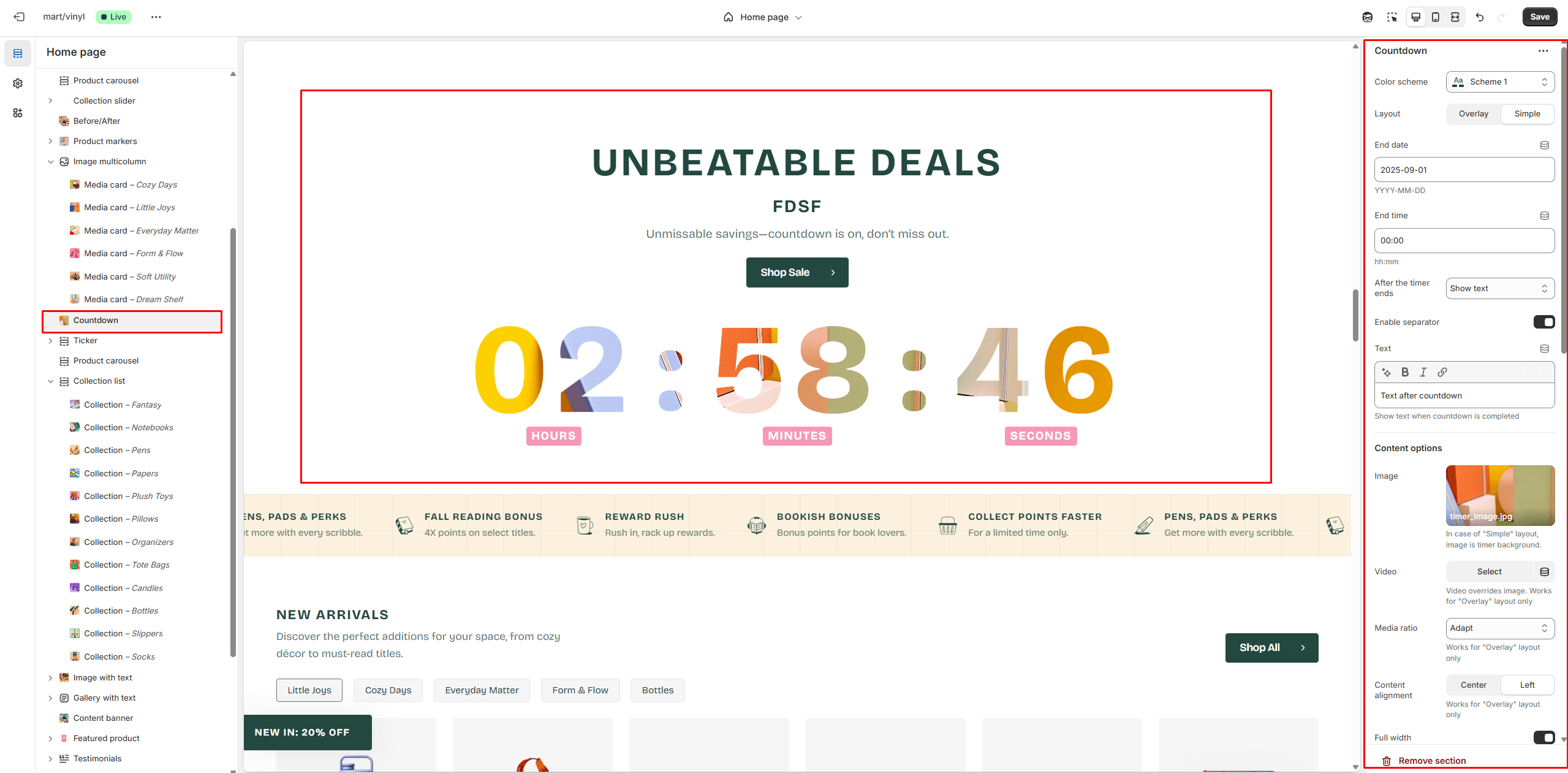
Countdown
You can add and customize a countdown timer.
- Layout selector allows you to select the layout type.
- Use Color scheme selector to change the color scheme.
- End date allows you to set the countdown end date.
- End time allows you to set the countdown end time.
- After the timer ends lets you select the action that should occur when the countdown is completed.
- Content options allows you to add image, video and texts.
- Heading animation allows you to add typewriter animation for Heading and control the speed.
- Timer animation allows you to add typewriter animation for timer and control the speed.
- Button options allows you to set a button and customize it.
Ticker
The section allows you to add scrolling ticker
- Use Color scheme selector to change the color scheme.
- Notebook canvas allows you to add a notebook canvas pattern to the background.
- Speed allows you to change speed for the ticker.
- Heading size selector field allows you to change the size of the section heading.
Collection List
Displays a list of collections.
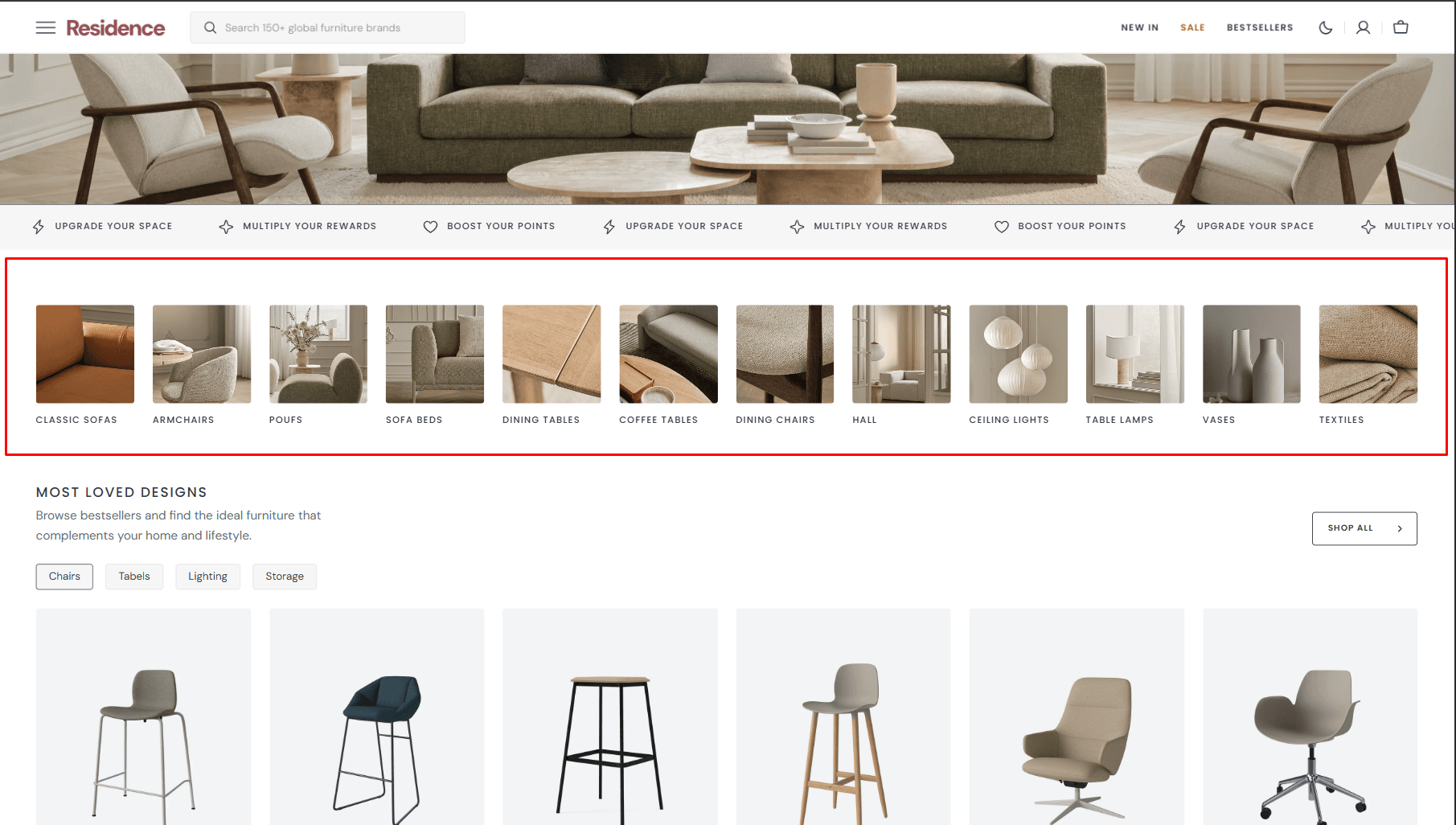
- Use Color scheme selector to change the color scheme.
- Notebook canvas allows you to add a notebook canvas pattern to the background.
- Columns per row slider allows you to change the number of collections per line only on desktop devices.
- Slider options allows you to customize slider.
- Heading options allows you to set a heading and description for the section.
- Heading animation allows you to add typewriter animation for Heading and control the speed.
- Button options allows you to set a button and customize it.
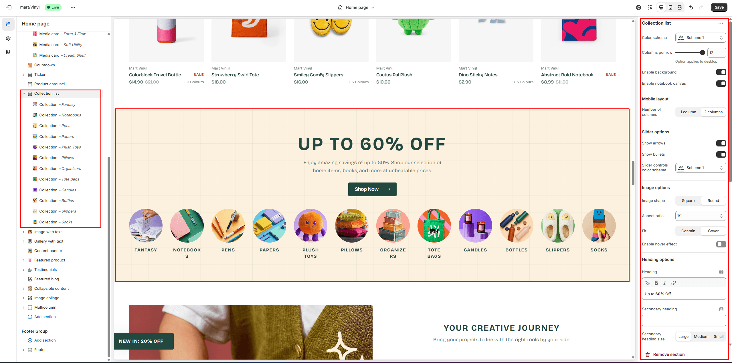
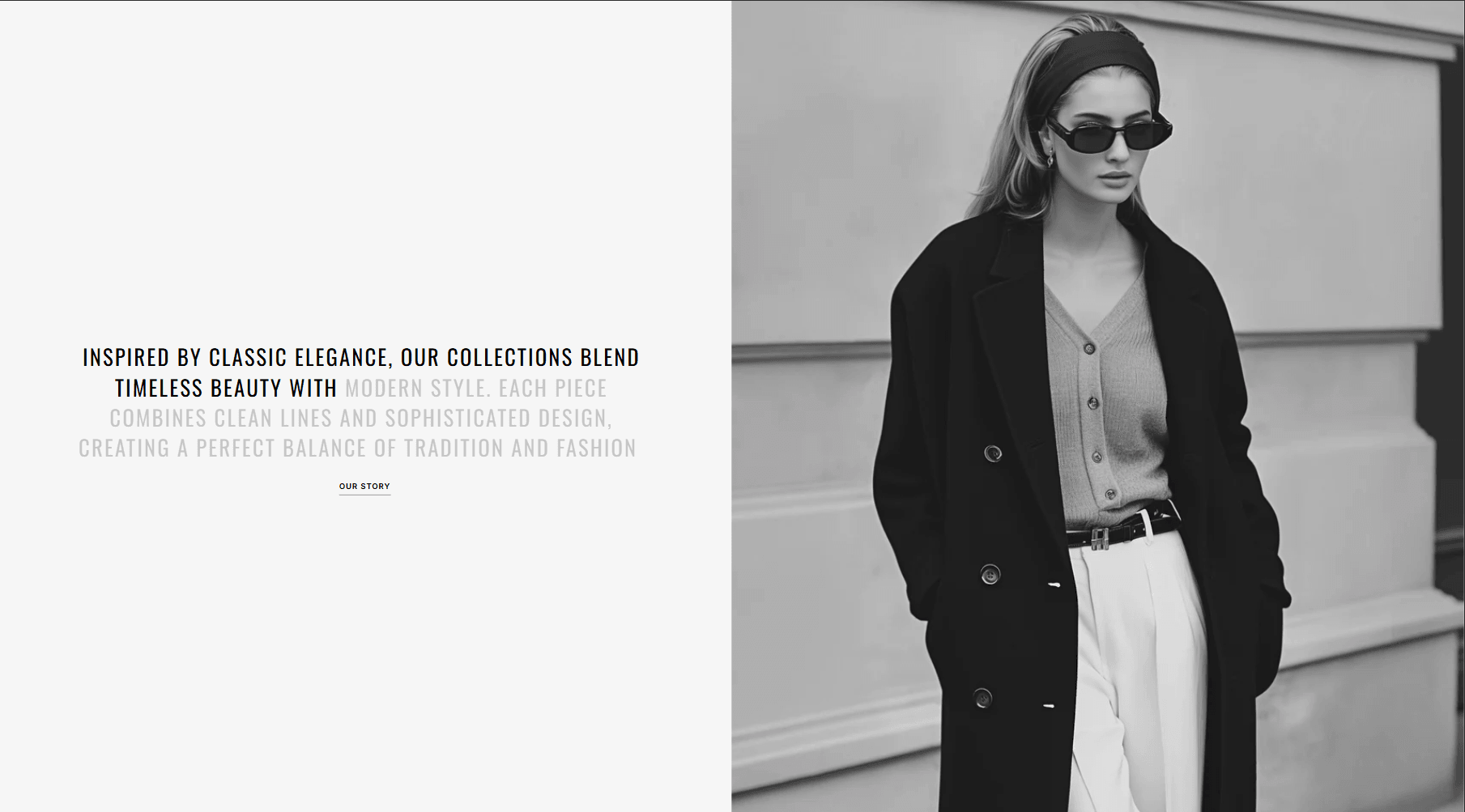
Image with text
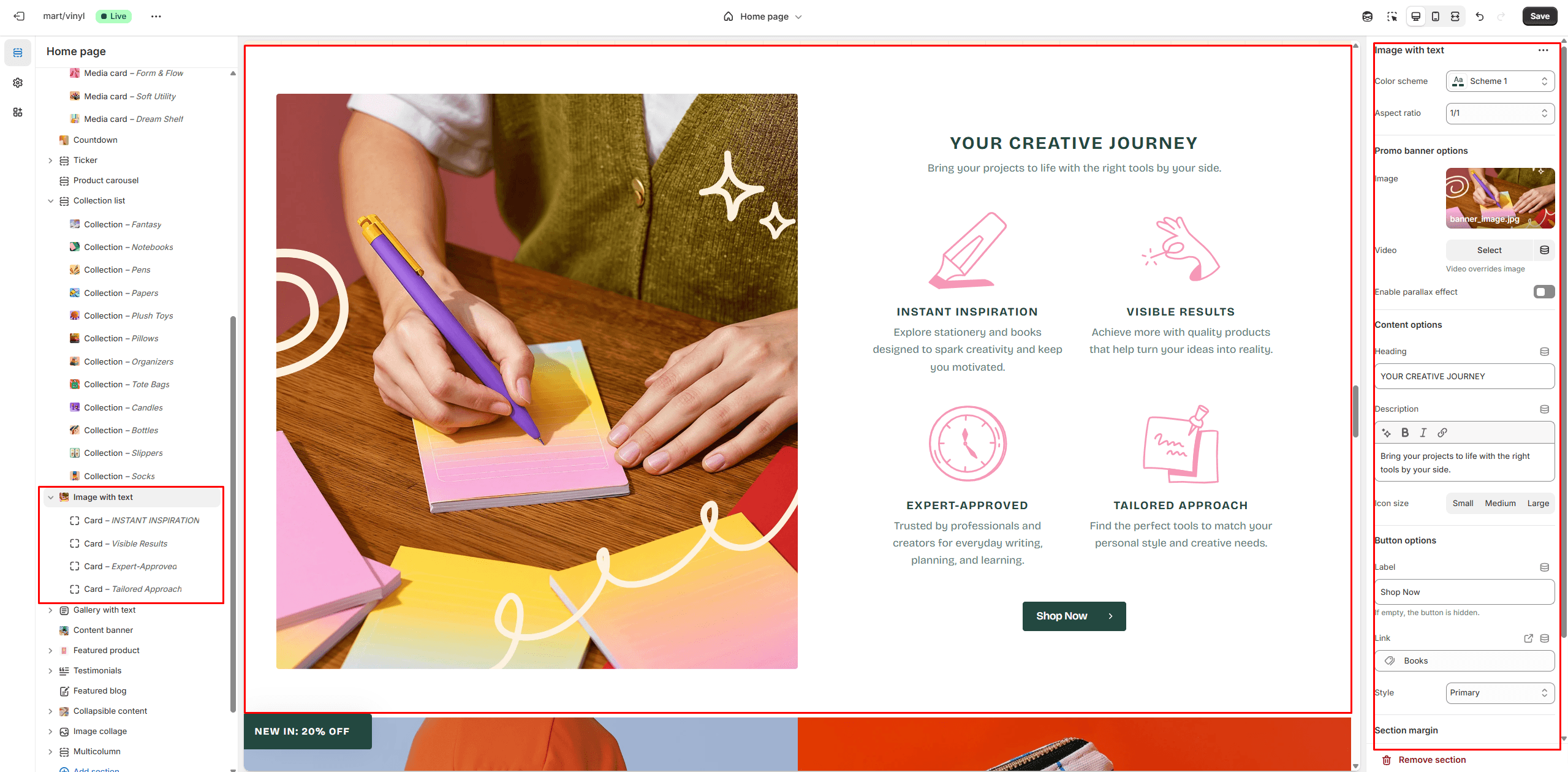
- Use Color scheme selector to change the color scheme.
- Aspect ratio sets the aspect ratio of the image..
- Image allows you to set a image for the section.
- Video allows you to set a video for the section.
- Content options allows you to set a heading and description
- Button options allows you to set a button and customize it.
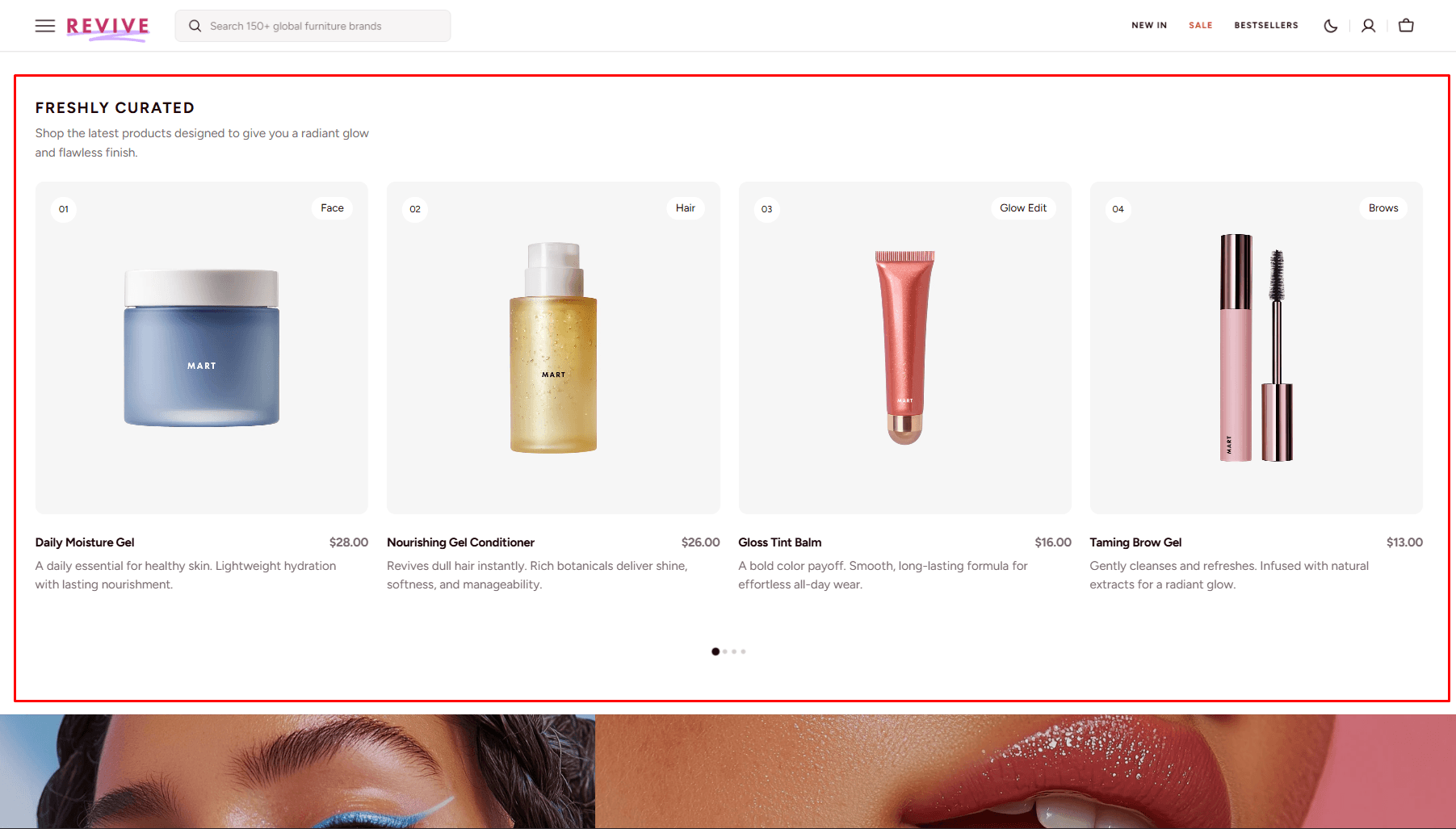
Gallery with text
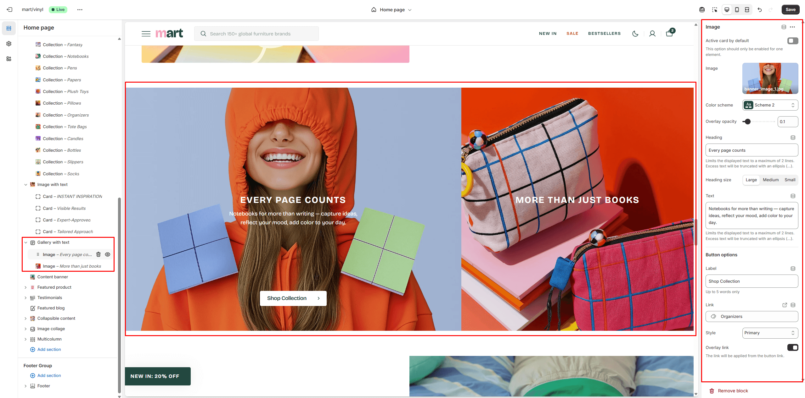
- Aspect ratio sets the aspect ratio of the image..
- Image allows you to set a image for the block.
- Use Color scheme selector to change the color scheme.
- Button options allows you to set a button and customize it.
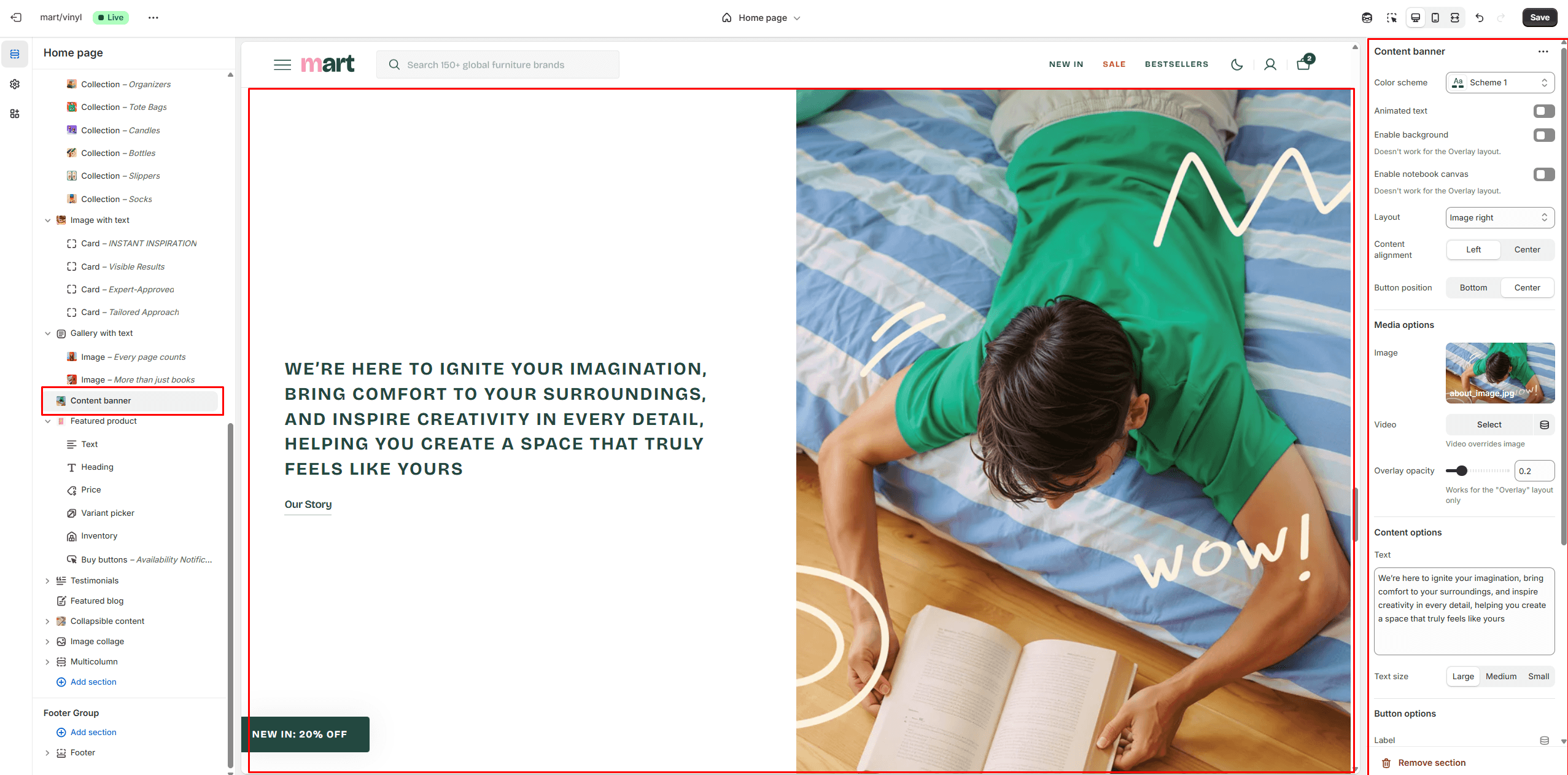
Content banner
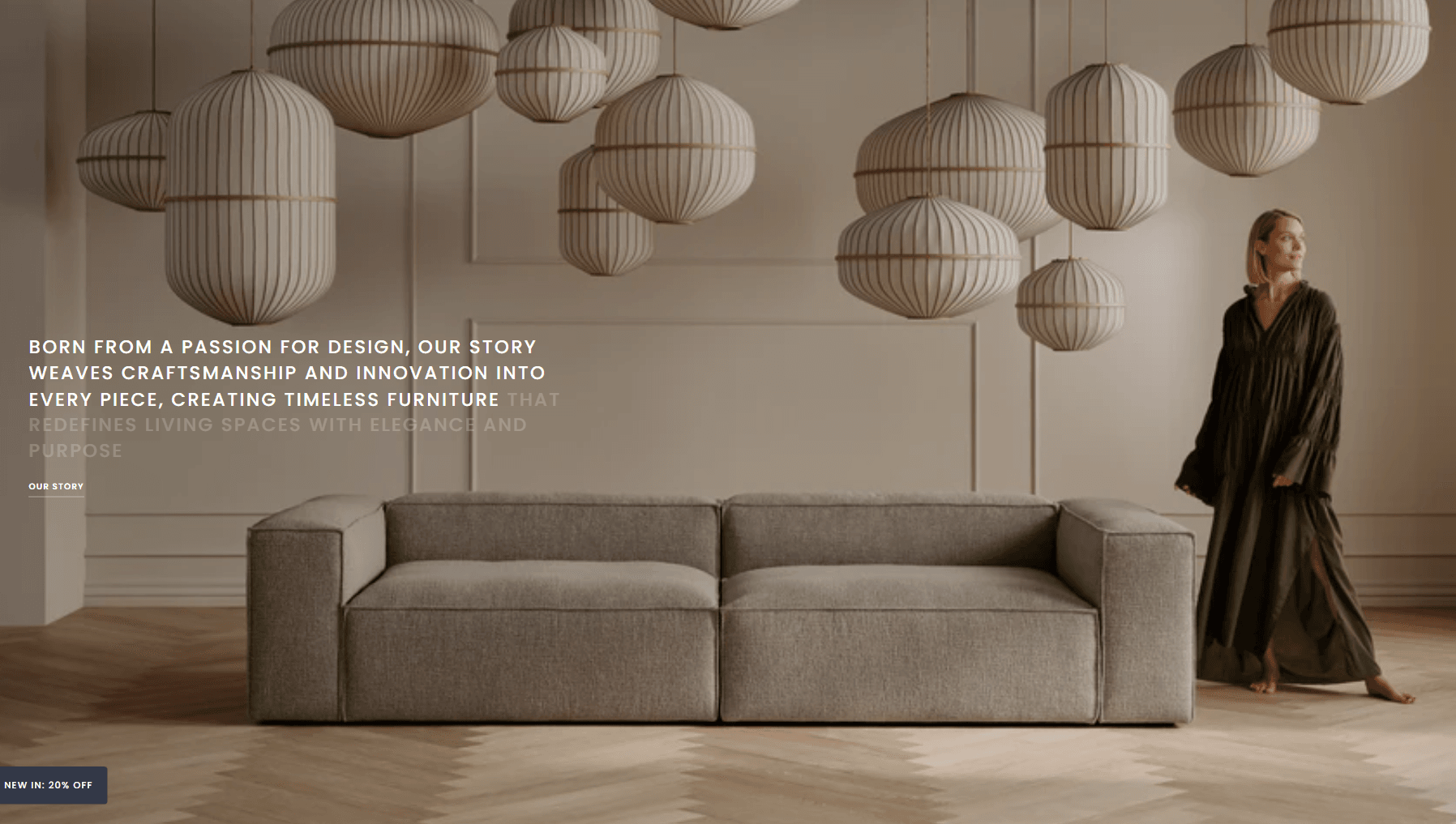
- Use Color scheme selector to change the color scheme.
- Animated text allows you to add scrolling animation for text.
- Notebook canvas allows you to add a notebook canvas pattern to the background.
- Layout selector allows you to select the layout type.
- Image allows you to set a image for the block.
- Video allows you to set a video for the section.
- Content options allows you to set text.
- Button options allows you to set a button and customize it.
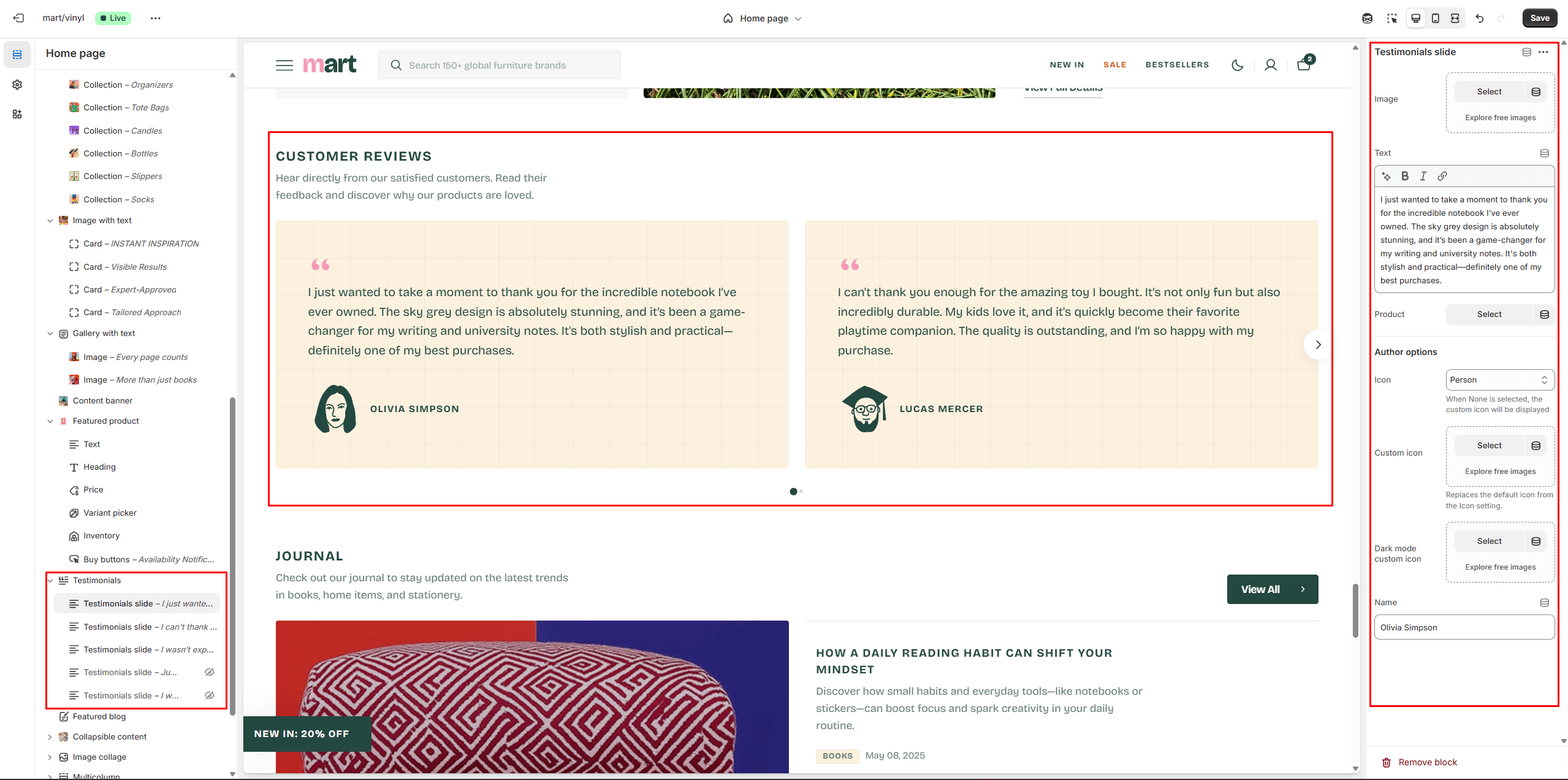
Testimonials
This section enables to add sliding product testimonials customer review.
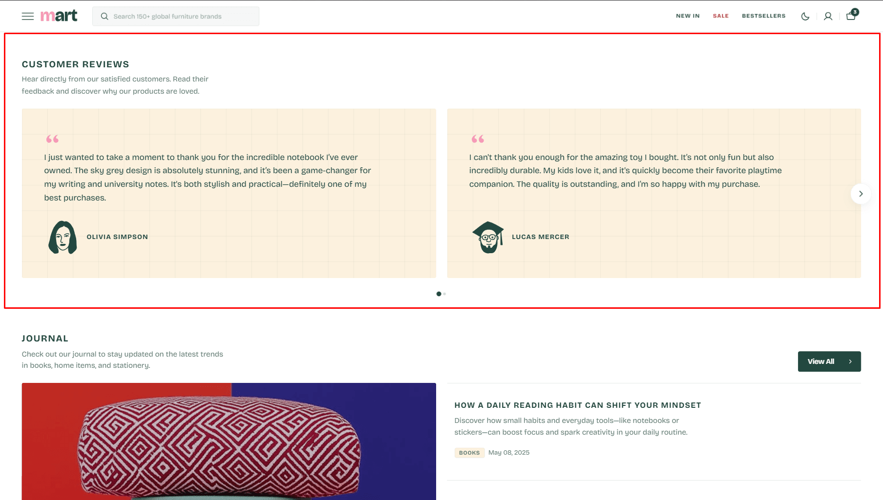
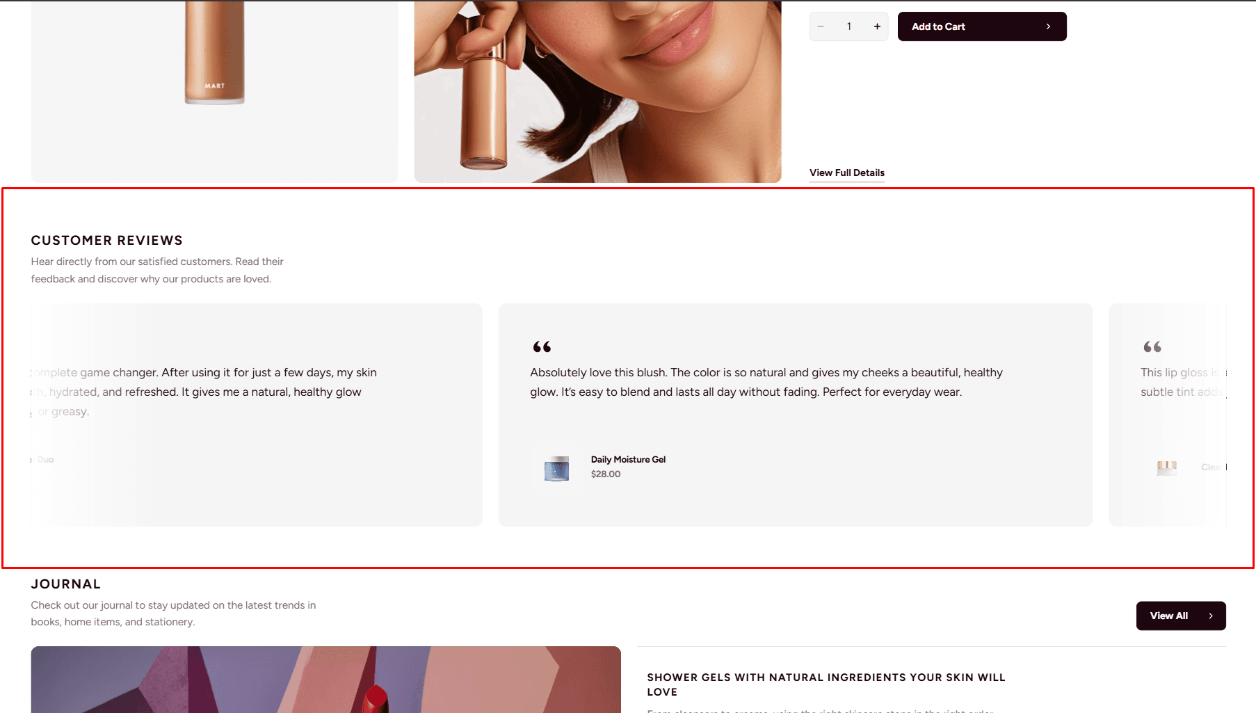
- Use Color scheme selector to change the color scheme.
- Notebook canvas allows you to add a notebook canvas pattern to the background.
- Slider options allows you to customize slider.
- Heading options allows you to set a heading and description for the section.
Featured blog
The section allows you to select a blog and customize it.
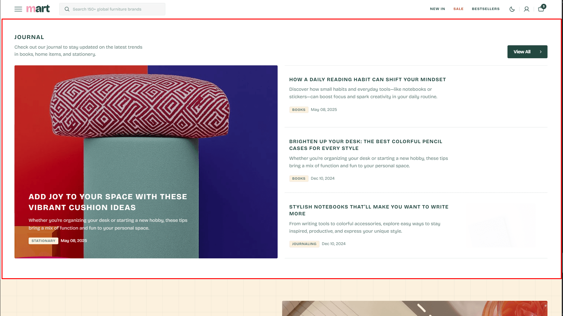
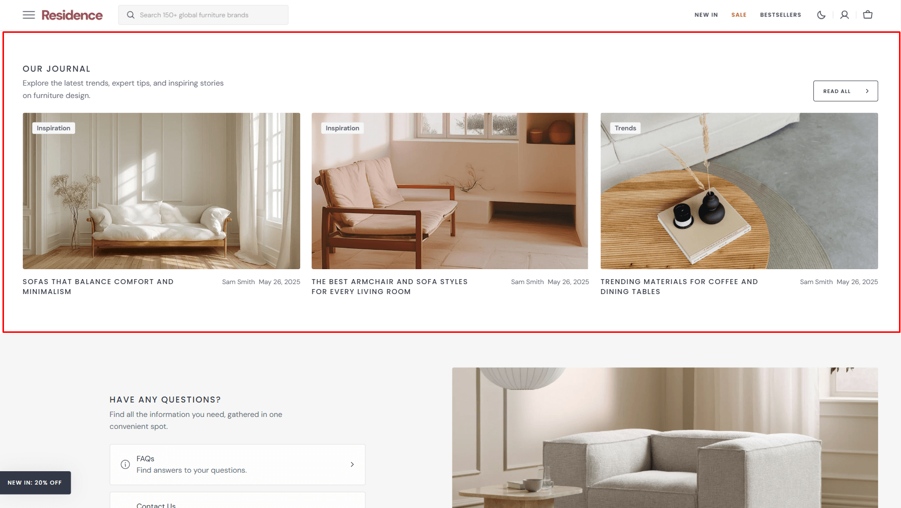
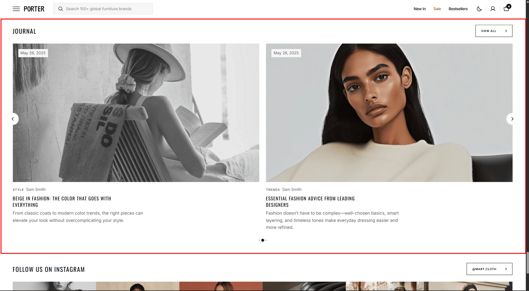
- Blog field allows you to choose a blog.
- Posts count slider allows you to change the posts display limit.
- Columns per row slider allows you to change the number of posts per line only on desktop devices.
- Content layout field allows you to select layout type.
- Overlay opacity slider allows you to change the opacity of the overlay.
- Show featured image field enables the display of an image for the blog post.
- Show tags field enables the display of tags for the blog post.
- Show date field enables the display of the date for the blog post.
- Show author field enables the display of the author for the blog post.
- Show excerpt field enables the display of the excerpt for the blog post.
- Slider options allows you to customize slider.
- Image options allow you to set the aspect ratio of the post image.
- Heading options allows you to set a heading and description for the section.
- Button options allows you to display of a button linking to all blog posts.
Collapsible Content
You can add and customize a Collapsible Content section, such as using it for FAQs.
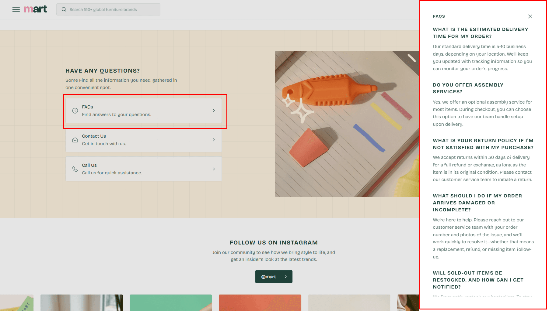
- Use Color scheme selector to change the color scheme.
- Image allows you to set a image for the block.
- Video allows you to set a video for the section.
- Aspect ratio sets the aspect ratio of the image.
- Notebook canvas allows you to add a notebook canvas pattern to the background.
- Heading allows you to set a heading for the section.
- Heading size selector field allows you to change the size of the section header.
- Description allows you to set a description for the section.
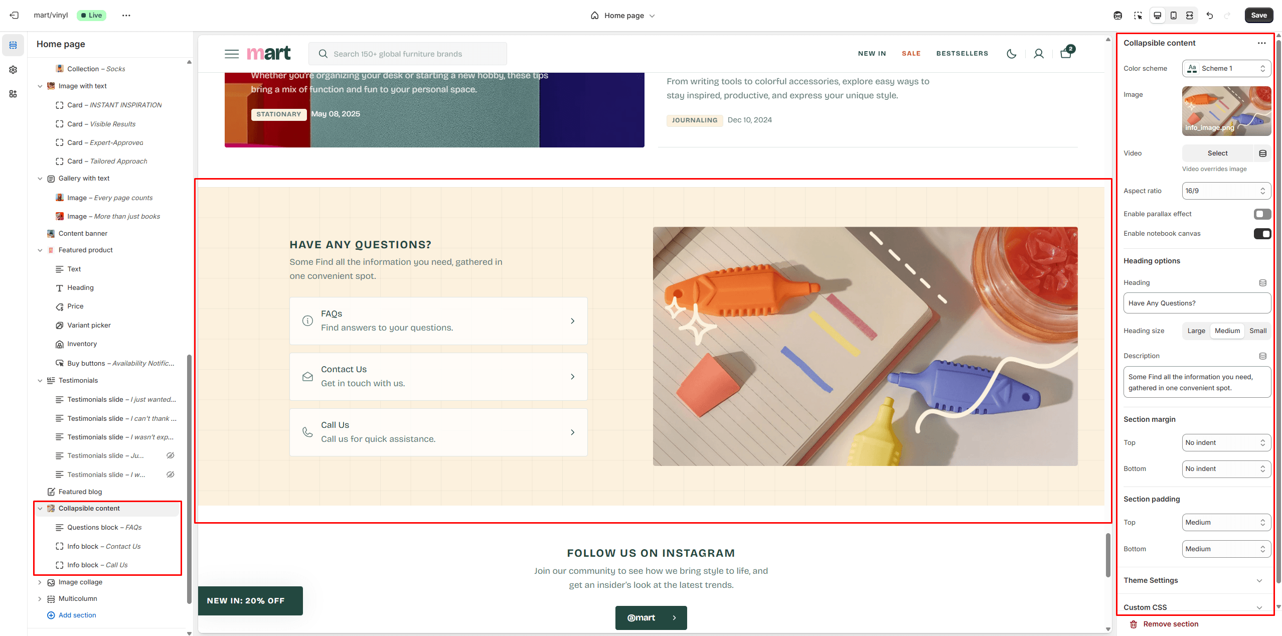
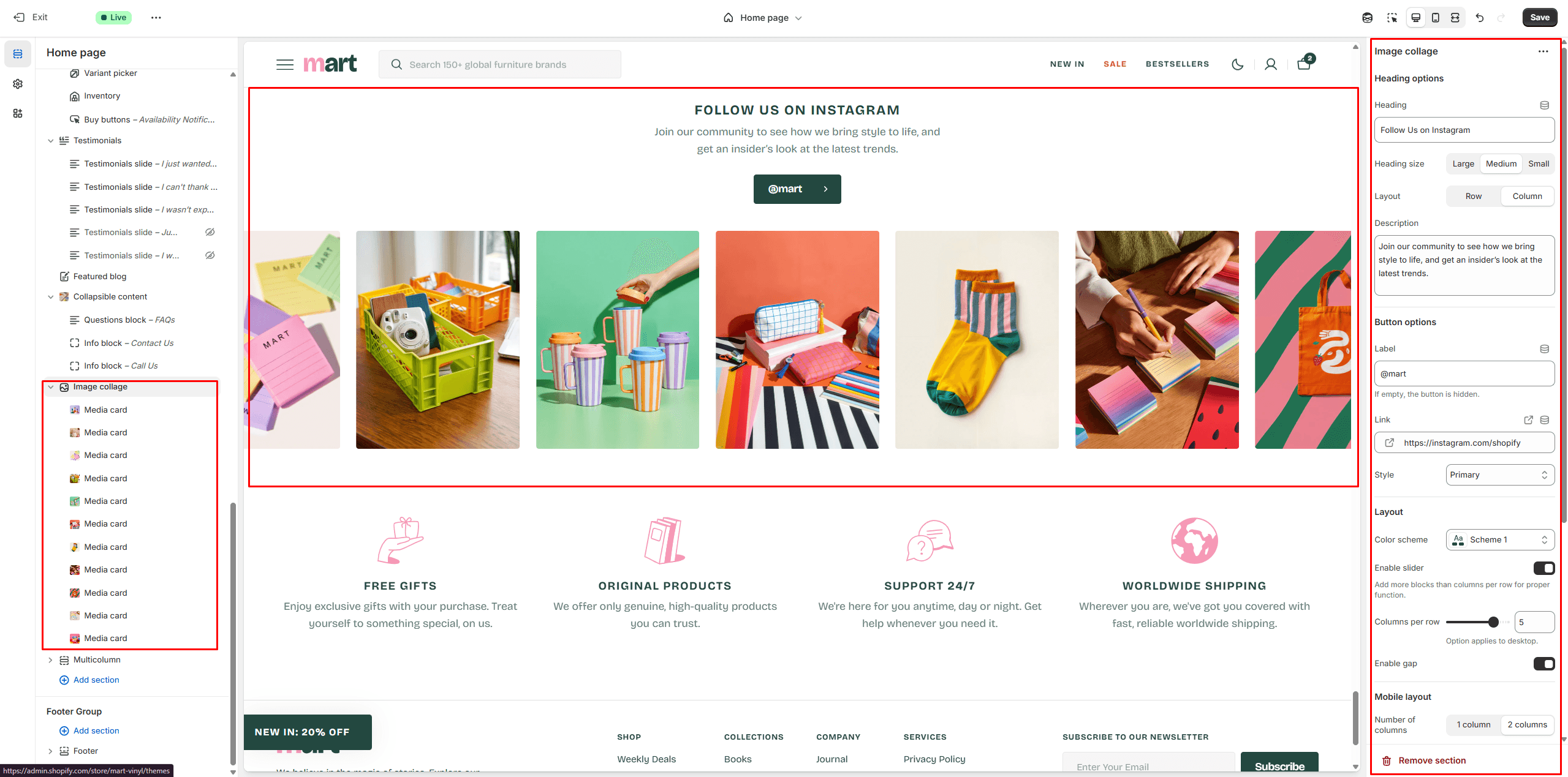
Image collage
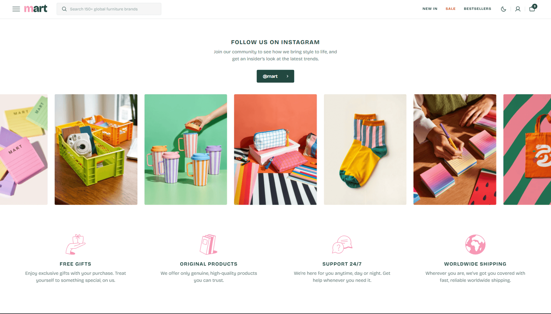
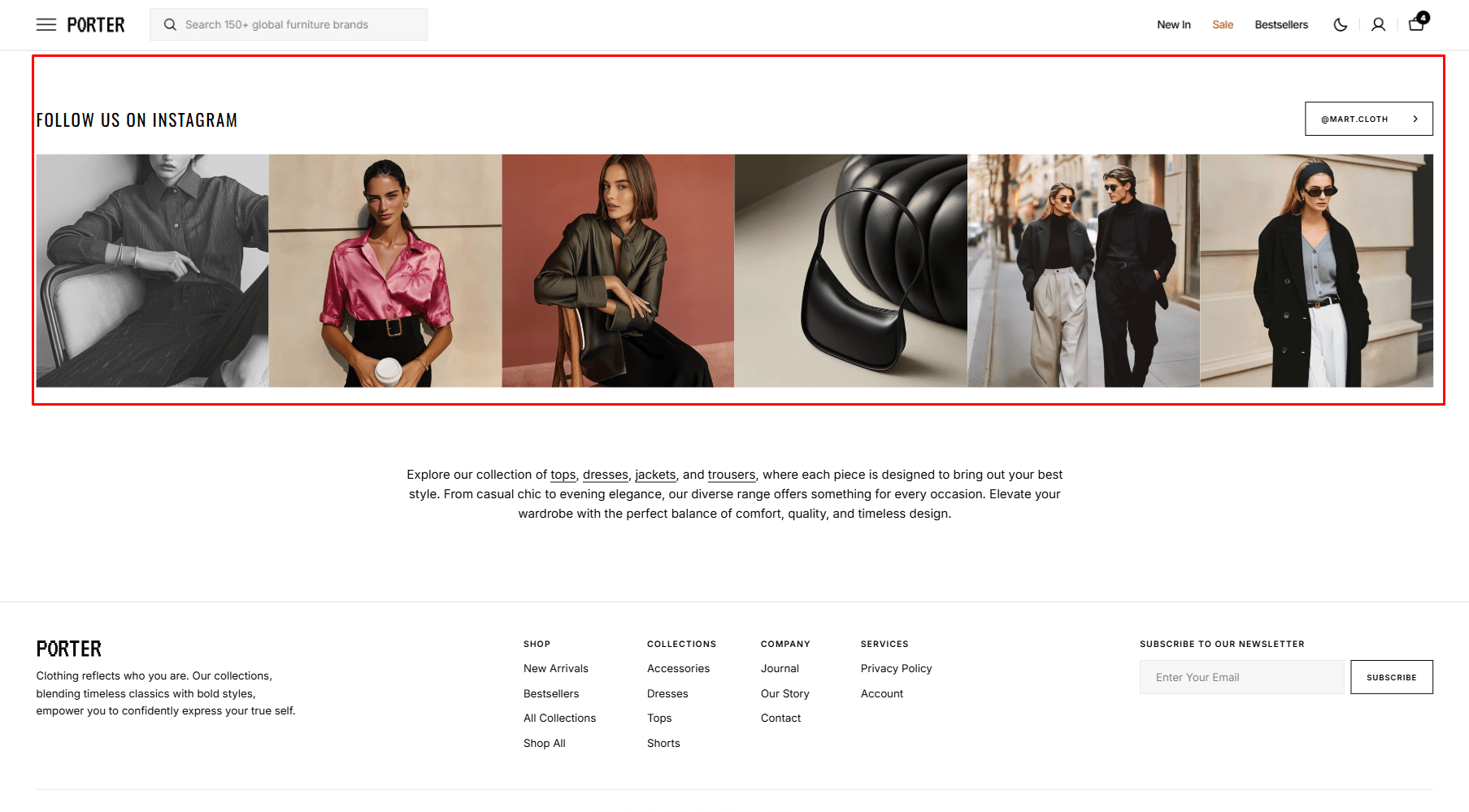
- Heading allows you to set a heading for the section.
- Heading size selector field allows you to change the size of the section header.
- Description allows you to set a description for the section.
- Layout selector allows you to select the layout type.
- Button options allows you to set a button and customize it.
- Use Color scheme selector to change the color scheme.
- Columns per row slider allows you to change the number of blocks per line only on desktop devices.
- Image options allow you to set the aspect ratio of the block image.
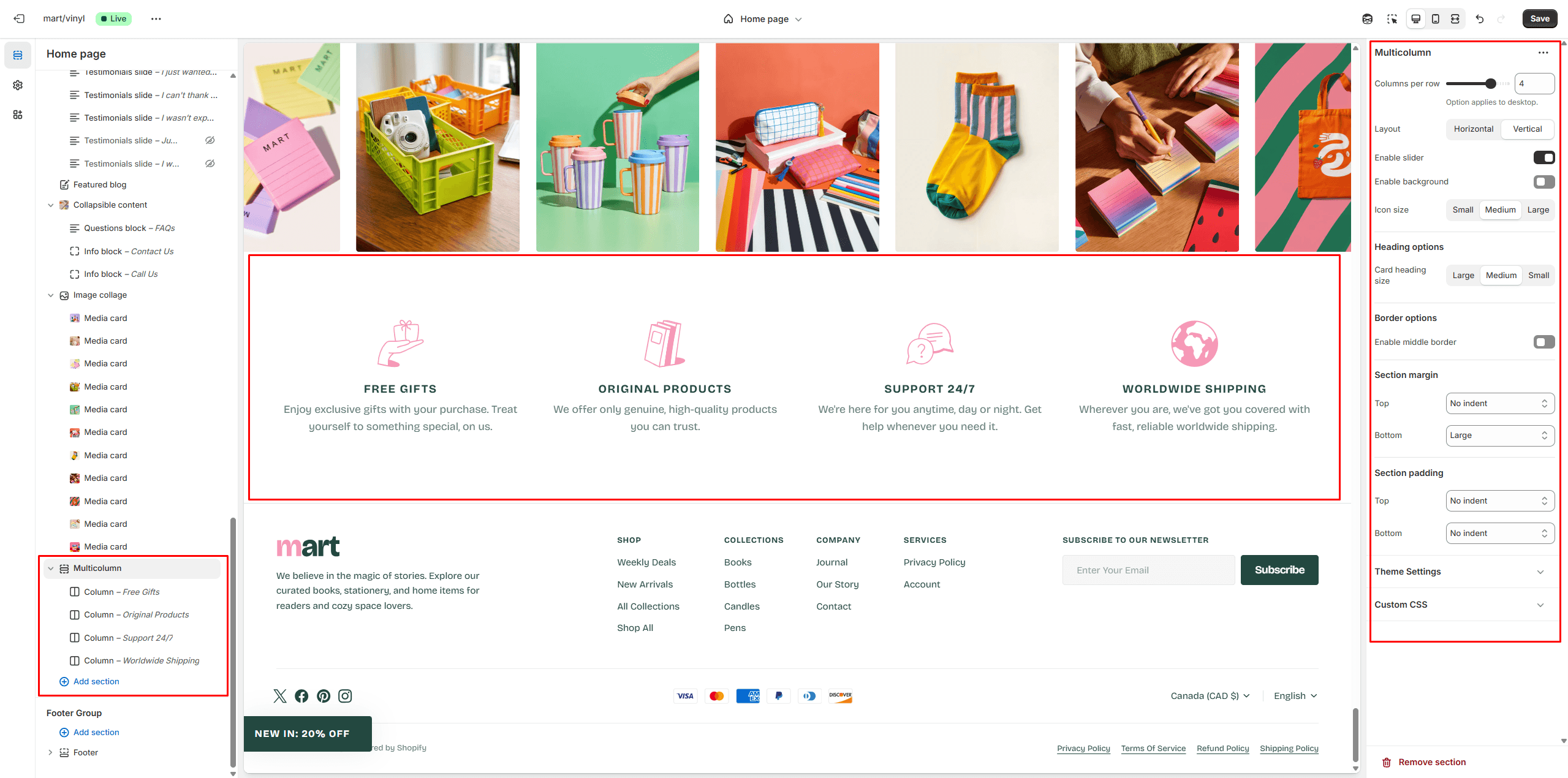
Multicolumn
Allows you to add blocks and customize them.
- Columns per row slider allows you to change the number of blocks per line only on desktop devices.
- Layout selector allows you to select the layout type.
- Icon size allows you to change the size of the icon.
- Icon options allow you to choose an icon from our list or add your special icons.
- Heading allows you to set a heading for the block.
- Description allows you to set a description for the block.
- Button options allows you to set a button and customize it.
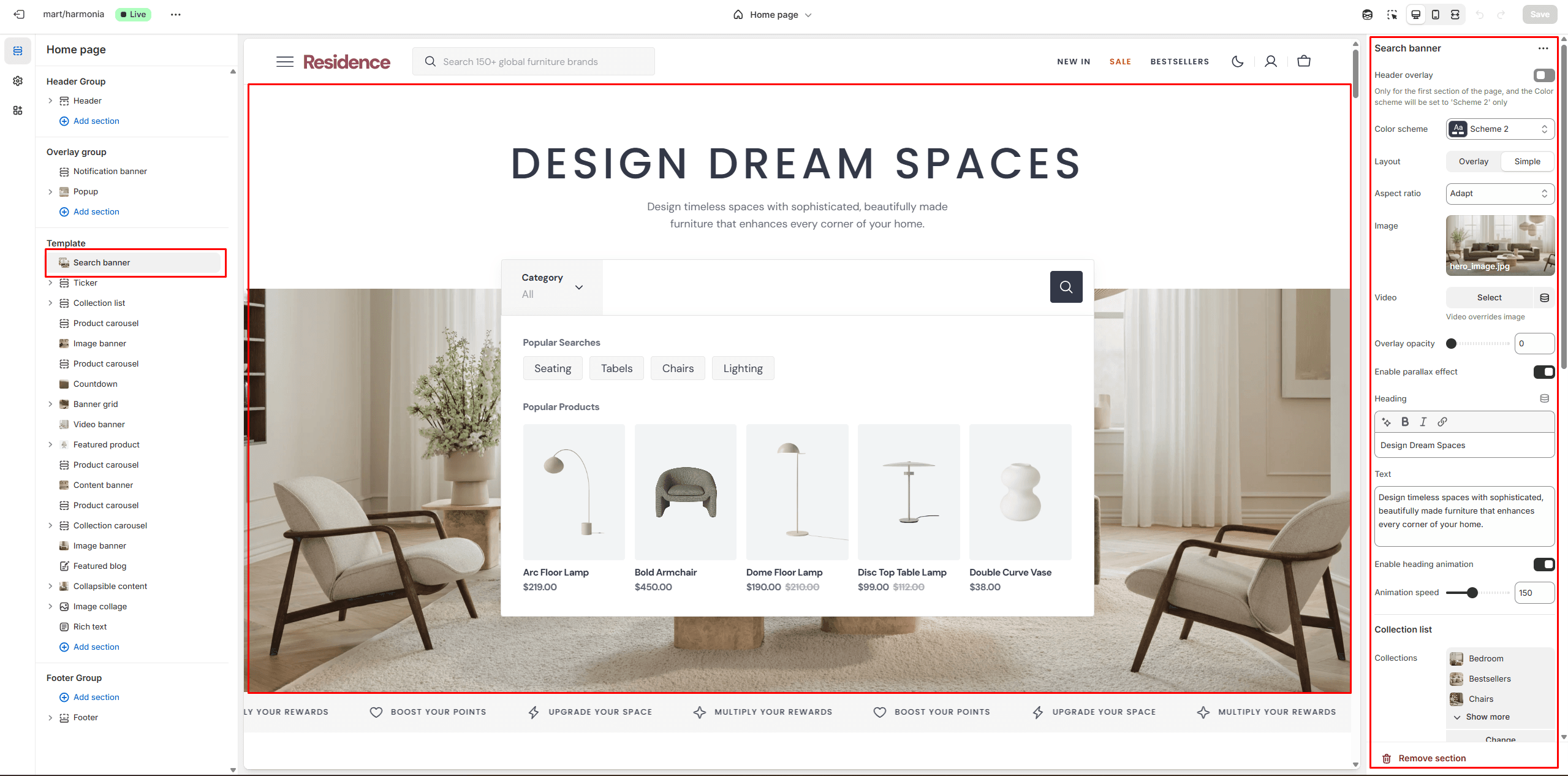
Search banner
Section allows you to add banner with search.
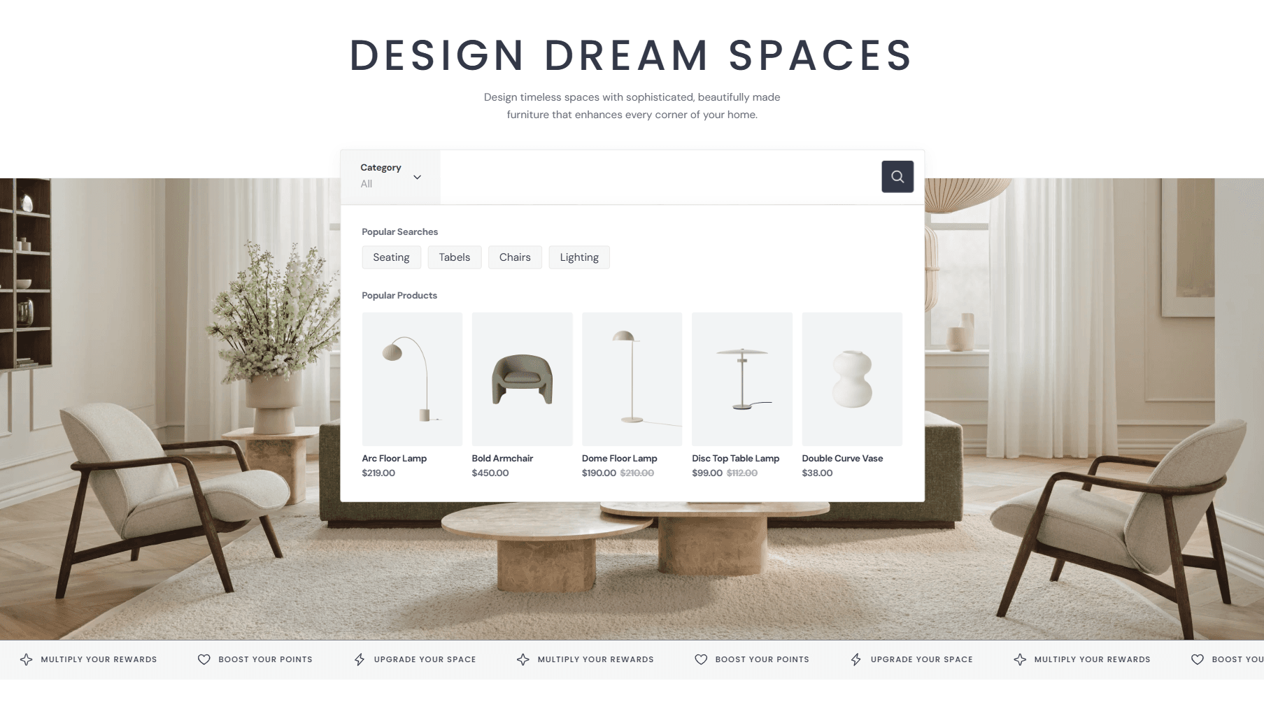
- Layout selector allows you to select the layout type.
- Use Color scheme selector to change the color scheme.
- Aspect ratio sets the aspect ratio of the image..
- Image allows you to set a image for the section.
- Video allows you to set a video for the section.
- The Collections list allows you to add collections and filter search results.
- Heading animation allows you to add typewriter animation for Heading and control the speed.
- You can also show Popular searches and Popular products and customize their display.
Brand list
Section allows you to add all the brands of your store.
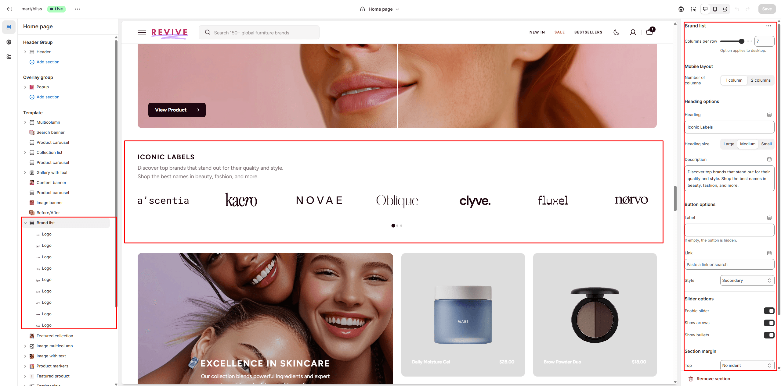
- Columns per row slider allows you to change the number of brands per line only on desktop devices.
- Heading options allows you to set texts.
- Button options allows you to set a button and customize it.
- Slider options allows you to customize slider.
Image banner
Section allows you to add content with background image
- Use Color scheme selector to change the color scheme.
- Image options allows you to set a image or video for the section.
- Content options allows you to set texts.
- Heading animation allows you to add typewriter animation for Heading and control the speed.
- Button options allows you to set a button and customize it.
Video Banner
In this section, you can add and customize an autoplay video.
- Enable scroll animation allows you to add a smooth scroll-activate effect.
- Content options allows you to set texts.
- Button options allows you to set a button and customize it.
- Video options allow you to add a video and customize its display.
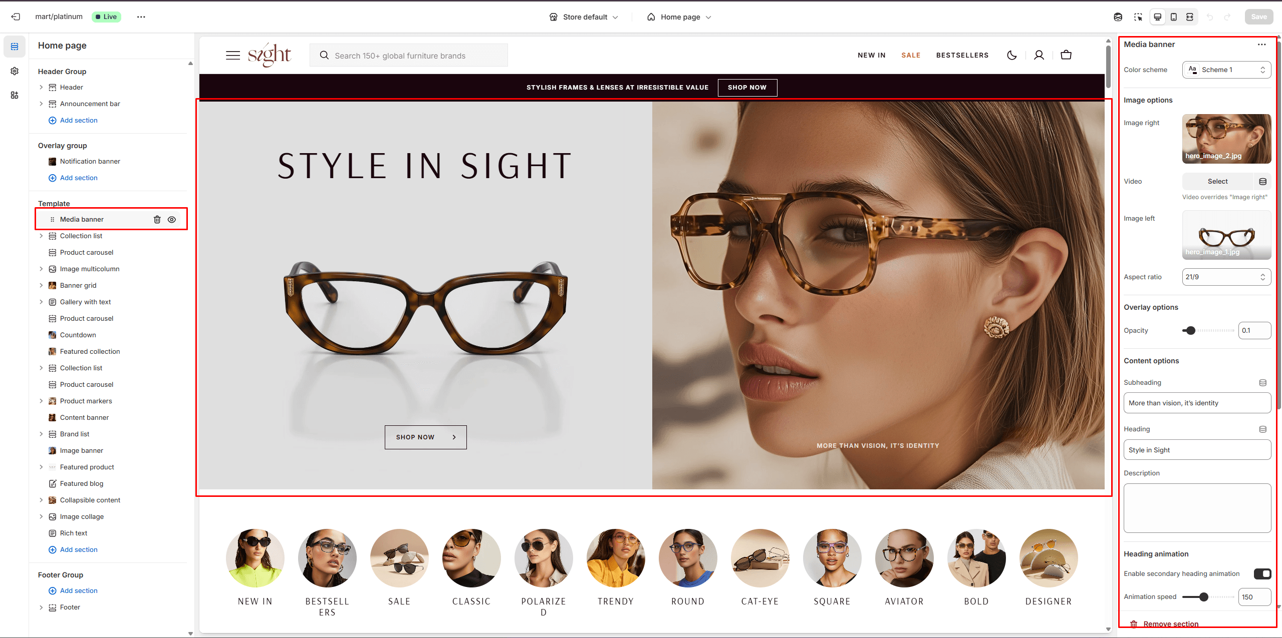
Media banner
Section allows you to add content with image
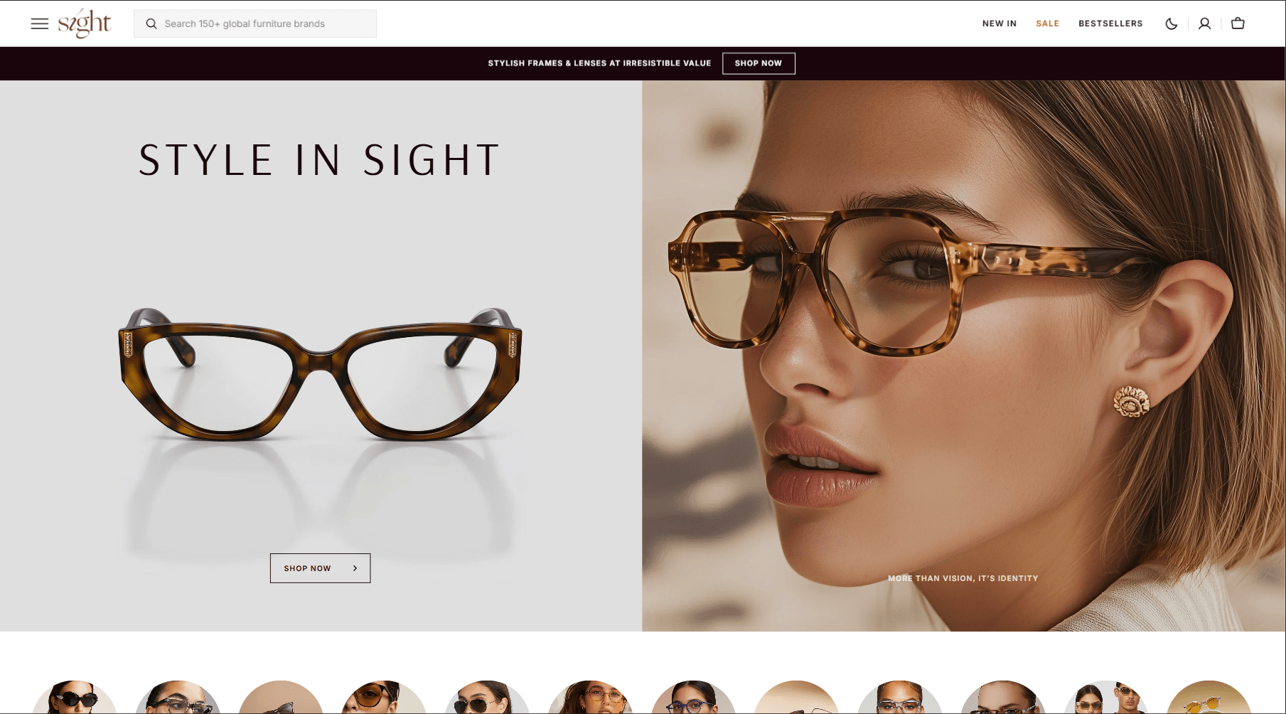
- Use Color scheme selector to change the color scheme.
- Image options allows you to set a image or video for the section and its display.
- Content options allows you to set texts.
- Heading animation allows you to add typewriter animation for Heading and control the speed.
- Button options allows you to set a button and customize it.
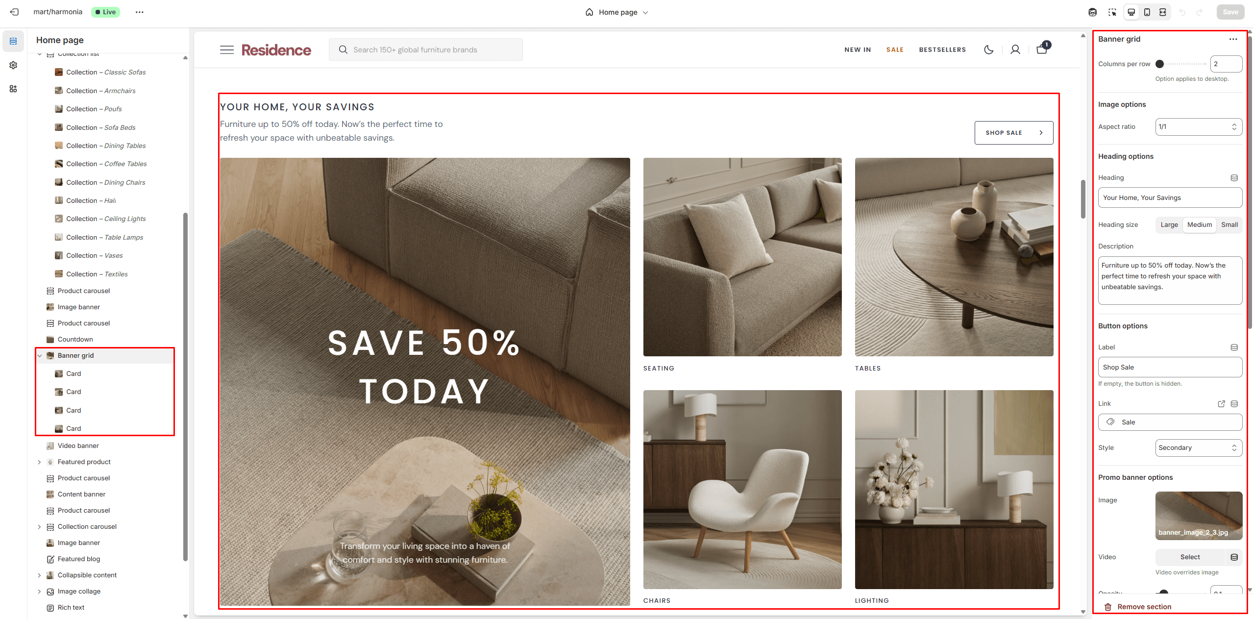
Banner grid
- Columns per row slider allows you to change the number of blocks per line only on desktop devices.
- Image options allows you to set the aspect ratio of images.
- Heading options allows you to set texts.
- Button options allows you to set a button and customize it.
- Heading animation allows you to add typewriter animation for Heading and control the speed.
- Promo banner options allows you to add an image and content and customize its display.
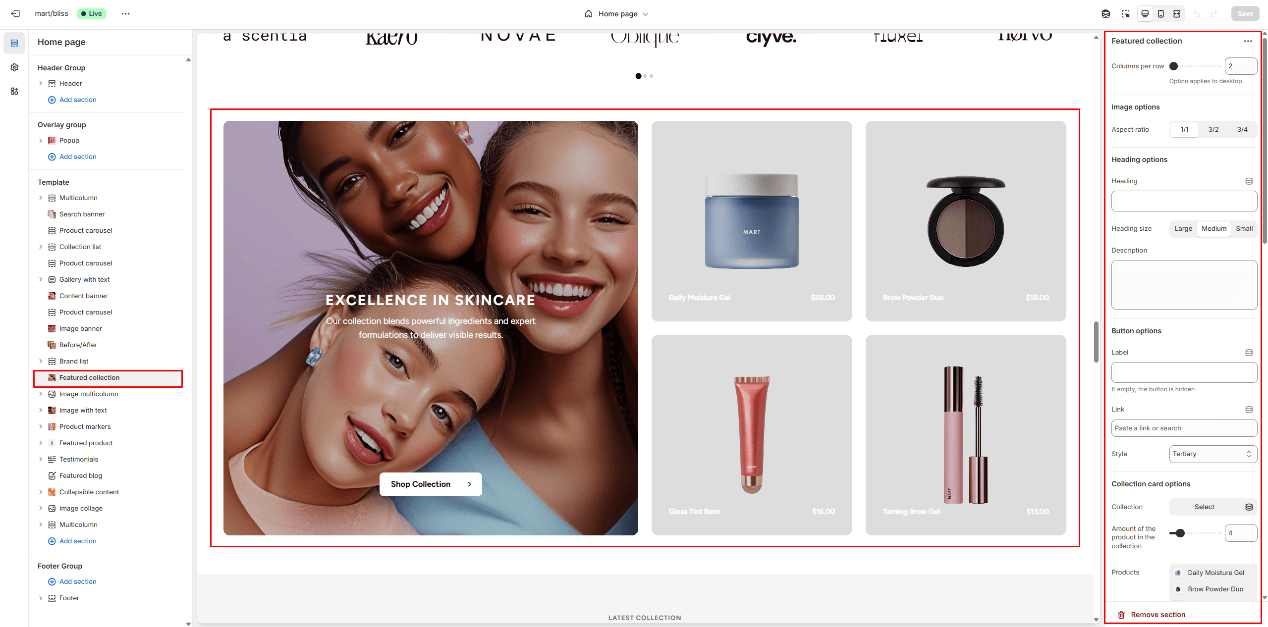
Featured collection
- Columns per row slider allows you to change the number of blocks per line only on desktop devices.
- Image options allows you to set the aspect ratio of images.
- Heading options allows you to set texts.
- Button options allows you to set a button and customize it.
- Collection card options allows you to add an image or video, as well as content, and customize its display.
- Product card options allow you to customize product cards in the section.
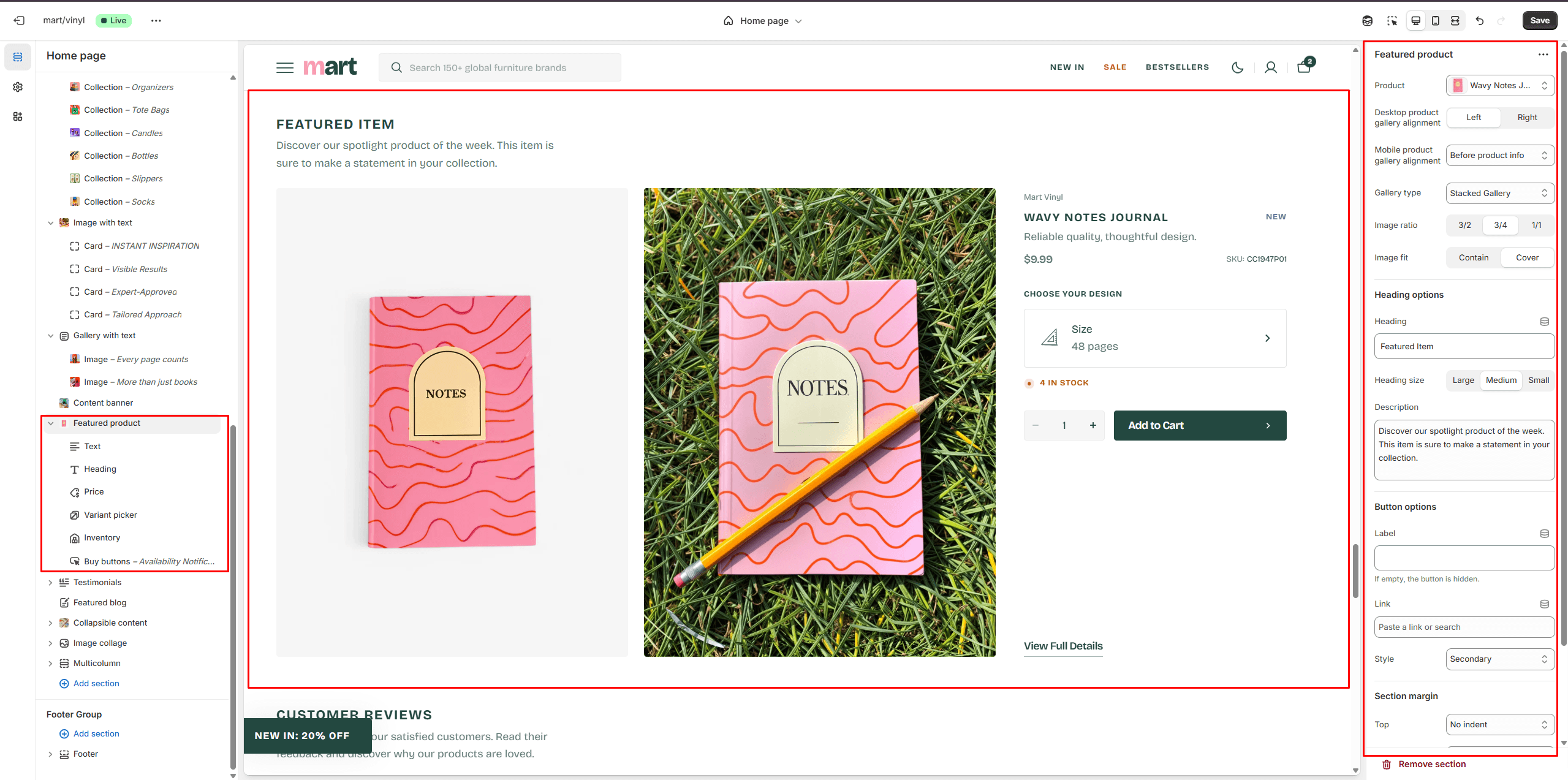
Featured Product
This section allows you to display a single product and highlight its key information.
Page
Information on topic pages includes relevant details.
Product Page
There’re 2 types of Gallery:
- Slider with Previews
- Stacked Gallery
Product Information
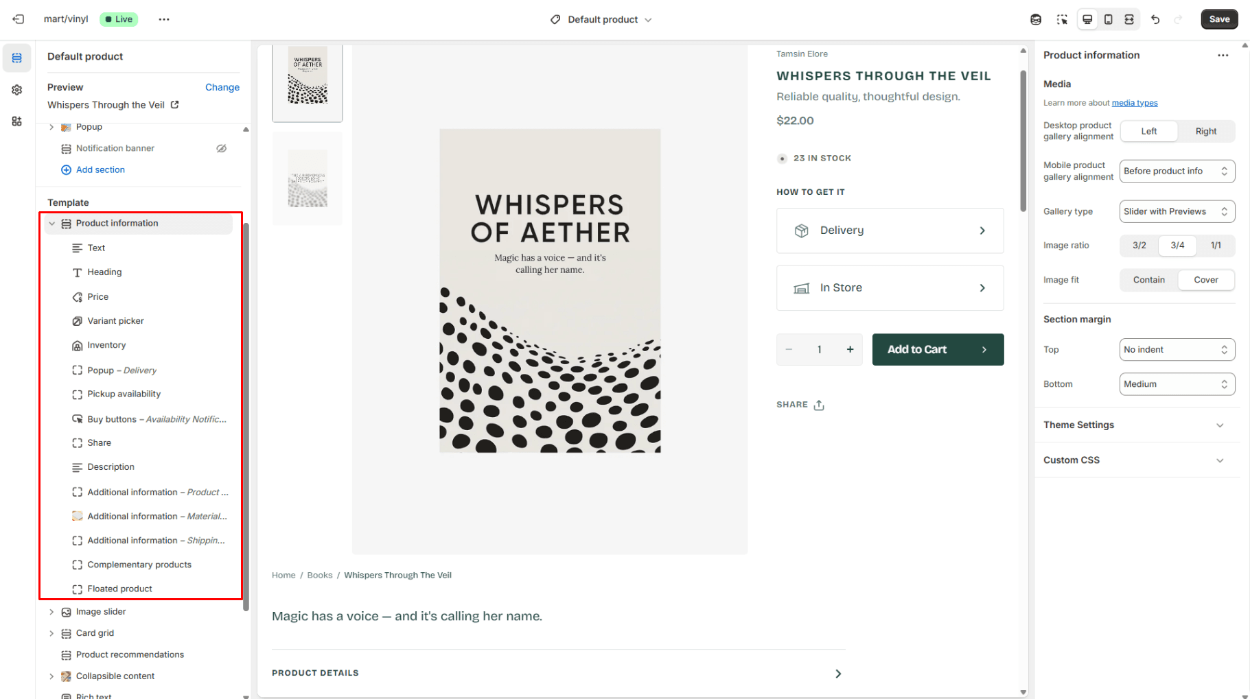
- Desktop product gallery alignment selector allows you to choose alignment type on desktop devices.
- Mobile product gallery alignment selector allows you to choose alignment type on mobile devices.
- Gallery type selector allows you to choose gallery type.
- Block Text allows you to enable brand/vendor.
- Block Inventory allows you to enable inventory status.
- Block Pickup availability allows you to display store availability.
- Block Popup allows you to enable and customize popup modals.
- Block Buy buttons option Show dynamic checkout buttons using the payment methods available on your store, customers see their preferred option, like PayPal or Apple Pay.
- Block Additional information enables you to feature collapsible content or popup modal.
- Block Floated product allows you to display a floating modal which is showing on scroll.
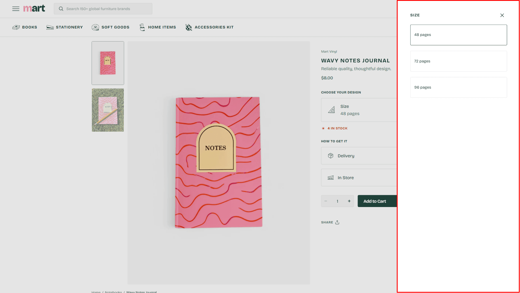
Variant picker
There’re 3 types of Variant picker
- Pills
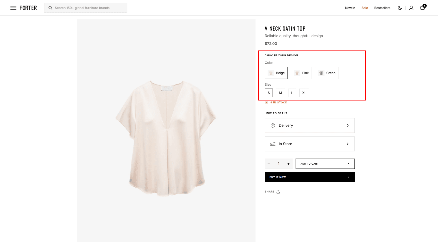
- Dropdown
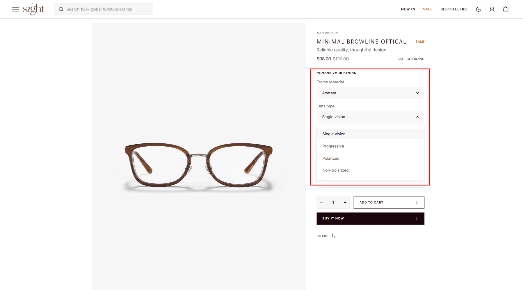
- Popup - Variants are displayed on modals.
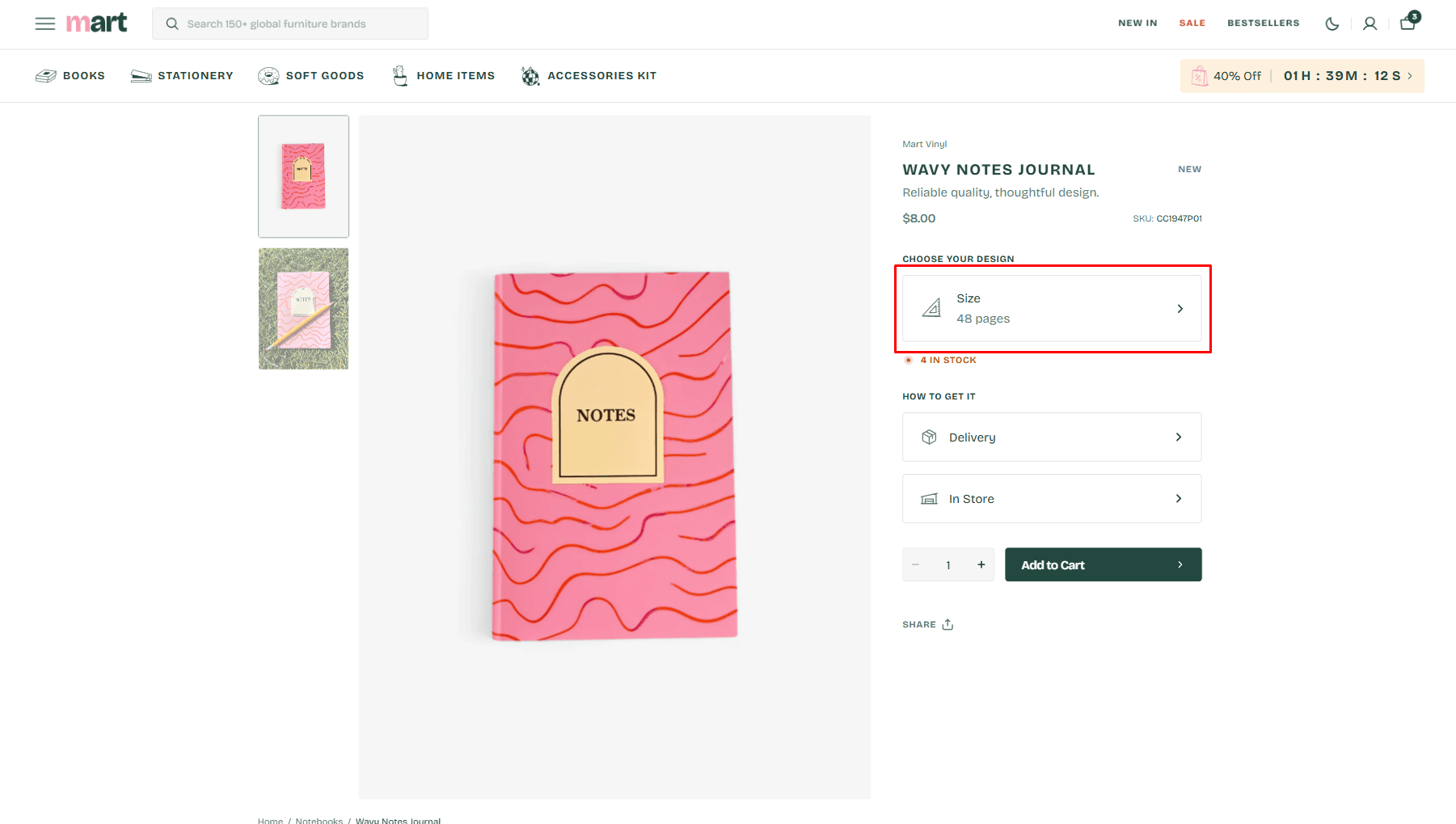
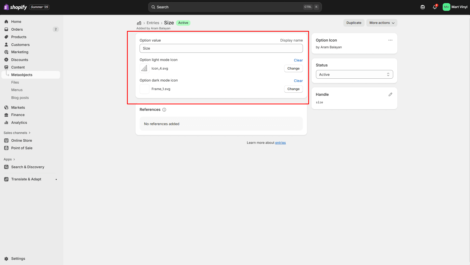
Option icon
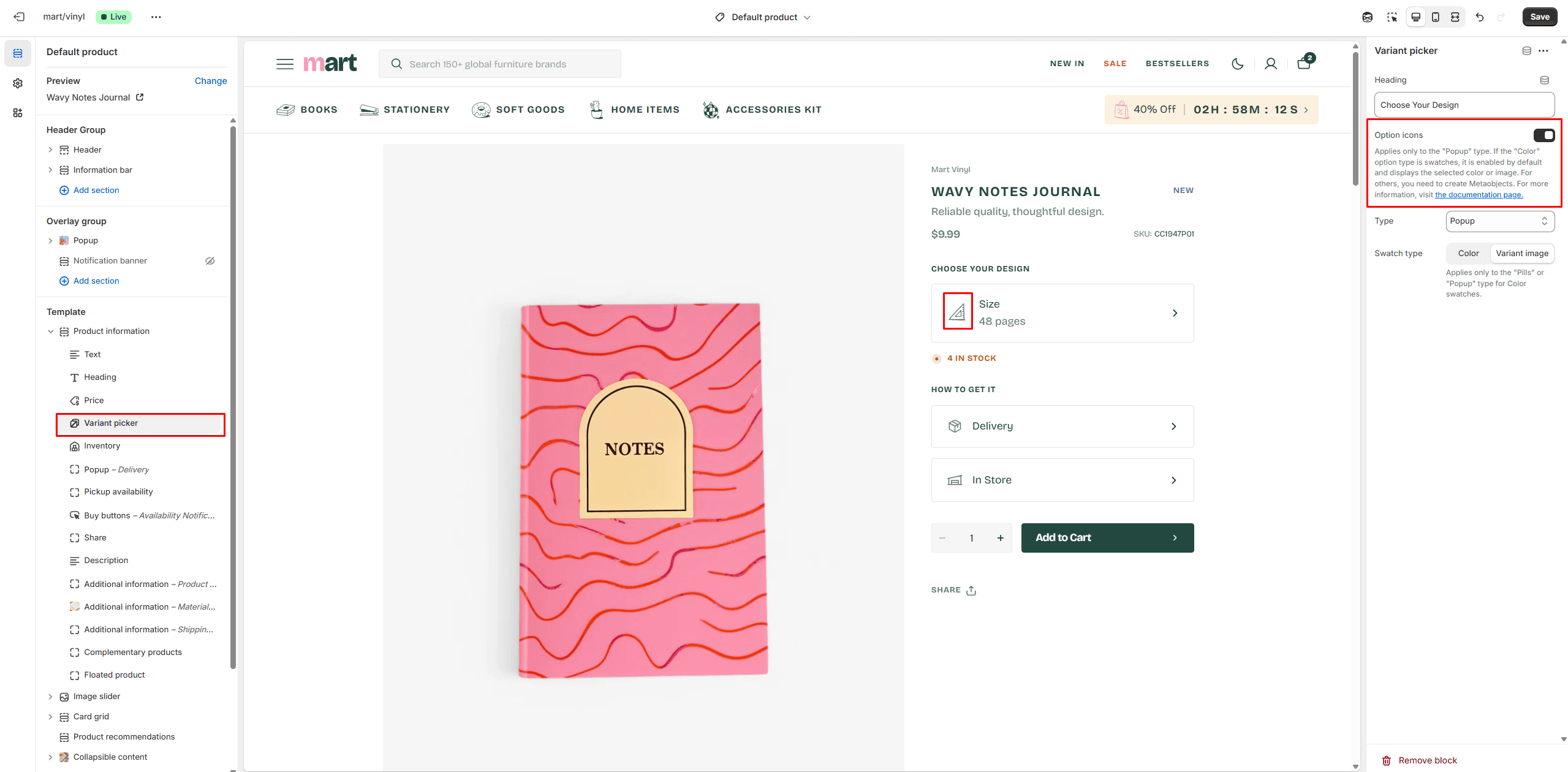
For Popup variant you can use Option icons, its allows you to choose an Icon for each variant. If the "Color" option type is swatches, it is enabled by default and displays the selected color or image. For others, you need to create Metaobjects.
- Go to Settings > Metafields and metaobjects in the Admin Panel.
- Find the Metaobject definitions and Click the button "Add definition" and fill the fields.
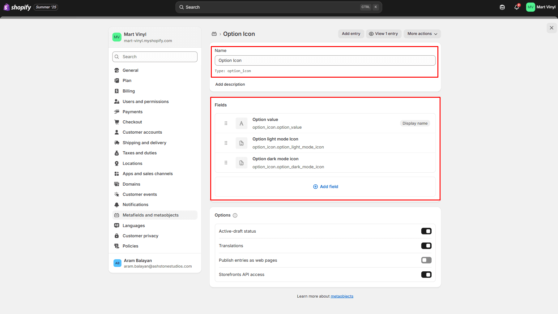
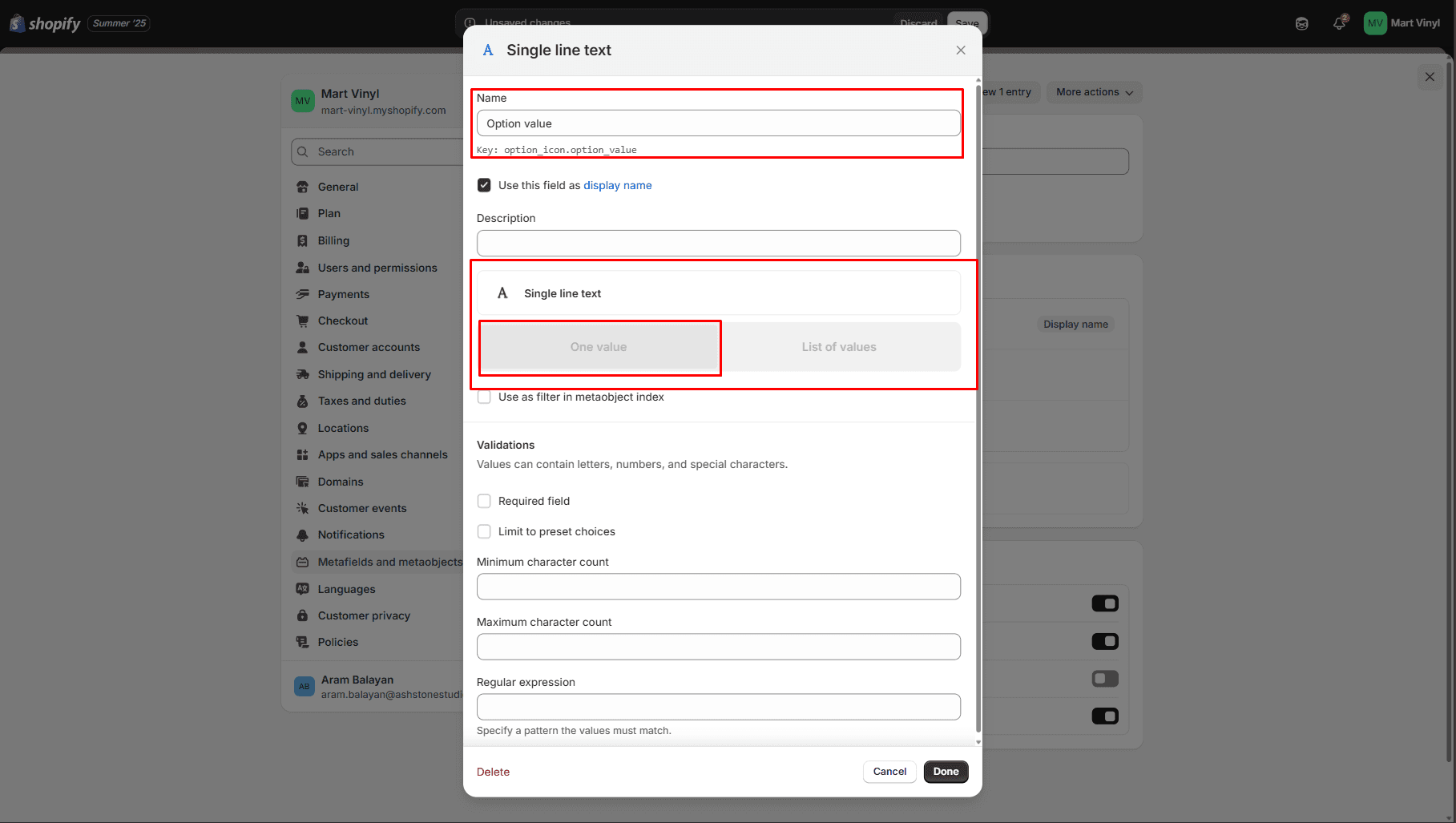
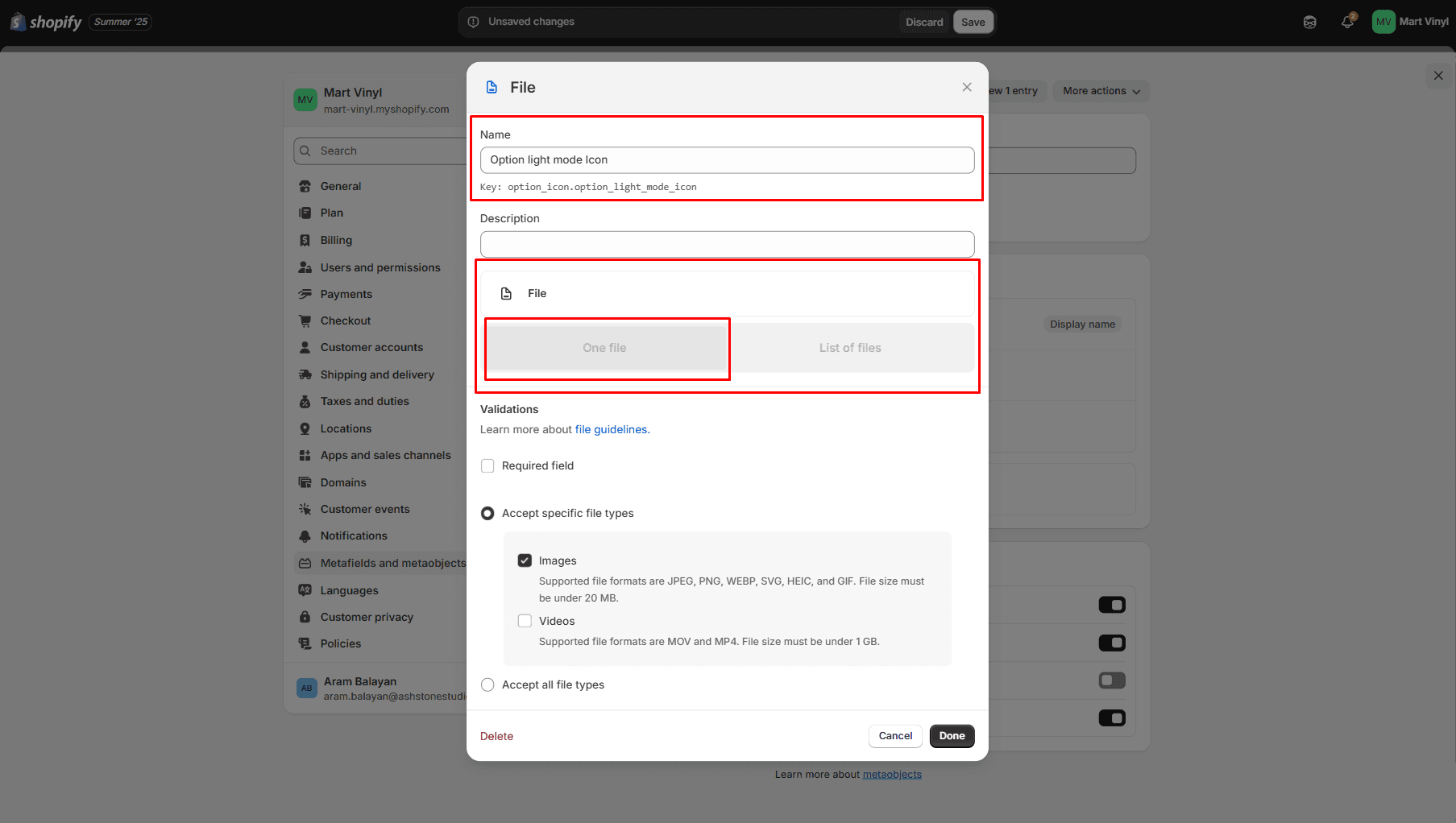
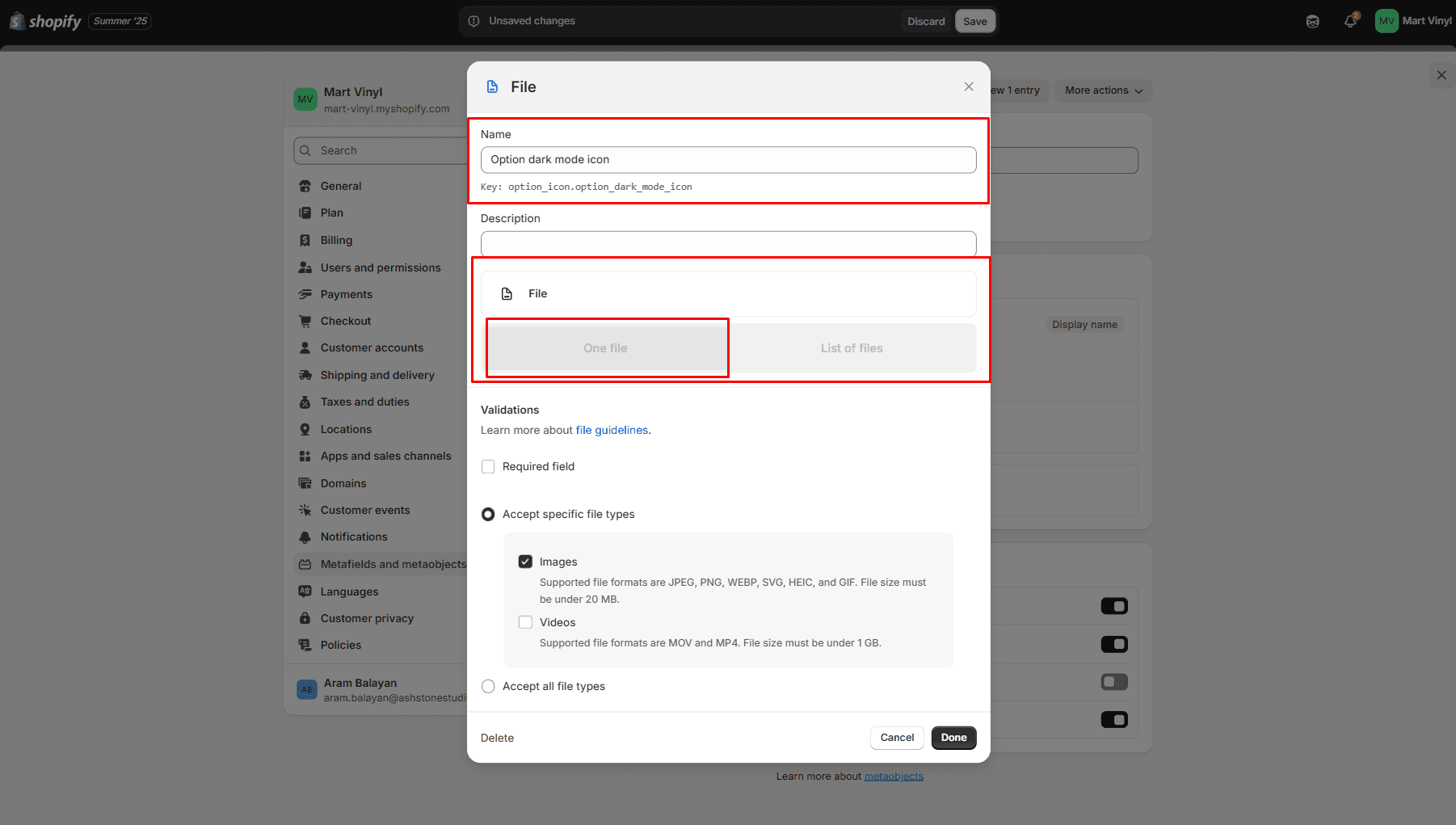
- Go to Content > Metaobjects in the General panel.
- Select Option Icon
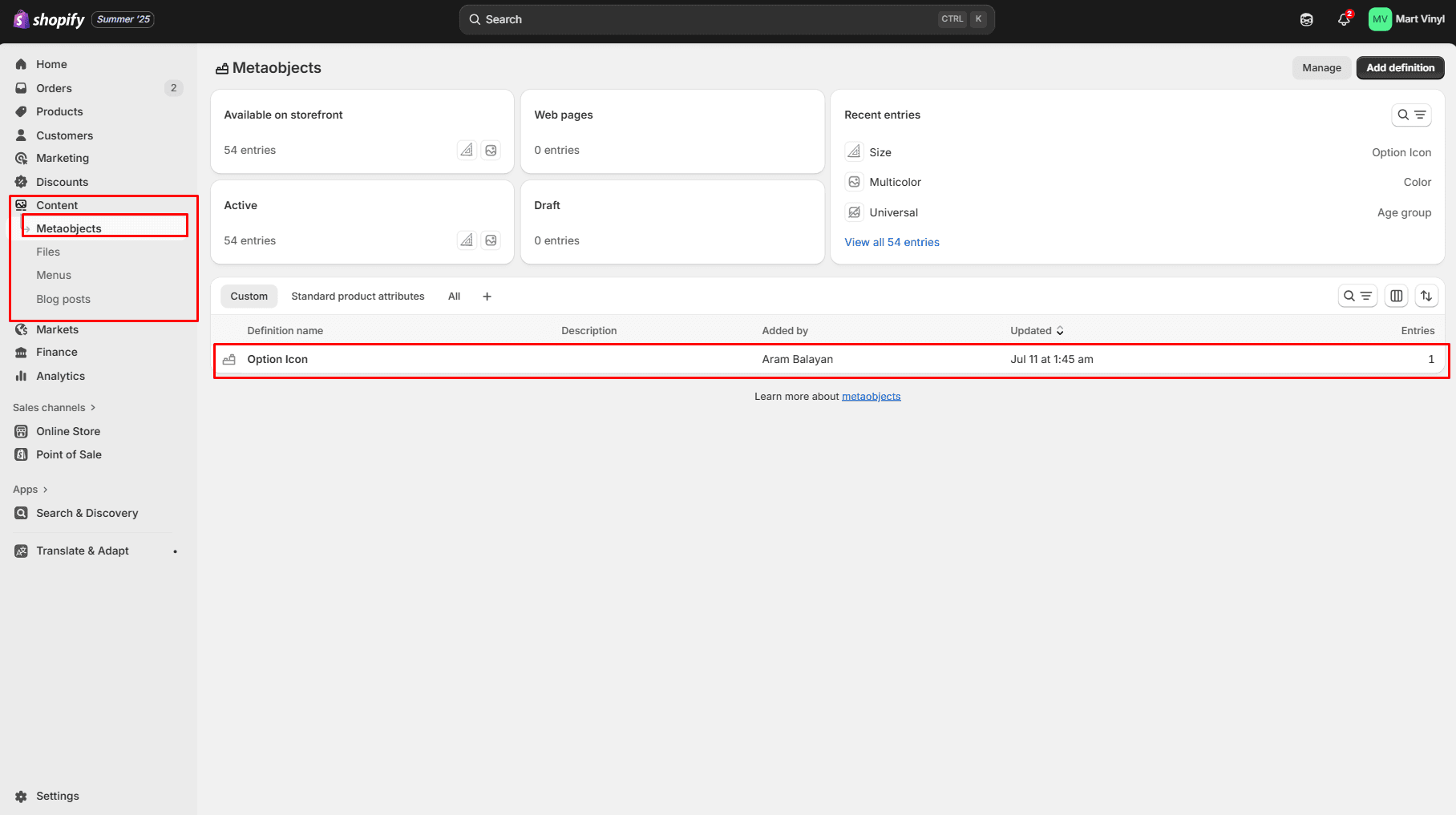
- Click the button "Add entry" and fill the fields.
Product Recommendations
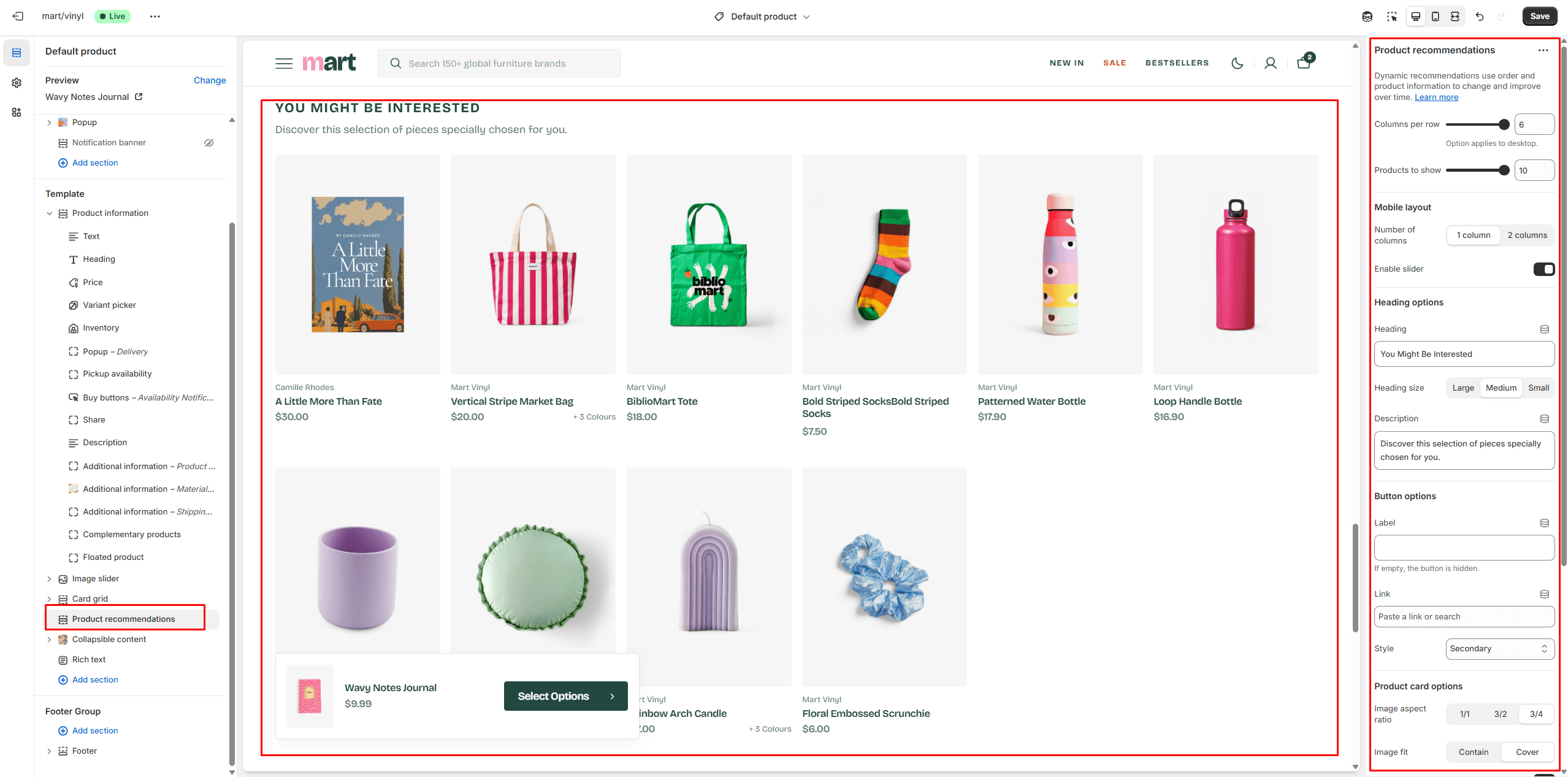
Dynamic recommendations use order and product information to change and improve over time.
To add and edit product recommendations, follow these steps:
- Install the Search & Discovery app by Shopify from the Apps page in the Admin Panel.
- Once installed, open the app and follow the 'View recommendations' link in the Feature overview section to add recommendations to your products.
Collections Page
Collection Banner
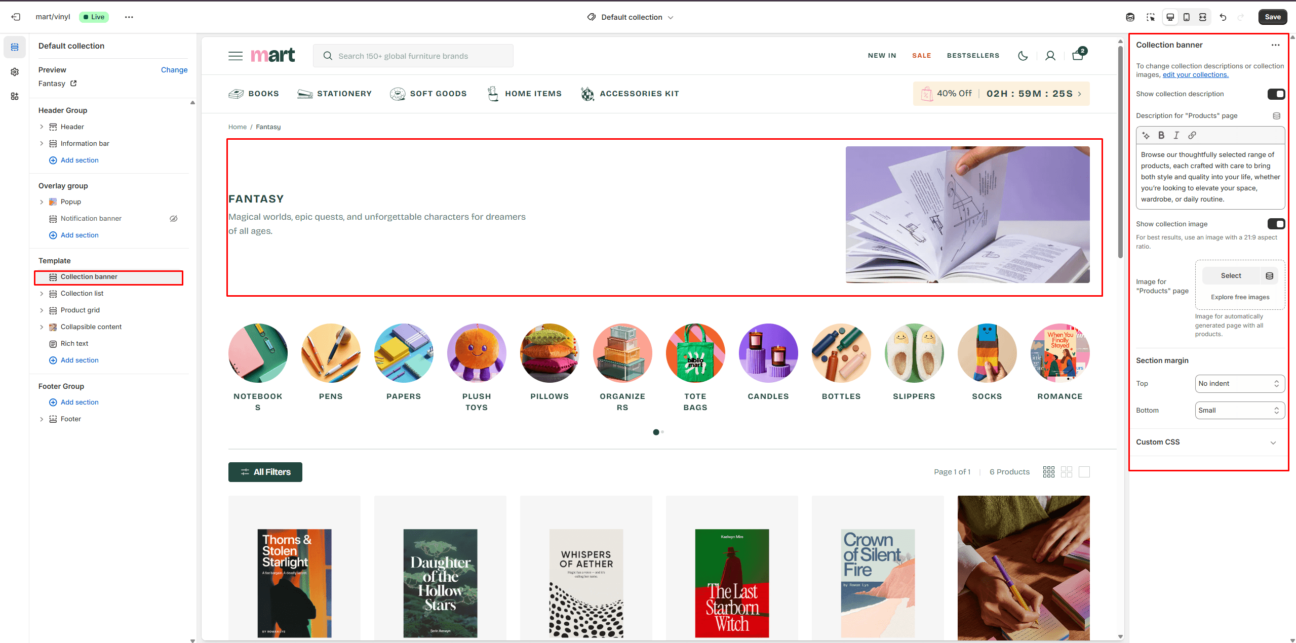
- Show collection description allows you to display the collection description.
- Show collection image allows you to display the collection image.
Product Grid
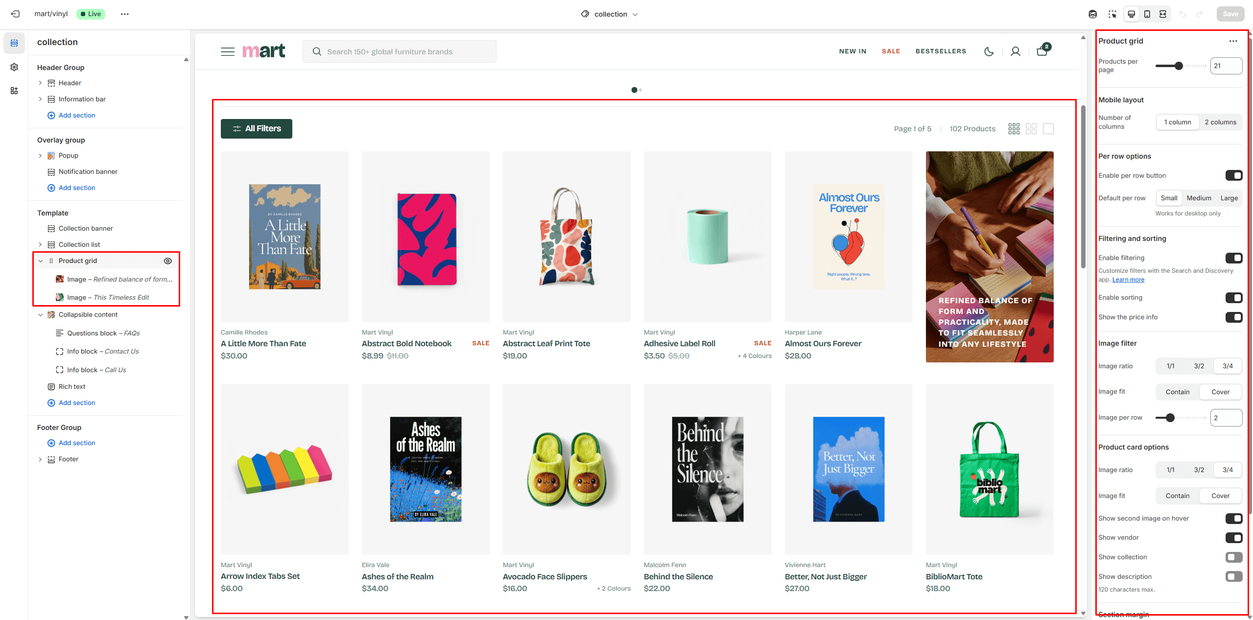
- Products per page field sets the number of displayed cards.
- Product card options allow you to customize product cards in the section.
- Enable filtering field turn filtering.
- Enable sorting field turn sorting.
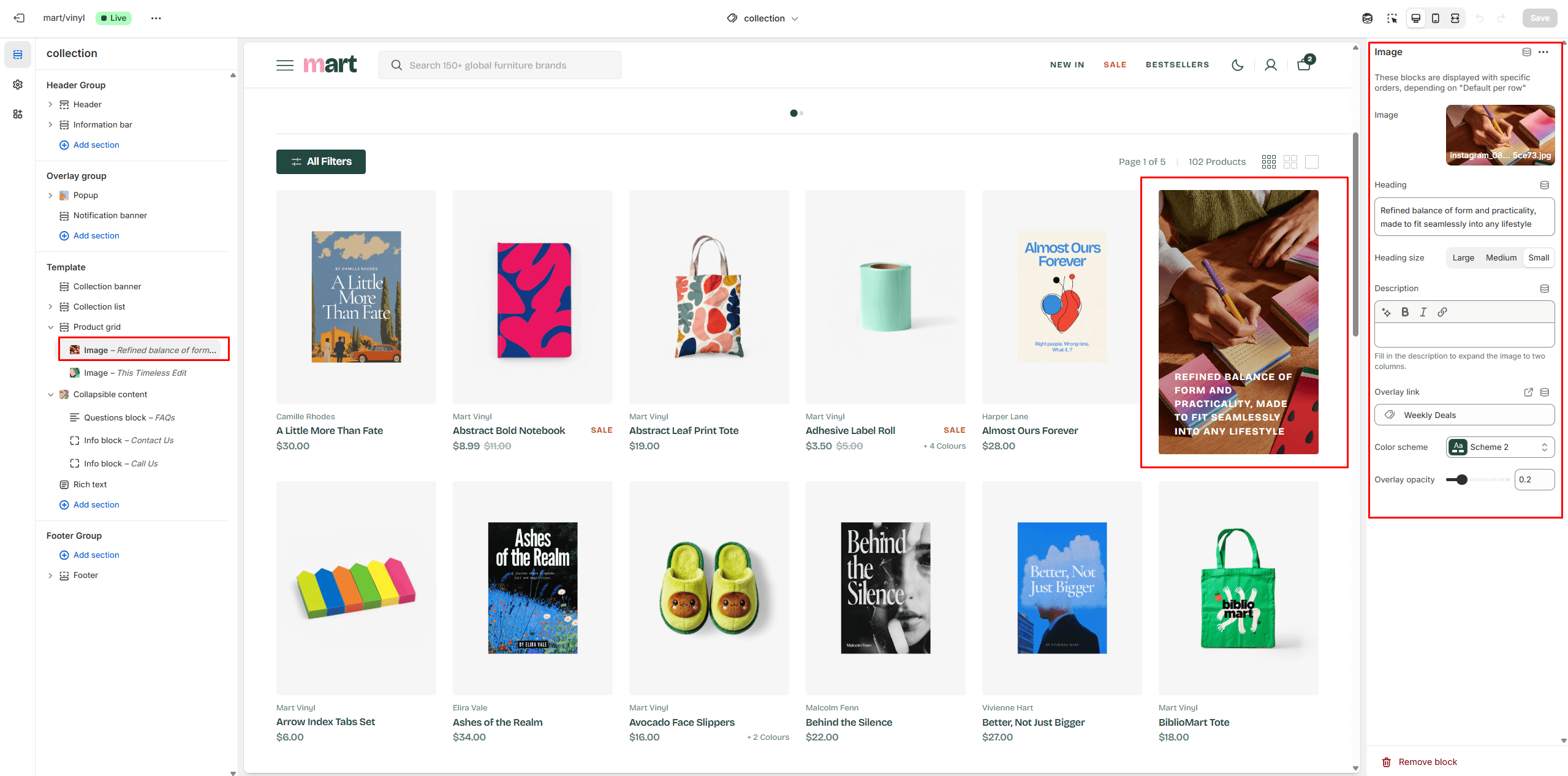
- You can add a promo image using the block that will be displayed on every page.
Collections List
Displays a list of all collections
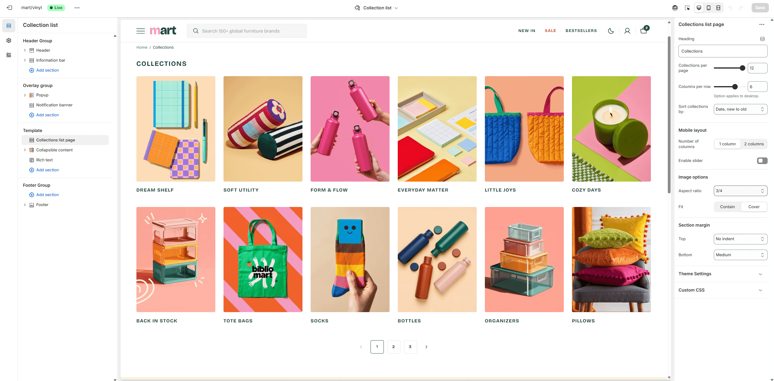
- Collections per page field sets the number of displayed cards.
- Columns per row slider allows you to change the number of collections per line only on desktop devices.
- Sort collections by field filters the collection by the specified parameters.
Cart
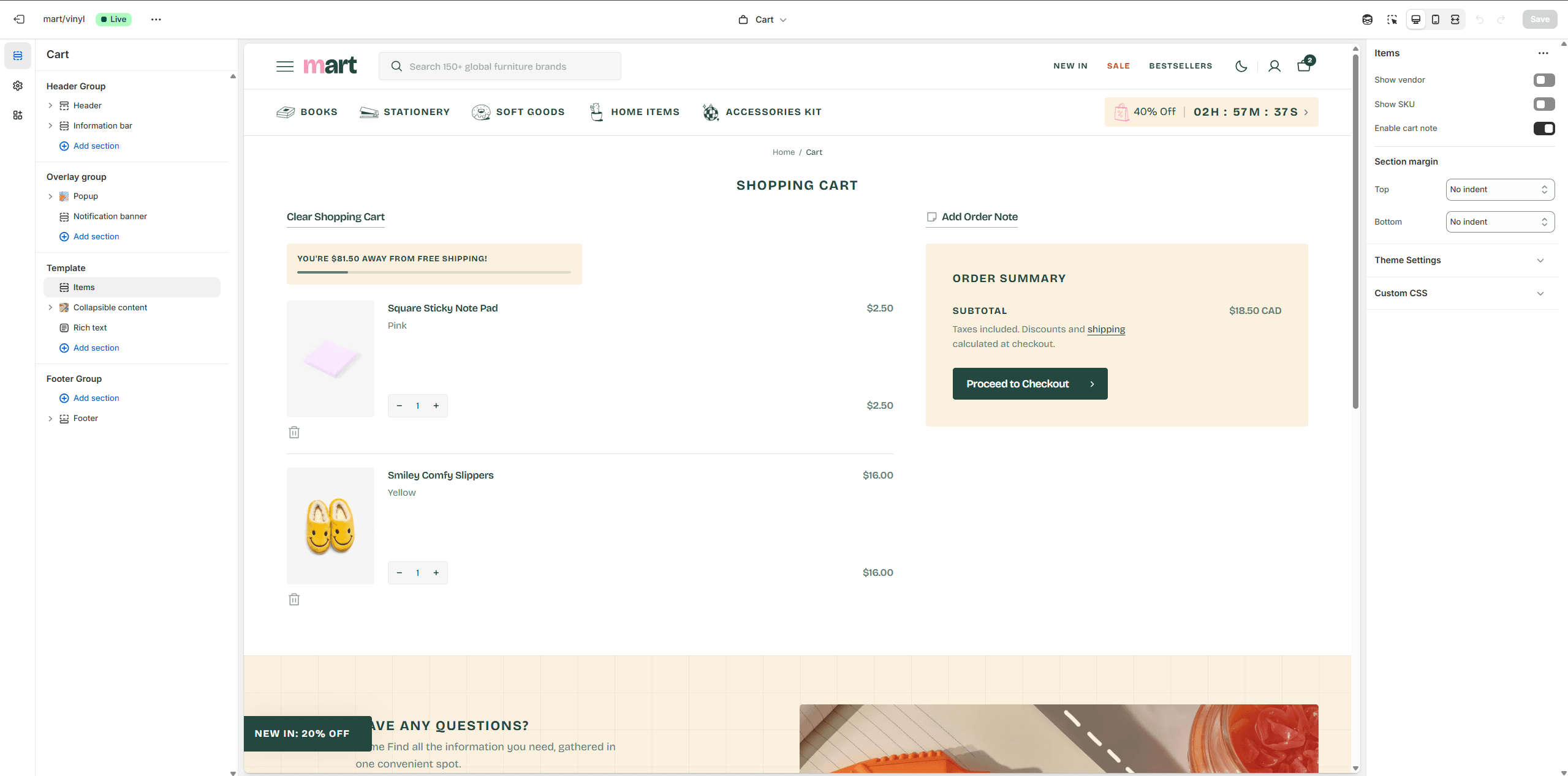
- Show vendor enables the display of the vendor.
- Show SKU enables the display of the sku.
- Enable cart note allows you to enable cart note.
Blog
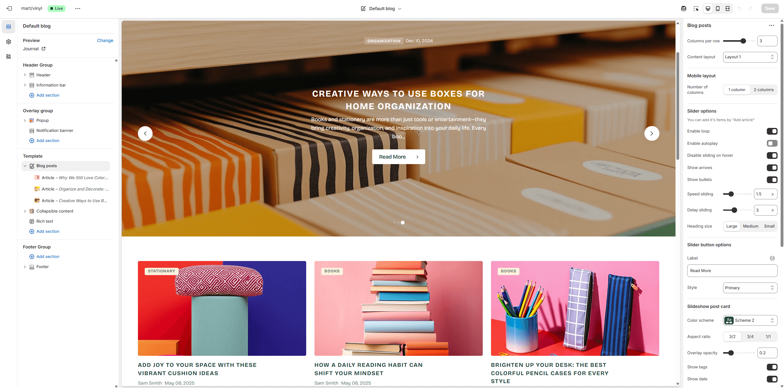
- Show featured image field enables the display of an image for the blog post.
- Show tags field enables the display of tags for the blog post.
- Show date field enables the display of the date for the blog post.
- Show author field enables the display of the author for the blog post.
- Show excerpt field enables the display of the excerpt for the blog post.
Blog Post
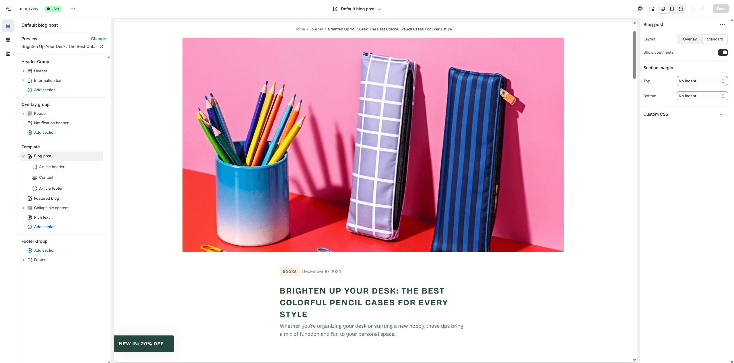
- Layout selector allows you to select the layout type.
- Block Article header allows toggling the display of tags, image, excerpt, author and date.
- Block Article footer allows toggling the display of tags, author and date.
- Block Article footer option Share allows enable links from the list.
Support
You can ask any questions about the theme and our support agent will help you within 24 hours on business days.
Visit Help Center View Privacy Policy